
Exploring a Concept: Updating Jira’s Color Palette to Enrich the User Experience
Jira: Empowering Teams with Smart Project Management
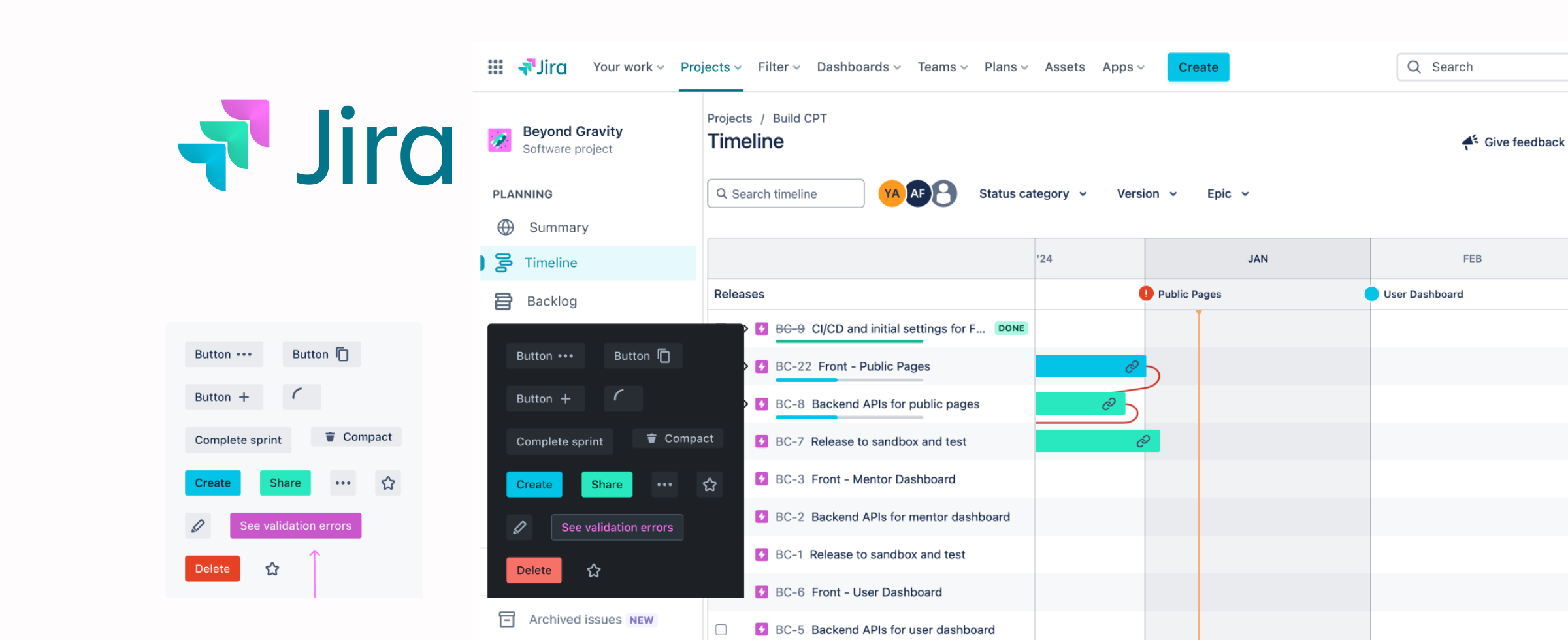
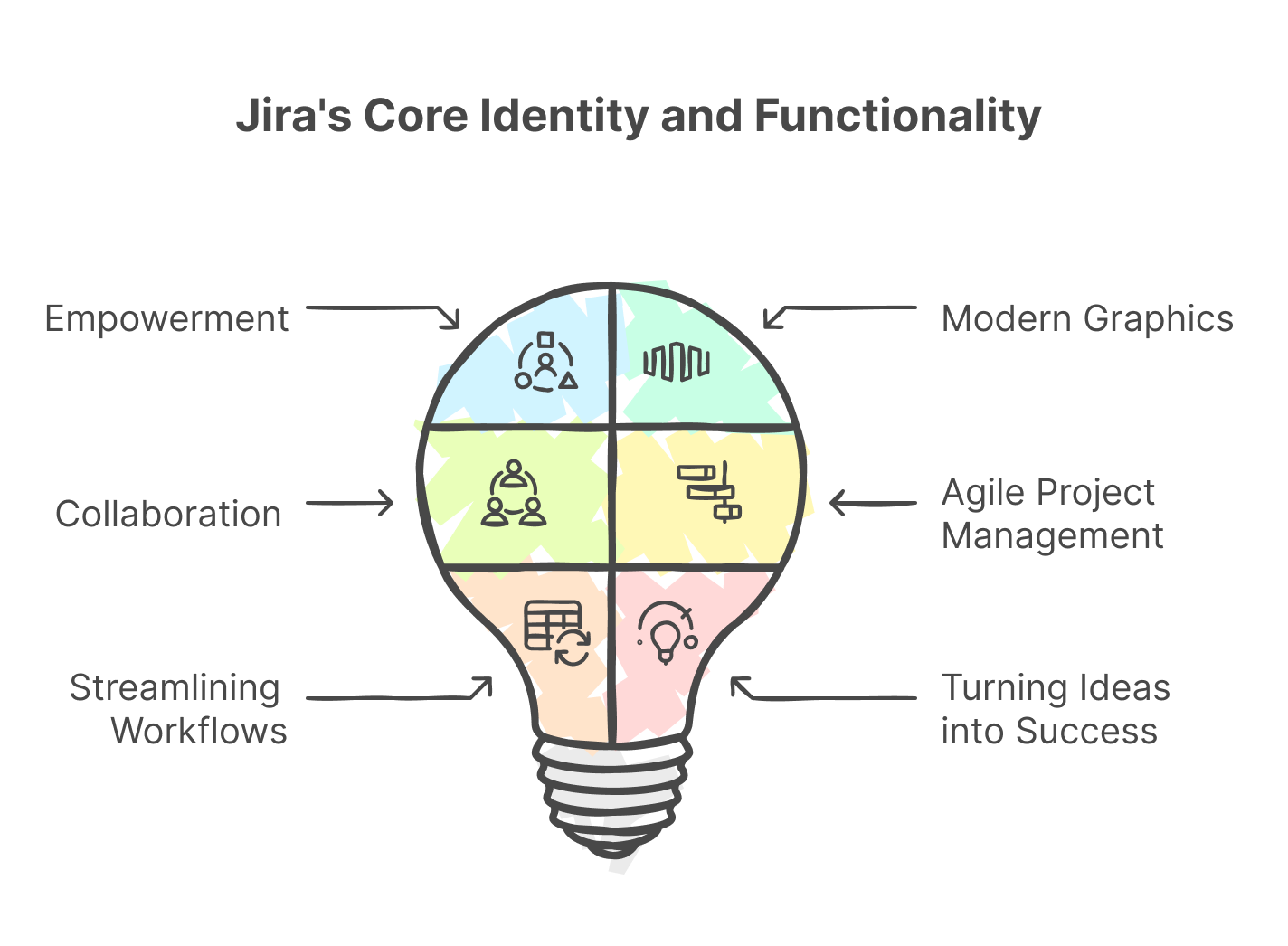
Jira, developed by Atlassian, reflects a clean and professional identity with a modern logo symbolising growth and achievement. Built for collaboration and agile management, it helps teams streamline workflows and turn ideas into success.
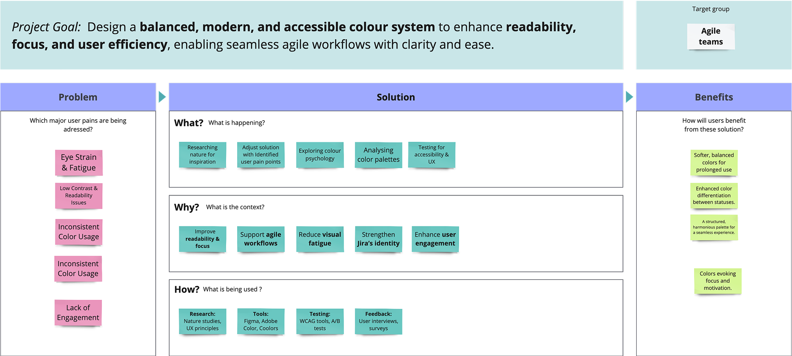
Problem
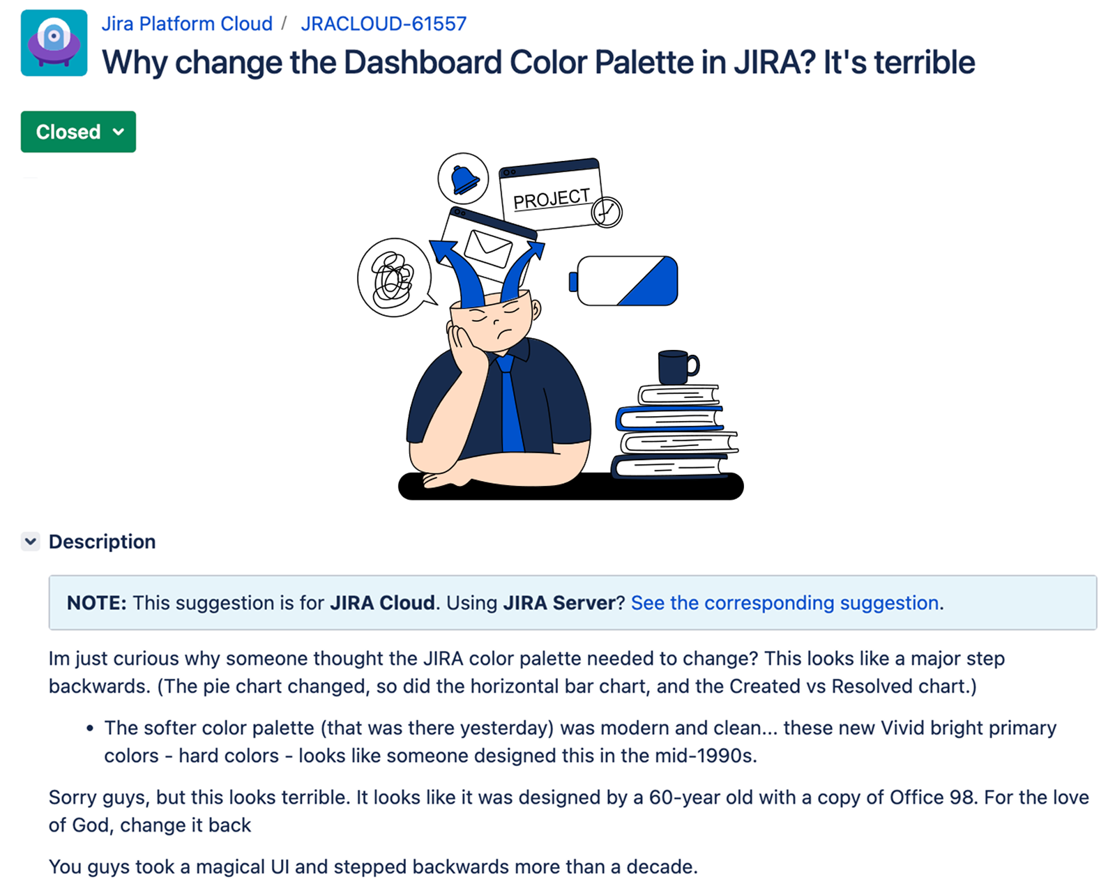
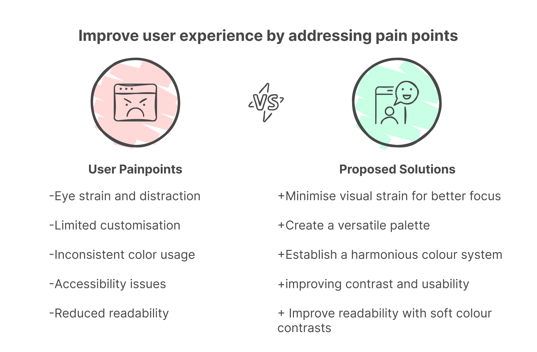
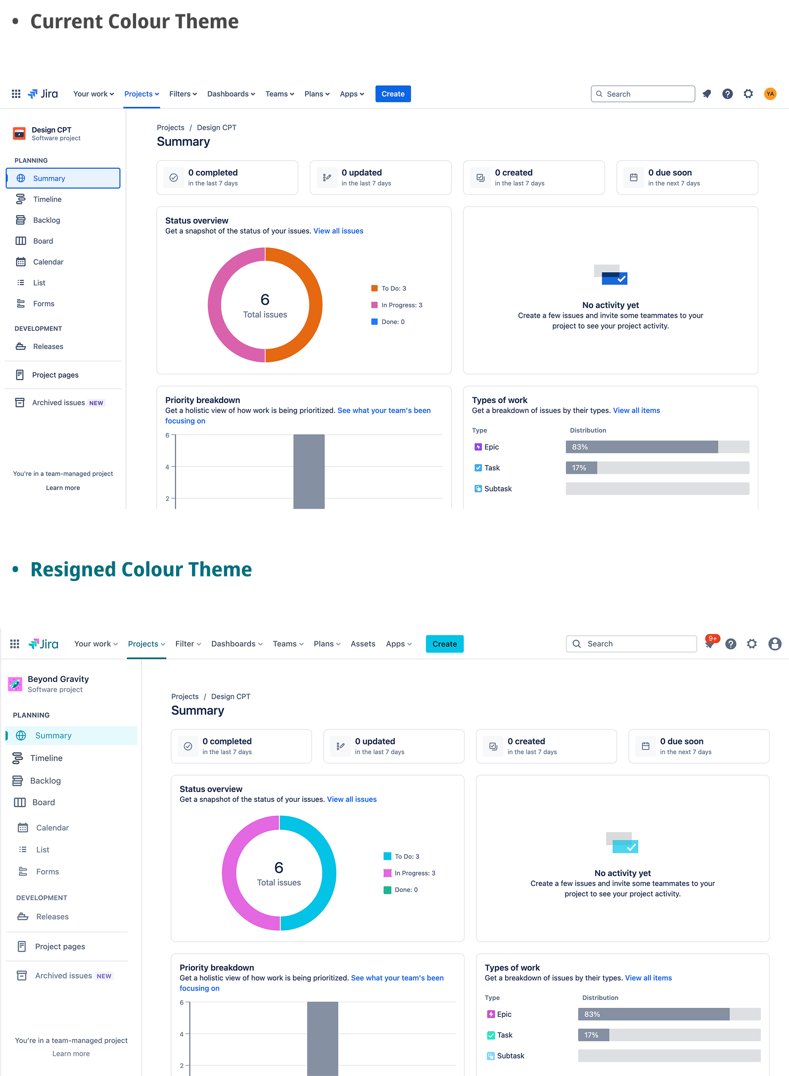
Jira’s existing color system, while functional, lacked the emotional and visual engagement needed for a modern and intuitive user experience. Users experienced visual fatigue, poor clarity, and uninspiring aesthetics, making long sessions exhausting. The rigid blue-heavy palette felt monotonous and hindered readability, especially for issue statuses.
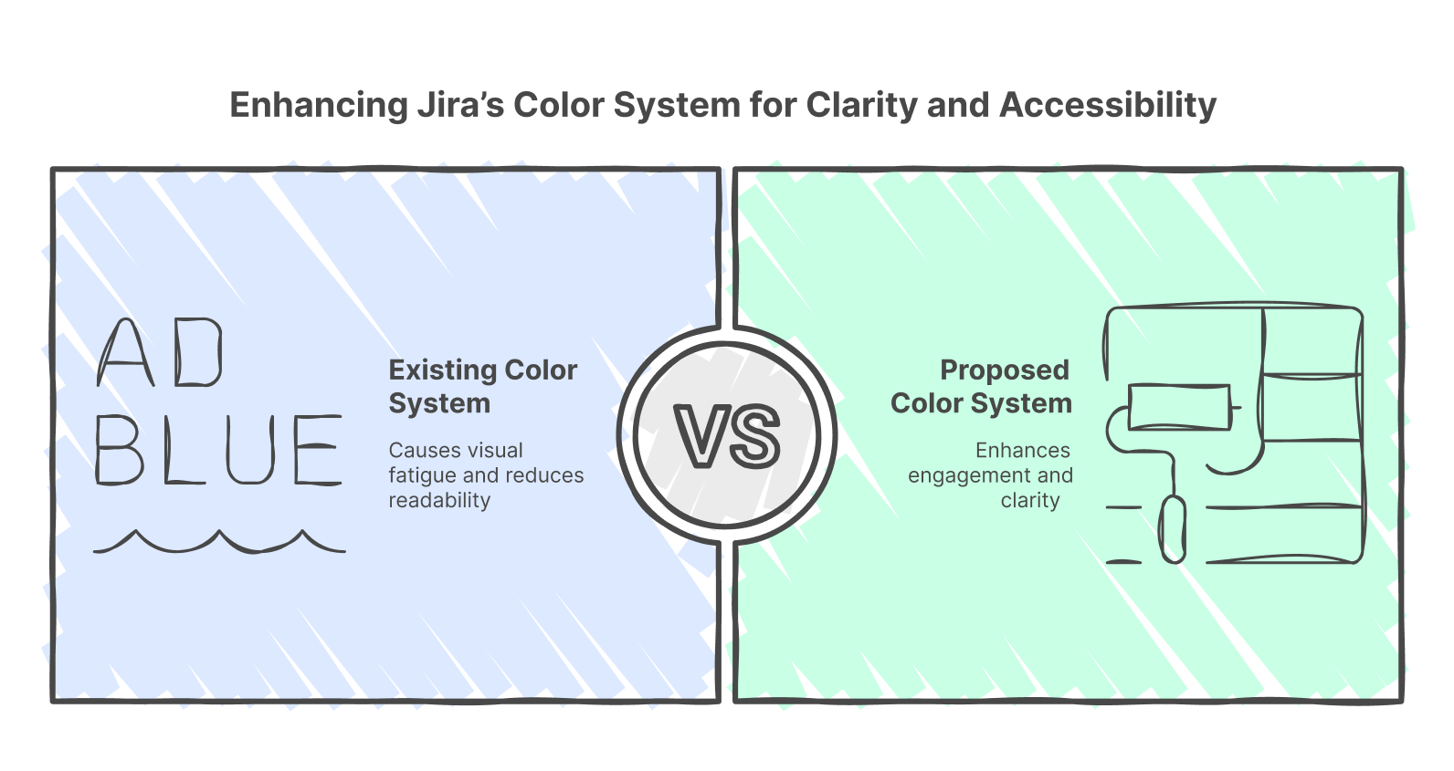
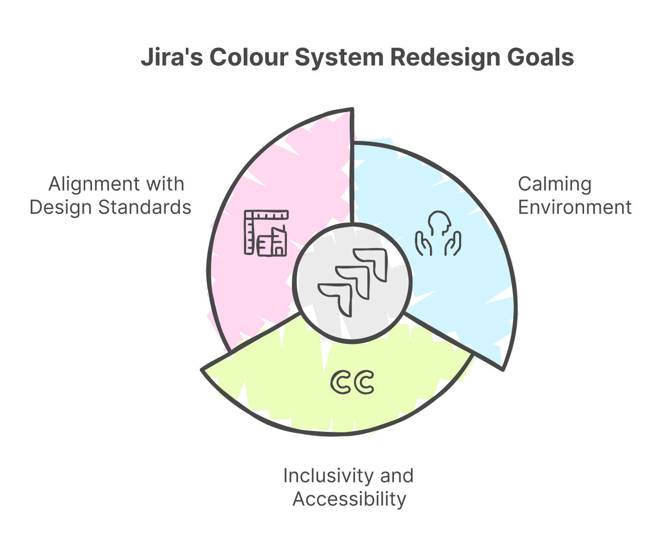
The challenge was to redesign Jira’s color system to be more engaging, accessible, and intuitive while ensuring it remained professional and aligned with the needs of diverse users.
The goal was threefold:
- Craft a calming and engaging visual environment
- Enhance inclusivity and accessibility for all users
- Modernise Jira’s aesthetic to align with today’s design standards
Why this redesign matters?
This project underscores the power of thoughtful design in digital tools. We created an environment that empowers users emotionally and celebrates all by reimagining something as fundamental as a colour system. Small, purposeful changes can create ripples of impact—improving how people feel and perform.
This transformation is not just about aesthetics; it’s a deliberate act of design thinking, putting the user’s emotional and functional needs front and centre.
Let’s dive into the journey that brought this vibrant vision to life.
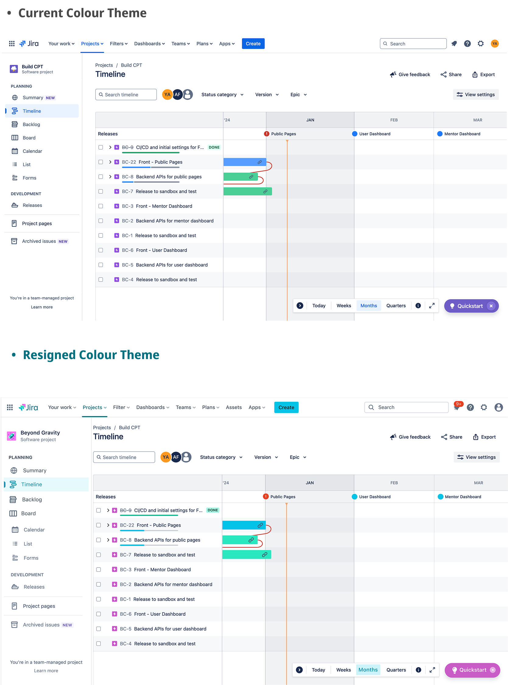
A New Era for Jira
Picture this: you log into Jira and are greeted by a soothing wave of colours—soft greens, coral pinks, and light blues—so your mood is refreshed and you are bright and focused. The rigid blues of the past are gone, replaced with a calmer, more creative interface that enhances daily workflows.

The Design Thinking Odyssey
This project underscores the power of thoughtful design in digital tools. We created an environment that empowers users emotionally and celebrates all by reimagining something as fundamental as a colour system. Small, purposeful changes can create ripples of impact—improving how people feel and perform.
Empathising with Users
User interviews with co-workers and friends using JIRA unearthed key pain points:
- visual fatigue
- lack of clarity
- and uninspiring aesthetics
Based on gathered data, users craved a less stressful and intuitive workspace.
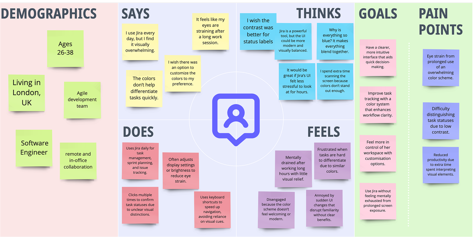
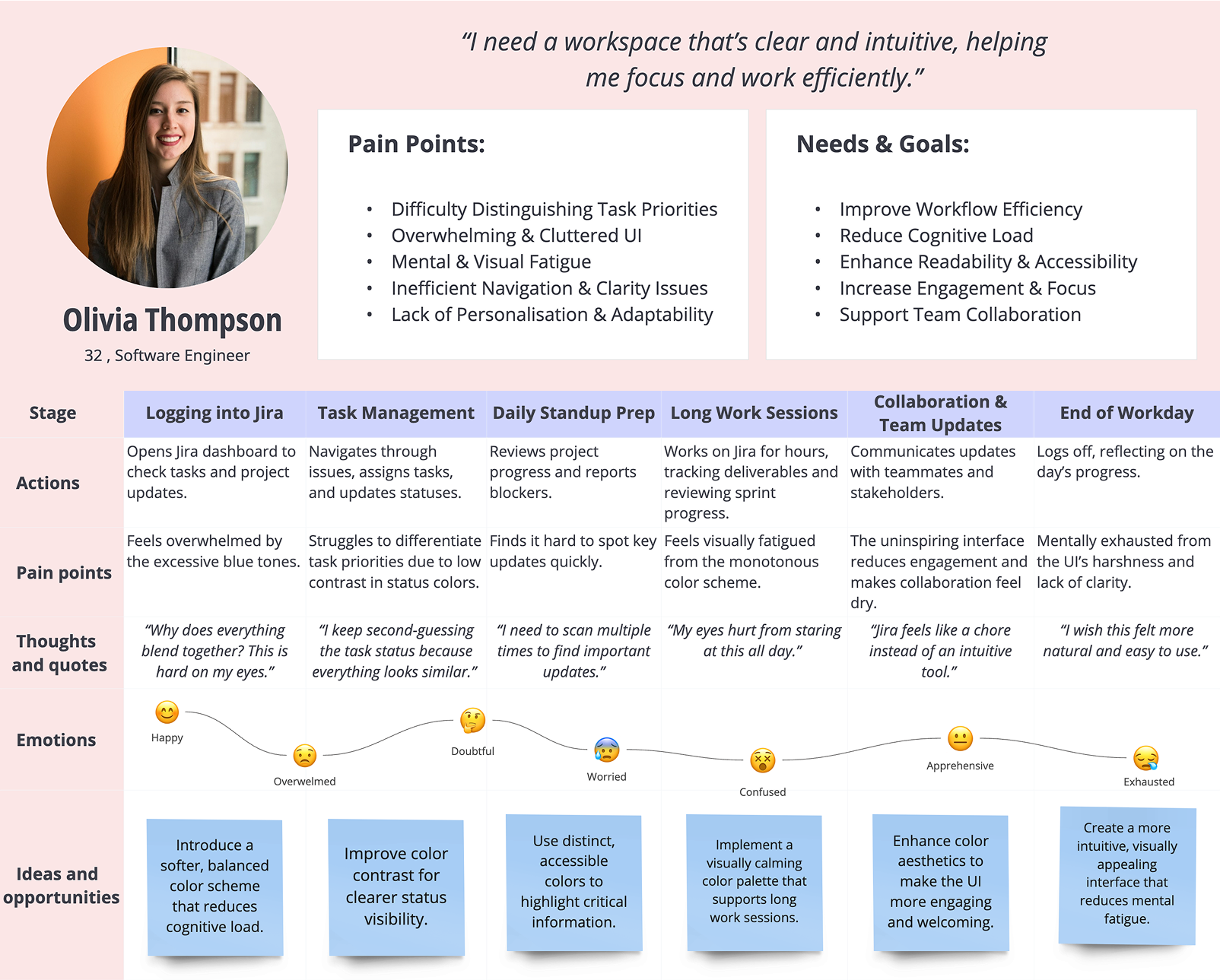
Identifying the Pain Points
For years, Jira’s colour system played it safe. The monochromatic blue-heavy palette worked, but only to a point. Users reported feelings of visual fatigue and a lack of inspiration. The system felt dated, overly corporate, and disconnected from the diverse, dynamic teams it was meant to support.
The challenge was clear:
“How can I redesign Jira’s colour system to evoke clarity, inclusivity, and emotional engagement, while maintaining its professional essence?”
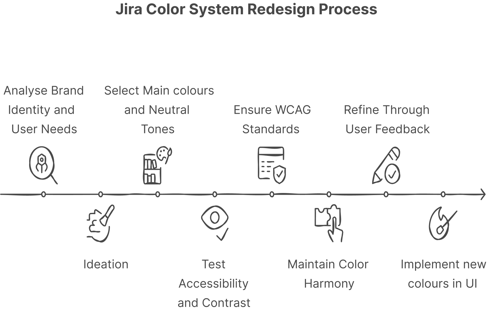
Ideation : A Vision Rooted in Nature’s vibrant ecosystems
I looked beyond screens and into nature to answer this question. Connecting user pain points, empathy maps, and feedback, I explored colour psychology and accessibility of varous color themes, using Figma and WCAG tools shape the final palette, aiming to enhance agile workflows, reduce cognitive load, and align with Jira’s identity for a clearer, stress-free experience.User interviews with co-workers and friends using JIRA unearthed key pain points:
To create a colour system that enhances focus and productivity, I looked to nature for inspiration. Some of the most productive and adaptive creatures in nature.
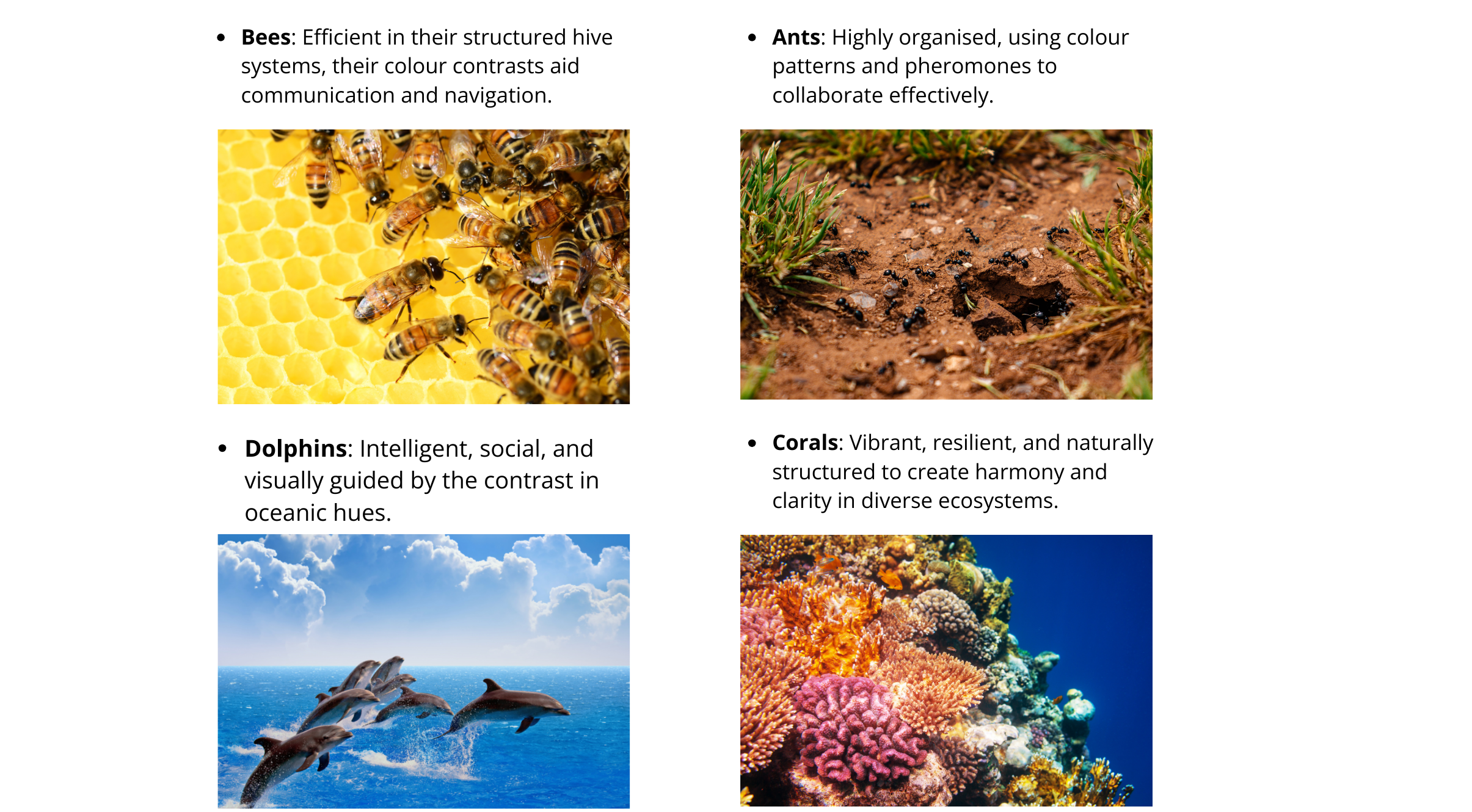
Through this exploration, coral reefs emerged as a strong inspiration.
Why Coral reefs?
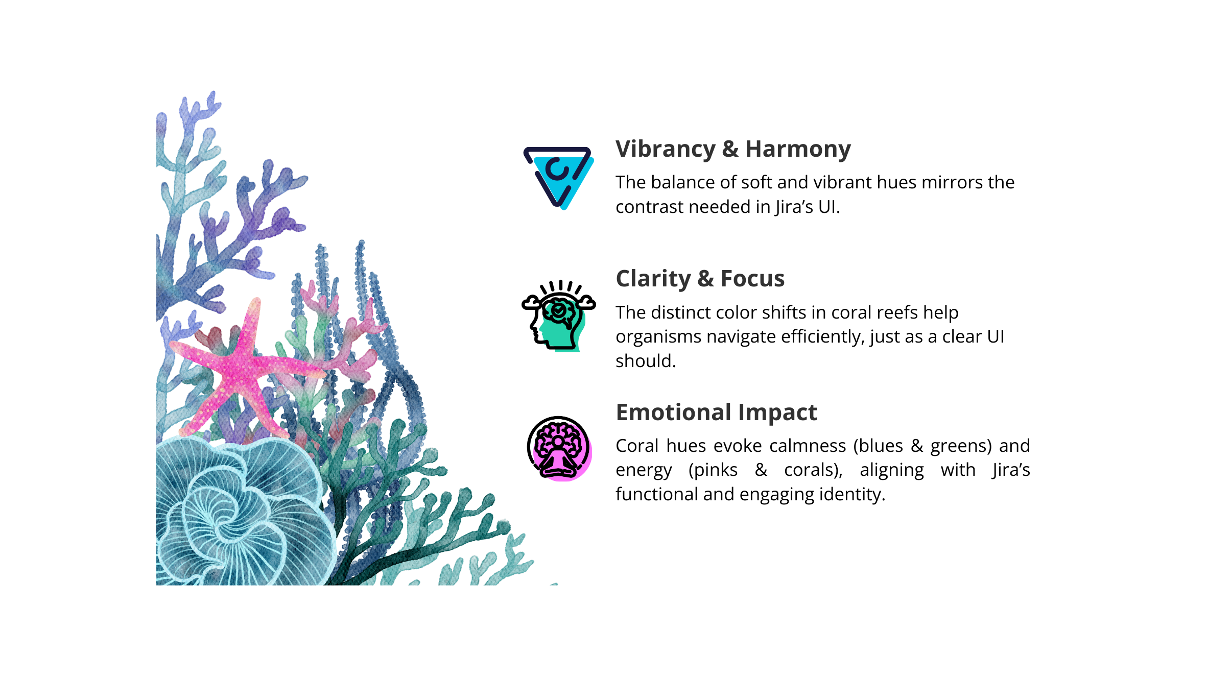
Coral reefs are one of the most productive ecosystems in nature. They support diverse life forms, thrive in harmony, and maintain resilience despite environmental changes. Their color diversity creates balance and distinction, making them the perfect analogy for Jira’s need for clarity, engagement, and focus.
Analysing Coral-Based Color Palettes
To refine the palette, I analysed multiple coral reef colour compositions to determine the best hues for Jira. This involved:
- Extracting dominant coral colours (teal, pastel green, soft blues, coral pinks).
- Testing variations for readability & usability.
- Ensuring accessibility compliance (WCAG standards).
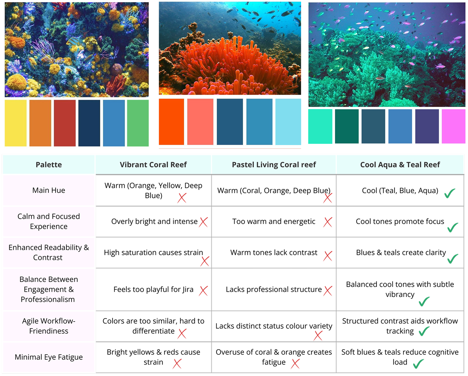
By leveraging colour psychology, we selected pastel green as the primary color, representing growth, balance, and renewal, while coral pink added vibrancy, and soft blues enhanced clarity.
Finalised Color Palette & Decision
After extensive iterations and testing, the finalised coral-inspired colour system for Jira included:
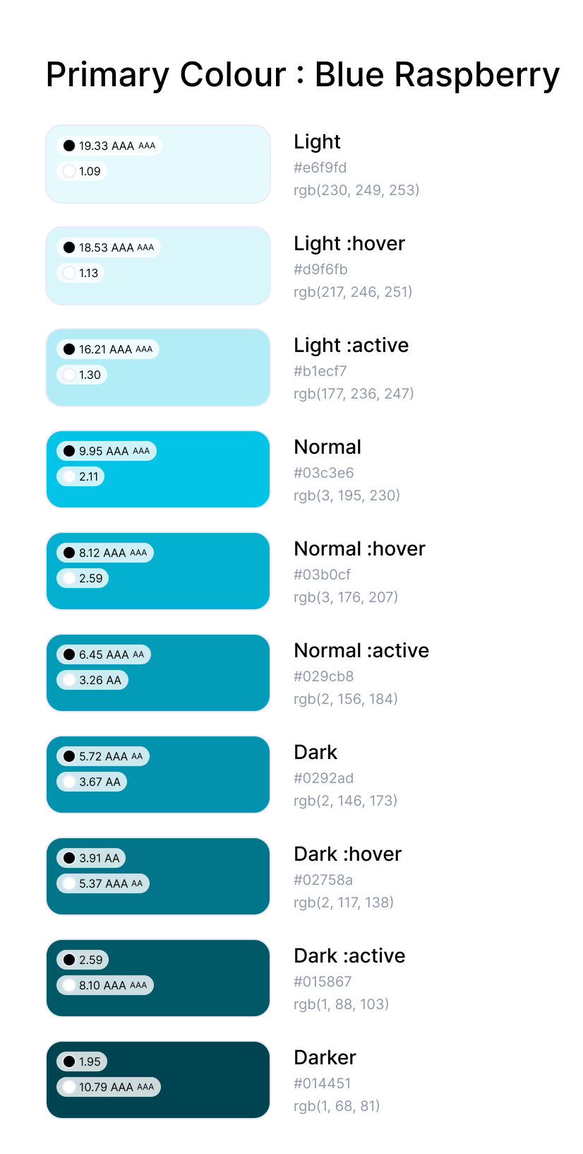
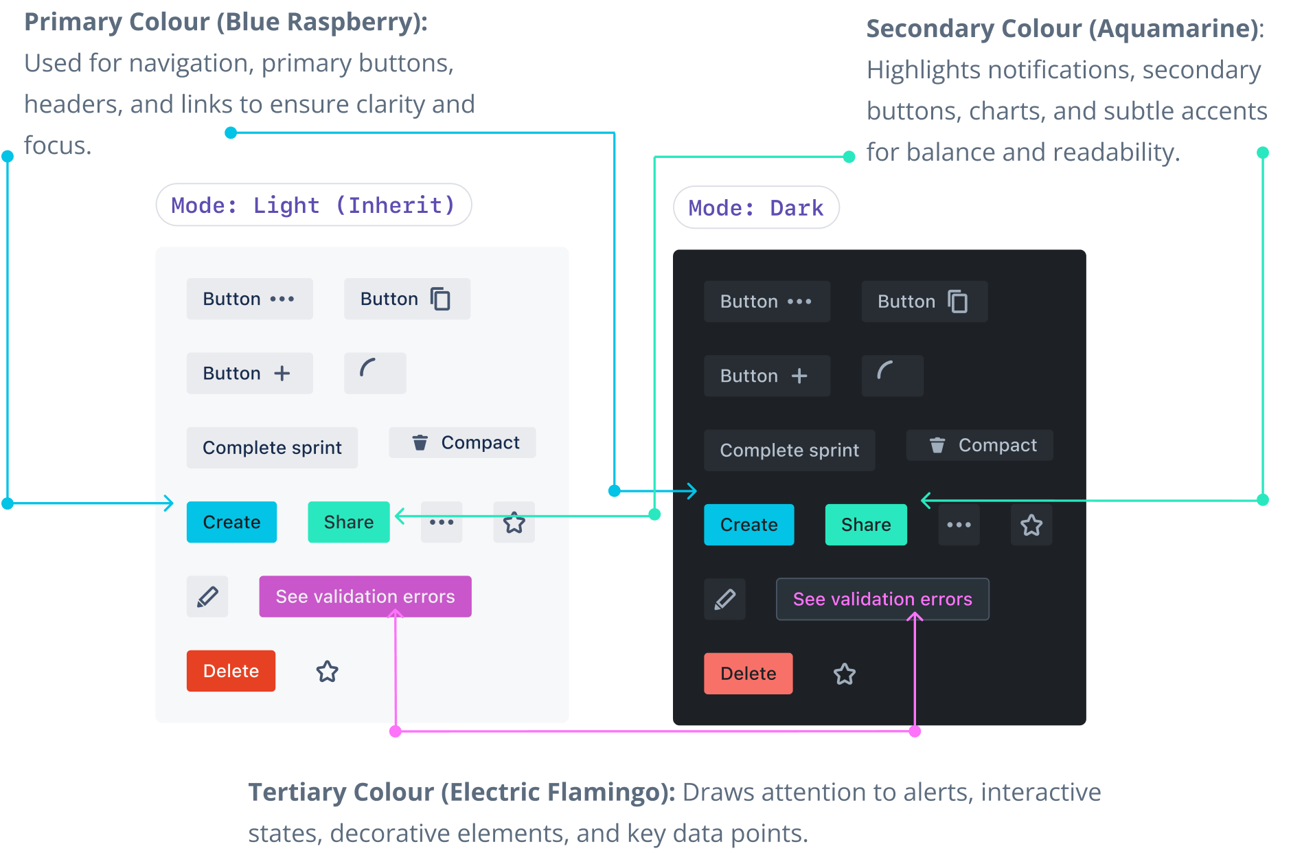
Primary colour: Blue Rasberry
Blue Raspberry symbolises creativity, loyalty, and calmness, blending vibrant energy with the serenity of introspection.
Why Blue Raspberry?
- Calm and Focused: Promotes serenity, reduces stress.
- Trusted and Stable: Symbolises loyalty and reliability.
- Creative and Innovative: Vibrant energy inspires teamwork.
- Wisdom and Depth: Reflects introspection and insight.
- Unique Identity: Modern, fresh, and professional.
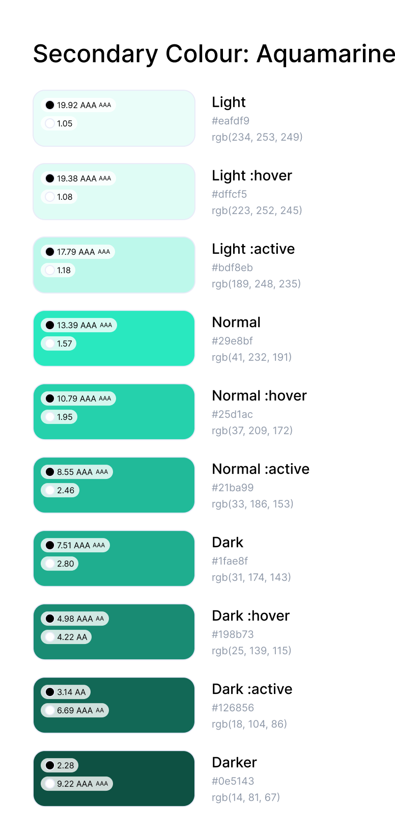
Secondary Colour: Aquamarine
Aquamarine symbolises tranquility, clarity, and renewal, inspired by the calming hues of the sea. Its psychological impact promotes relaxation, focus, and emotional balance, making it an ideal choice for fostering productivity and harmony in design.
Why Aquamarine?
- Calm and Inviting: Evokes serenity and balance, reducing tension.
- Clarity and Focus: Enhances mental clarity and decision-making.
- Renewal and Growth: Reflects rejuvenation and adaptability.
- Trust and Openness: Encourages collaboration and harmony.
- Modern Sophistication: Adds a refreshing, contemporary touch.
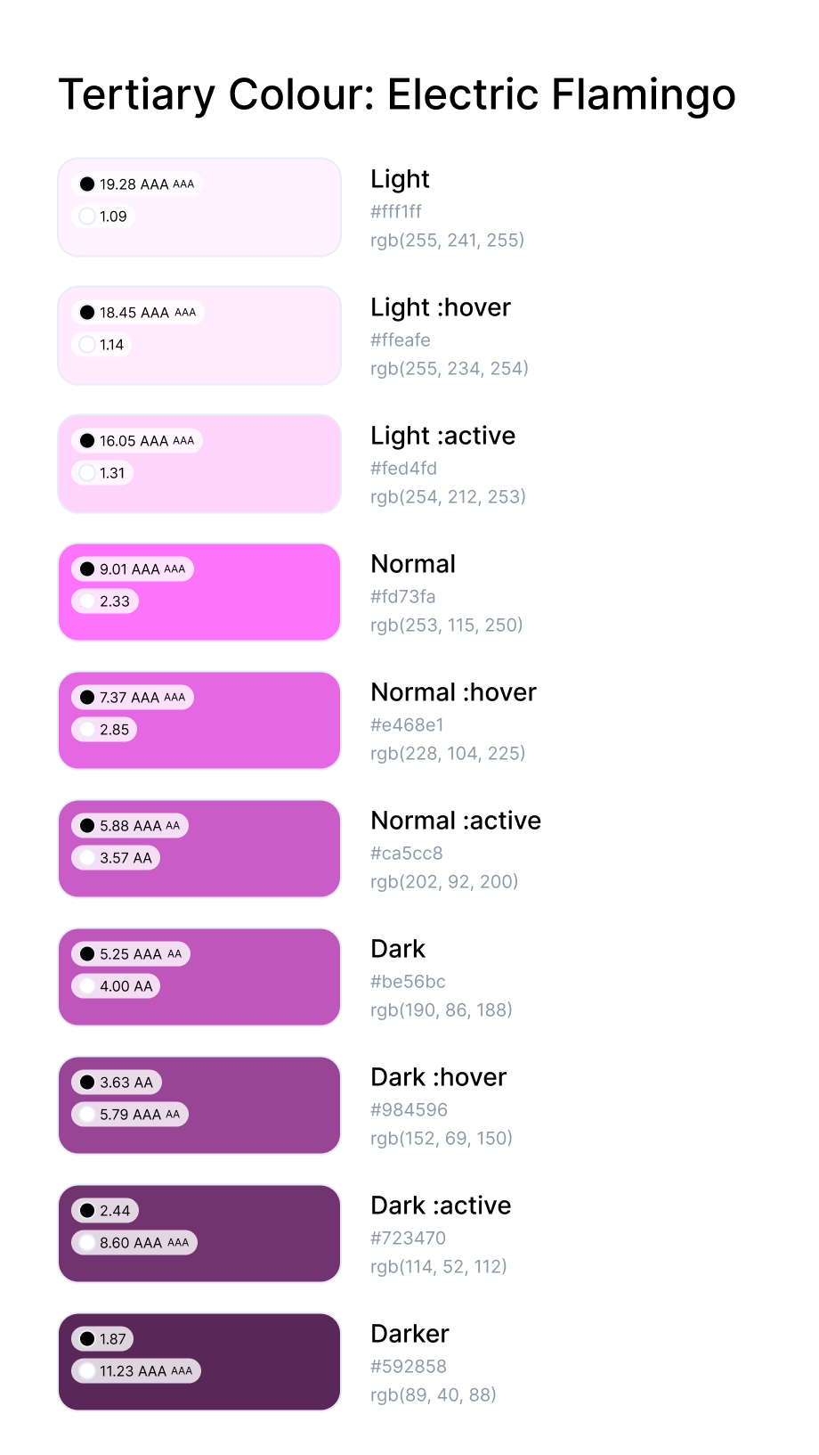
Tertiary Colour
Electric Flamingo symbolises energy, passion, and creativity, blending boldness with a sense of fun to inspire action and excitement.
Why Electric Flamingo?
- Bold and Vibrant: Captures attention, energises the interface.
- Passionate and Motivating: Encourages action and enthusiasm.
- Creative and Playful: Sparks innovation and teamwork.
- Modern Edge: Adds a fresh, dynamic contrast.
- Memorable Identity: Leaves a lasting, unique impression.
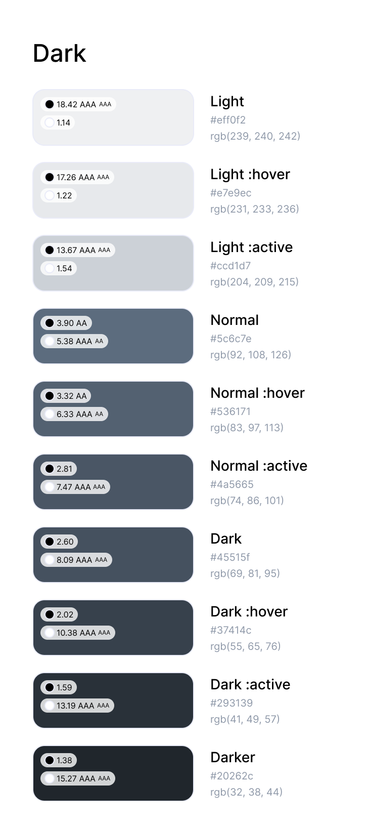
Dark Colour Palette
This palette is designed for optimal readability and accessibility, offering a balance of contrast and subtlety. Its cool, muted tones ensure clarity for text-heavy interfaces without overwhelming the design, enhancing focus and professionalism.
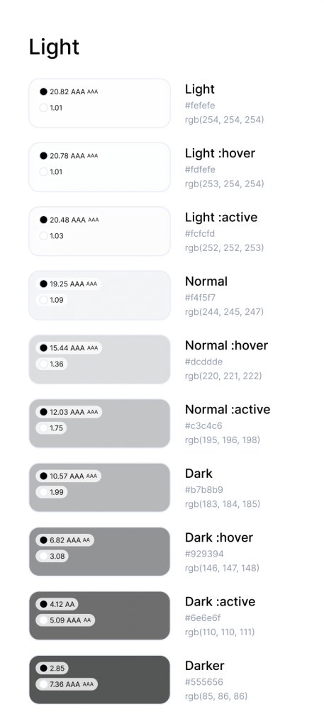
Light Colour Palette
The neutral light palette provides a foundation of versatile shades, supporting primary and accent colours. These hues create depth, hierarchy, and a cohesive aesthetic, offering flexibility for backgrounds, borders, and non-disruptive UI elements.
System Colours
The system colour palette is designed to convey clear and intuitive feedback:
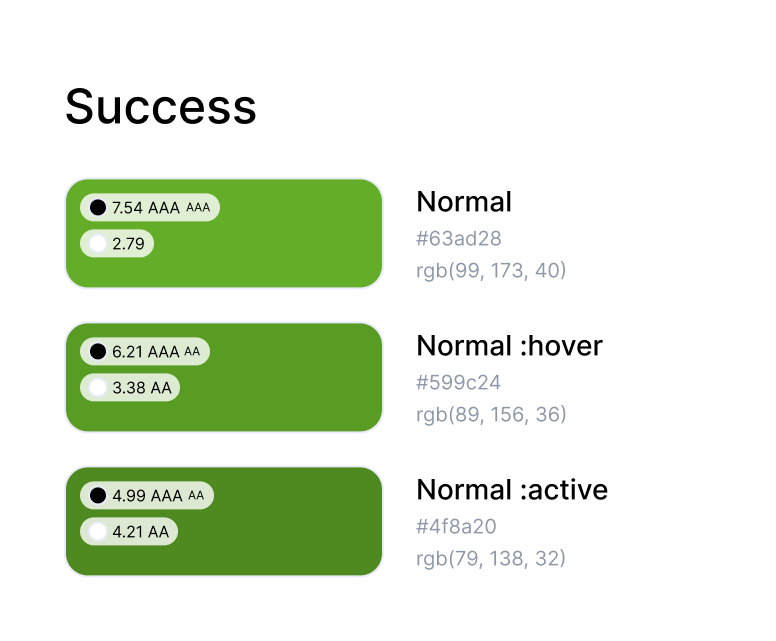
Green:
Indicates positive actions, completed tasks, or successful outcomes.
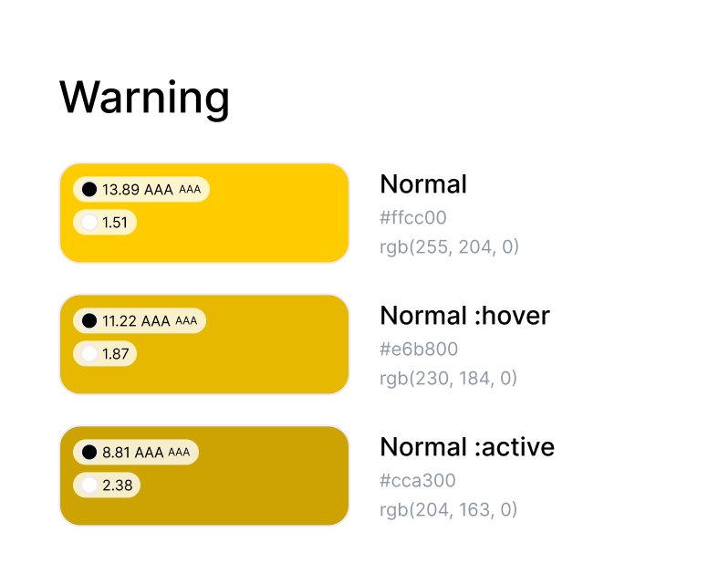
Yellow:
Alerts users to potential issues or cautionary scenarios.
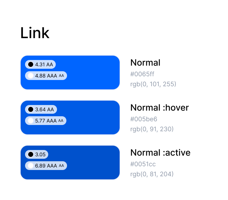
Blue:
Will be used exclusively for links to ensure consistency and clarity.
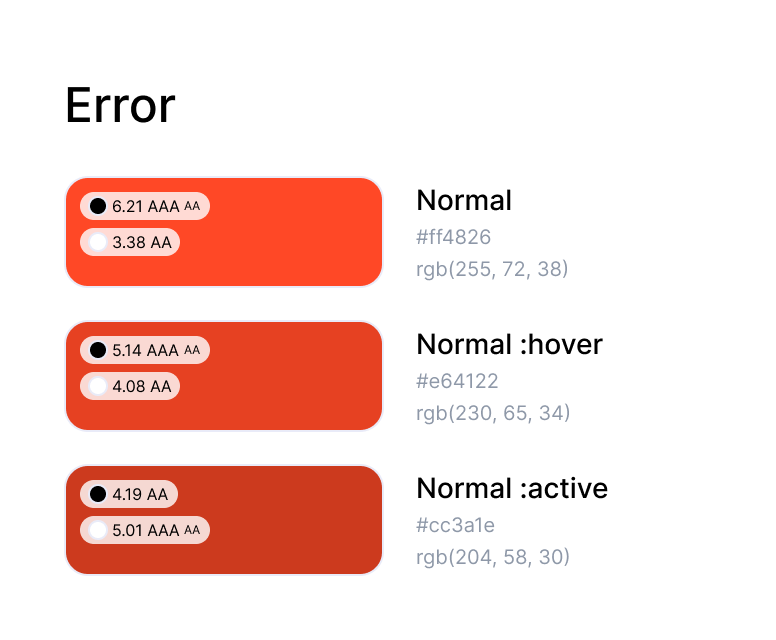
Red:
Highlights critical errors or actions requiring immediate attention.
Accessibility Prioritised
Every colour choice passed rigorous contrast tests to ensure clarity for all users.
Accessibility checks ensured compliance with WCAG standards, making the design inclusive for users with visual impairments.
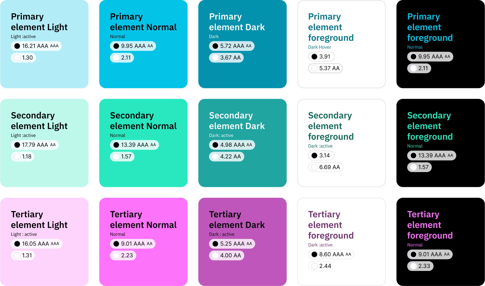
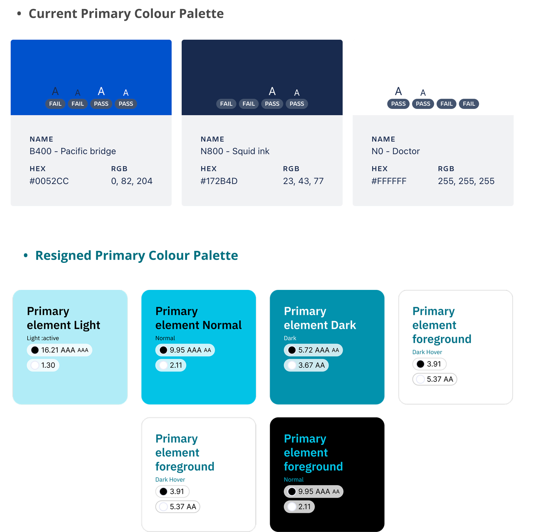
These samples demonstrate the three system colours tested for WCAG accessibility ratings.
The ratings—A, AA, and AAA—ensure sufficient contrast for readability, catering to a wide range of users and accessibility needs.
Outcome
A visually stunning, functionally superior colour system that redefines the Jira experience:
- Calm and Focused Workflows: The palette reduces stress and supports long work sessions.
- Enhanced Readability: Thoughtful contrasts improve clarity and ease of use.
- Modern and Inclusive Aesthetic: Jira now feels contemporary and welcoming to its global user base
What is users opinion about new colours?
Users praised the new colour system clarity and focus-enhancing qualities, while some requested more customisation options.
User feedbacks include:
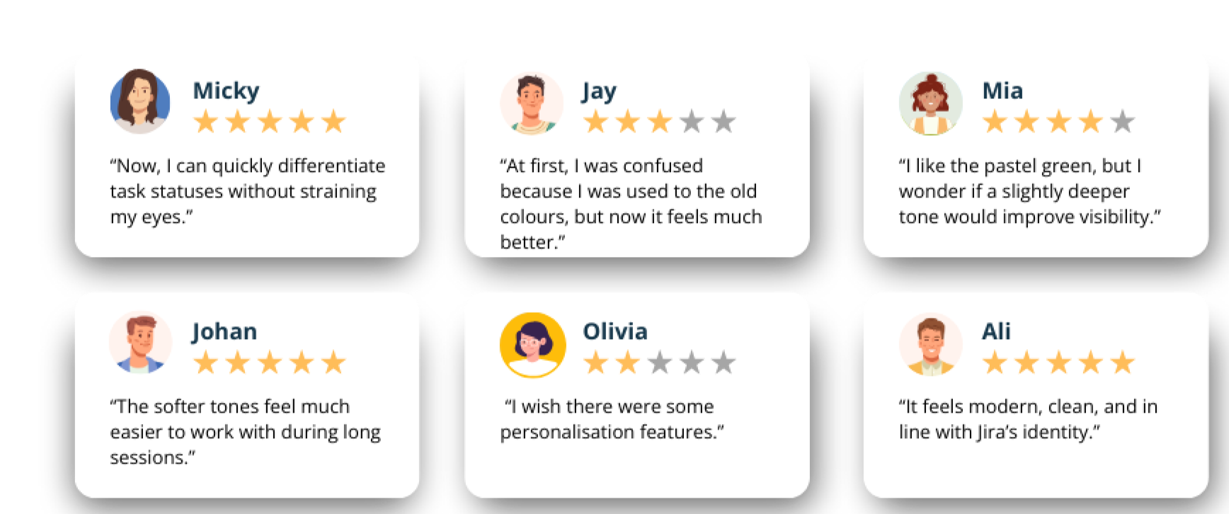
- Improved Clarity & Readability: Users find it easier to distinguish tasks, statuses, and priorities, reducing confusion.
- Reduced Visual Fatigue: The softer, balanced colours make long work sessions more comfortable and less straining.
- Better Workflow Efficiency: Agile teams report smoother navigation and faster decision-making due to clearer color differentiation.
- Desire for Customisation: While the new design is well-received, some users wish for personalisation options to tailor the colour scheme to their preferences.

Learned lessons from the Jira color palette redesign
This is more than a story about colors. It celebrates how design thinking, empathy, and creativity can transform the mundane into something extraordinary. And that’s a journey worth sharing.
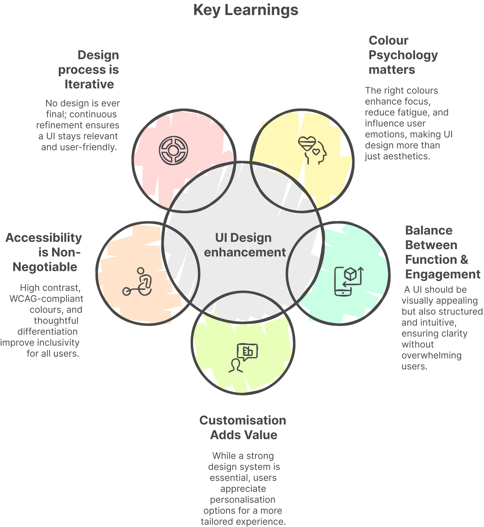
Looking ahead…
The redesigned colour system is just the beginning. It lays a strong foundation for future innovations, ensuring continuous practice and learning in user-centric design.
To reach further enhancement in JIRA’s color system, the next steps are:
- Expanding Customisation Options
Introduce theme variations (light, dark, high-contrast) and allow users to adjust UI colours. - Enhancing Accessibility Compliance
Further test contrast levels, ensure colour differentiation for visually impaired users, and refine WCAG compliance. - User Feedback & Iteration
Conduct A/B testing, surveys, and usability tests to fine-tune the color system based on real user needs.

Other Works
- IQOS Companion App
 IQOS Companion App: A UX/UI Design Story Exploring How Data Can Drive… Read more: IQOS Companion App
 - BILL
 Simplifying Approval Processes:A UX Case Study on Enhancing Visibility and Usability of… Read more: BILL
 - SplitWise Case Study
 Splitwise Less stress when sharing expenses with anyone Optimising Splitwise:Better Usability & Higher… Read more: SplitWise Case Study