
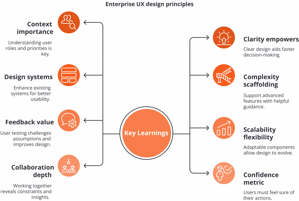
Simplifying Approval Processes:
A UX Case Study on Enhancing Visibility and Usability of Payables Approvals in BILL
- Duration: 2 weeks
- Team: 1 UX/UI Designer, 1 UX Consultant
- Role: UX Research, UI/UX Design
- Project Scope: Voluntary UX/UI Design Case Study
- Tools: Figma, Figjam, UXpilot, Firestudio, Maze
Overview
BILL is a cloud-based financial operations platform that automates accounts payable and receivable processes for businesses, ensuring accuracy, compliance, and efficiency in invoice approvals and payments.
Products of Focus
- Accounts Payable
- Invoice Processing
- Automated Bill Approvals
- Vendor Payments
The Problem
The approval process in BILL lacks clarity, structure, and customisation, making it difficult for users to track progress, understand responsibilities, and manage notifications effectively. Limited filtering options, lack of bulk actions for invoices, and poor organisation of approval requests in the inbox further contribute to delays, inefficiencies, and user frustration.
The Goal
The goal of redesigning approval experience is to streamline workflows, enhance clarity, and empower users with better control. By introducing clear status tracking, role-specific task views, custom filters, bulk invoice actions, and an organised inbox, the solution enables faster, more accurate approvals while reducing delays, errors, and user frustration.
My Process
The scope and activities of my process vary depending on available resources, project constraints, and access to first-hand data. Since I did not have direct access to BILL’s internal systems, I approached this project through in-depth research, competitive analysis, and user feedback. My process involved studying existing workflows, identifying pain points, and designing an optimised approval experience based on industry best practices.

The Discovery phase involved collecting and analysing information about BILL’s approval workflow, identifying user pain points, and evaluating competing fintech platforms. Since I did not have direct access to BILL platform, my research relied on desk research consist of customer reviews, and existing BILL UI design visuals, user interview, help desk tickets and BILL’s tutorials to build an accurate understanding of the existing process.
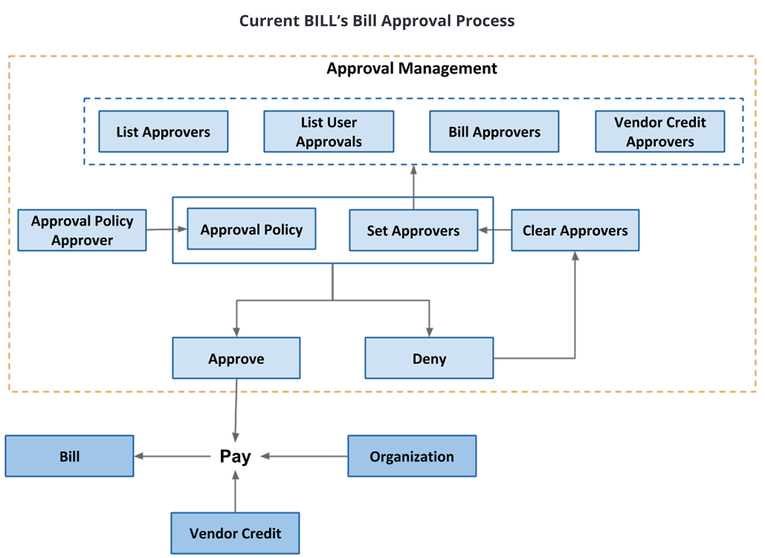
Understanding the Approval Workflow
Before proposing improvements, I needed to fully grasp how BILL’s approval system functions, its limitations, and how users interact with it. I focused on key areas such as the end-to-end workflow, approval routing, notification system, and overall user experience.
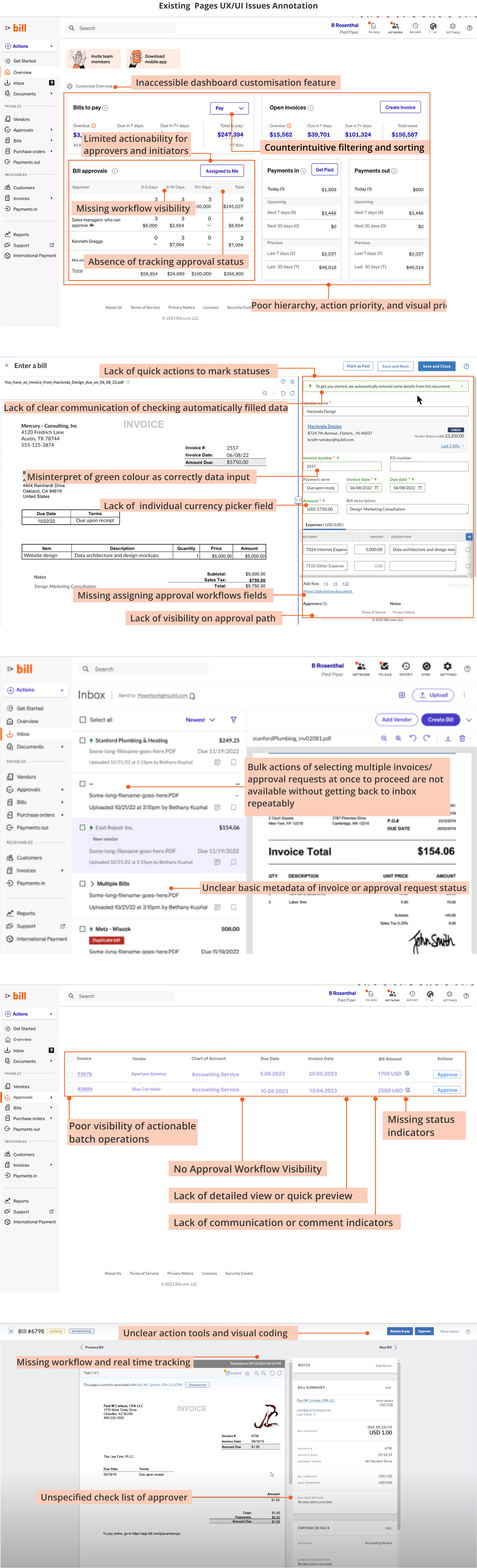
User Pain Point Analysis
Through user research and feedback analysis, I identified several key pain points that impact the efficiency of BILL’s approval process:
- Lack of visibility: Users struggle to track pending approvals, leading to delays and confusion.
- Rigid workflows: The system lacks flexibility in modifying approval chains, especially when approvers are unavailable.
- Notification inefficiencies: Excessive yet ineffective notifications result in missed approvals and manual follow-ups.
- Interface friction: Navigating approvals, reviewing invoices, and taking action is not always intuitive, causing delays.
- Limited exception handling: Users face difficulties modifying bills post-submission, requiring unnecessary manual workarounds.
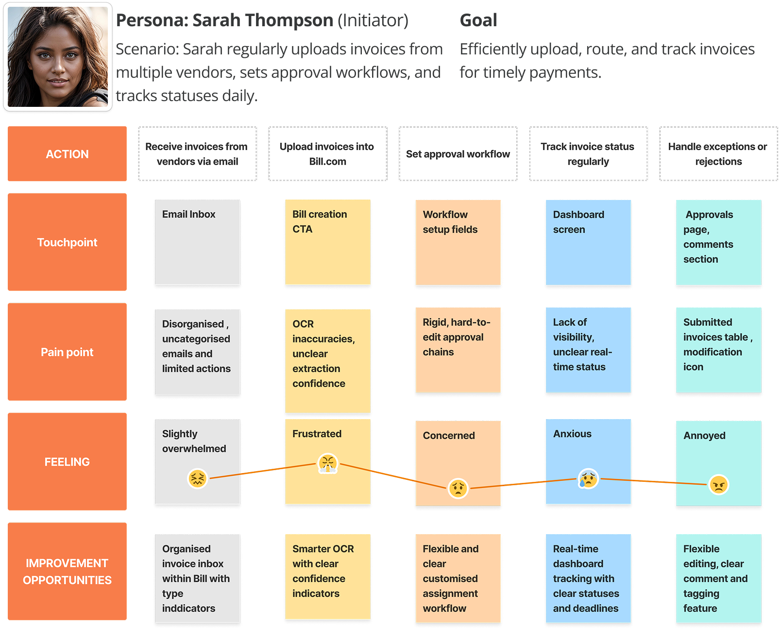
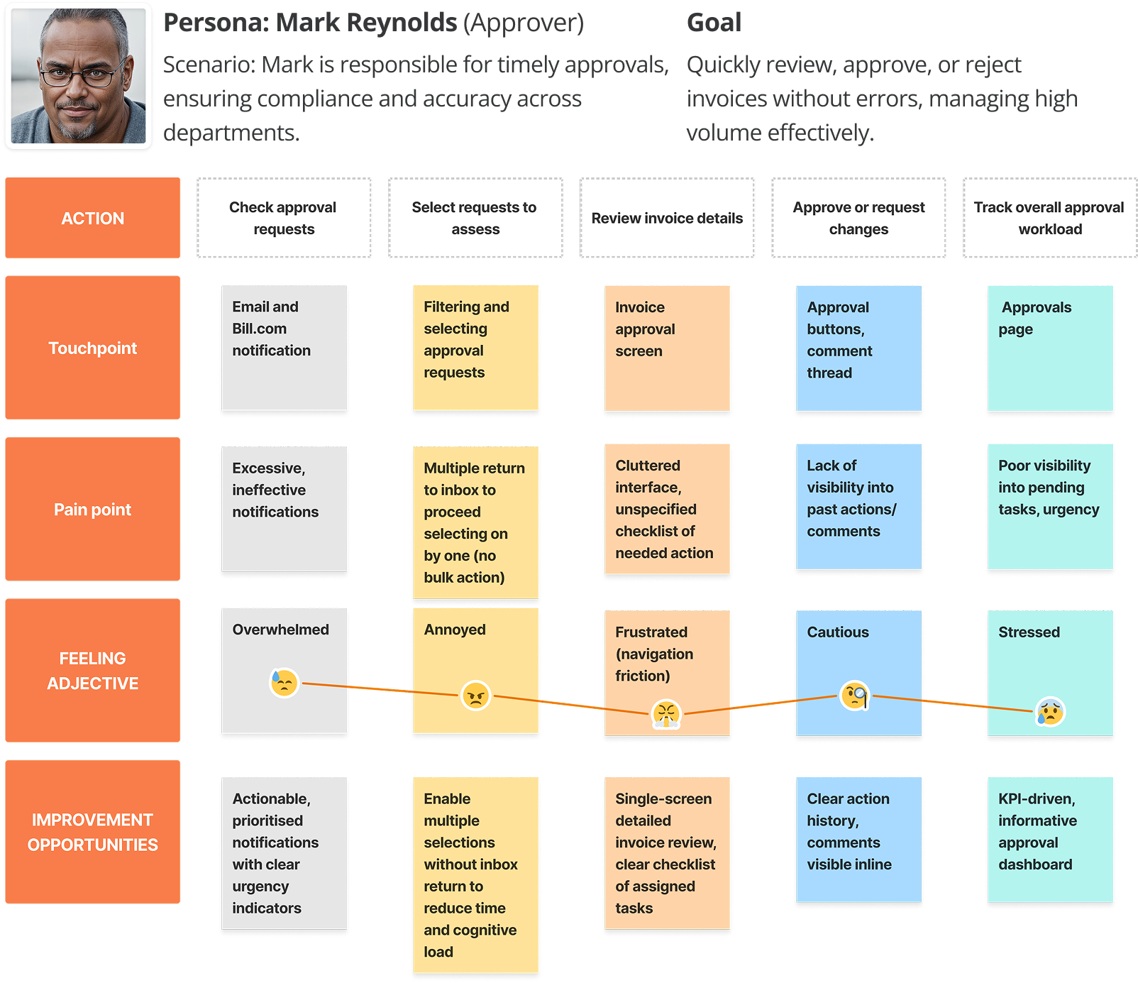
Mapping the User Journey
I created a user journeys of BILL’s approval users to highlight inefficiencies and areas for optimisation. The mapping process helped identify:
- Where approvals tend to get delayed?
- How notifications impact the workflow?
- When users need better visibility and control?
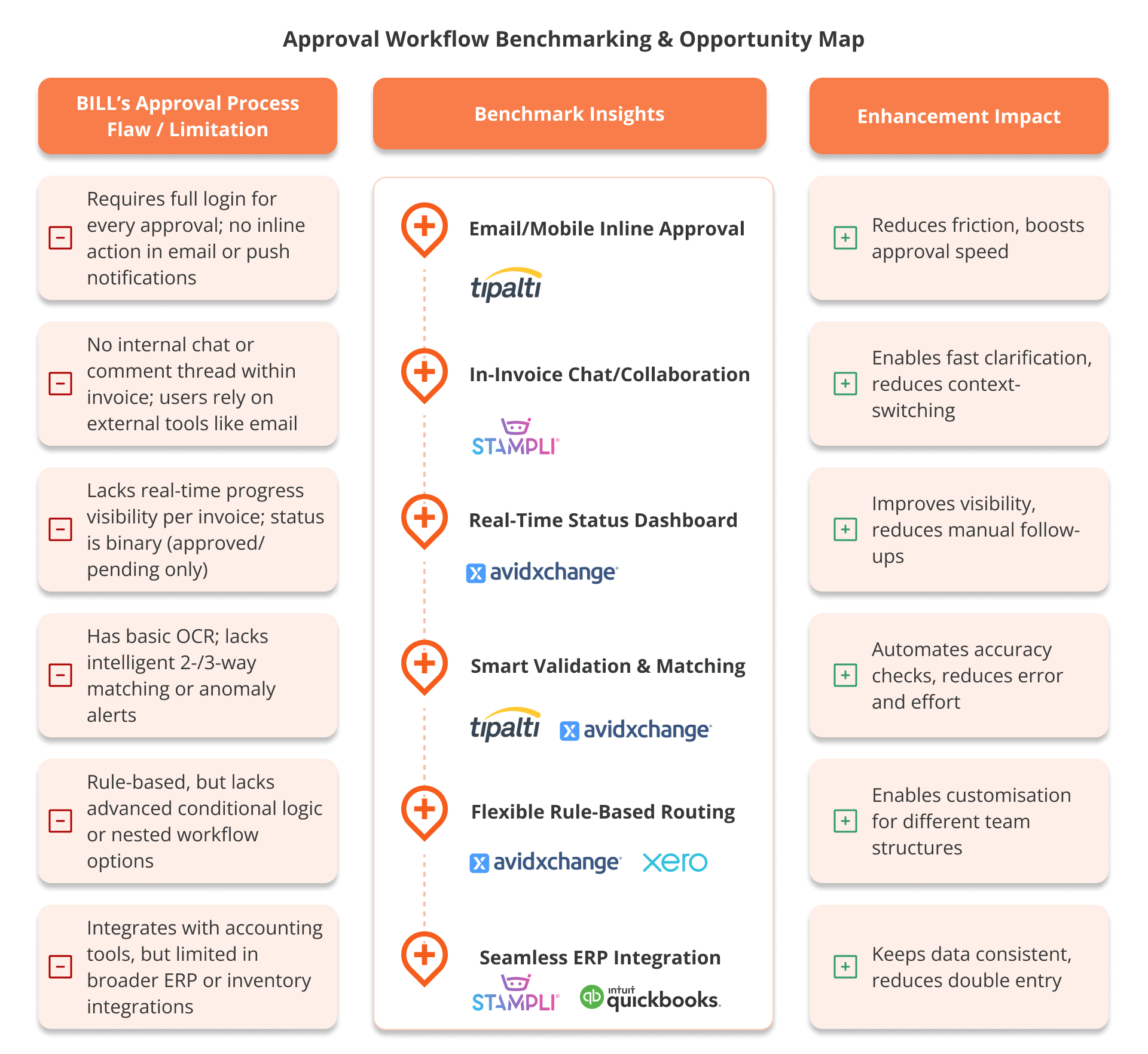
Competitors Analysis
To benchmark BILL’s approval workflow against industry standards, I analysed competing platforms to identify strengths and gaps.
Key Findings
- Competitor platforms offer more intuitive approval tracking with clearer progress indicators.
- Tipalti and Stampli provide email-based approvals, reducing login friction for occasional approvers.
- Competitors enable more flexible delegation and escalation, improving approval efficiency.
- Bill.com leads in accounting software integration but lags in UI/UX execution compared to modern fintech solutions.
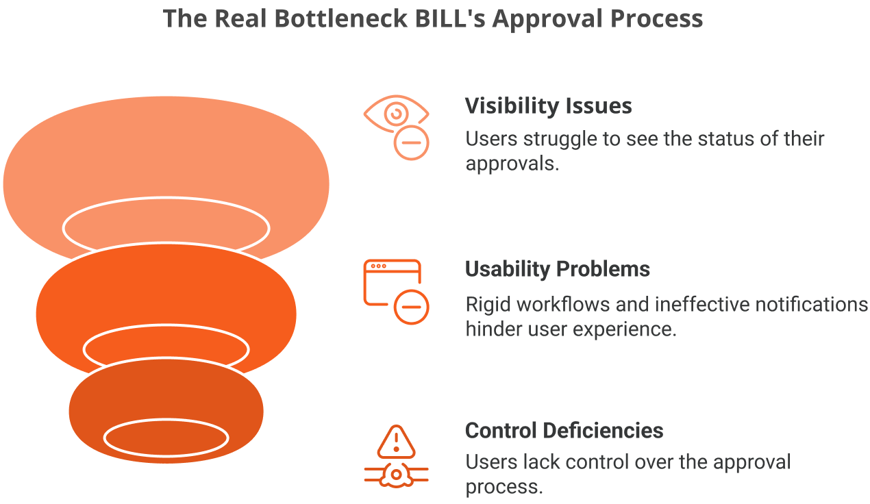
The Real Bottleneck: Visibility and Usability in BILL’s Approvals
As a result of my research, I discovered that the core problem in BILL’s approval process isn’t a lack of functionality, but a lack of usability, visibility, and control. While the system is feature-rich, users struggle with tracking approvals, navigating rigid workflows, and managing ineffective notifications. This insight shifted my focus from adding features to improving clarity, streamlining interactions, and designing a more intuitive, empowering user experience.

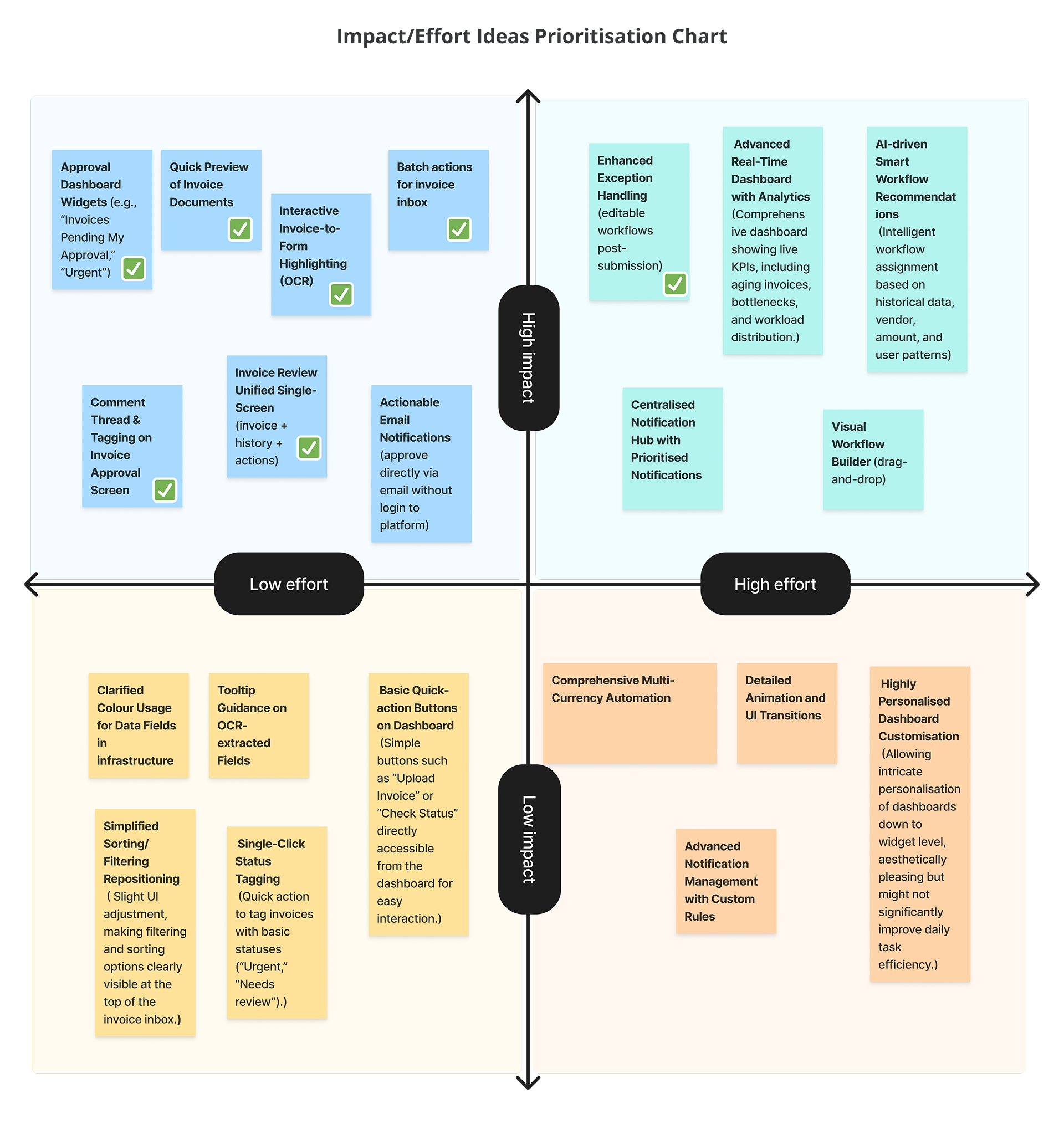
With a clear understanding of BILL’s approval workflow, user pain points, and industry benchmarks, I identified visibility and usability as the core issues impacting efficiency. I then began ideating solutions to simplify the approval process, enhance user control, and maintain the flexibility needed for varying organisational needs.
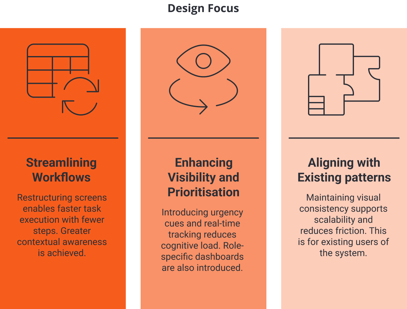
Exploring Design Solution
I began brainstorming ways to improve usability and address key friction points from research. A key insight emerged: the main barriers were not technical, but rooted in poor visibility and unintuitive design. This shifted my focus to creating a clearer, faster, and more manageable approval experience. Key considerations included:

- Reduce approval bottlenecks with clearer tracking and escalation paths.
- Improve notification relevance and prioritisation to reduce missed approvals.
- Enhance the approval dashboard for better visibility and control.
- Introduce a more intuitive workflow for handling exceptions and edits.
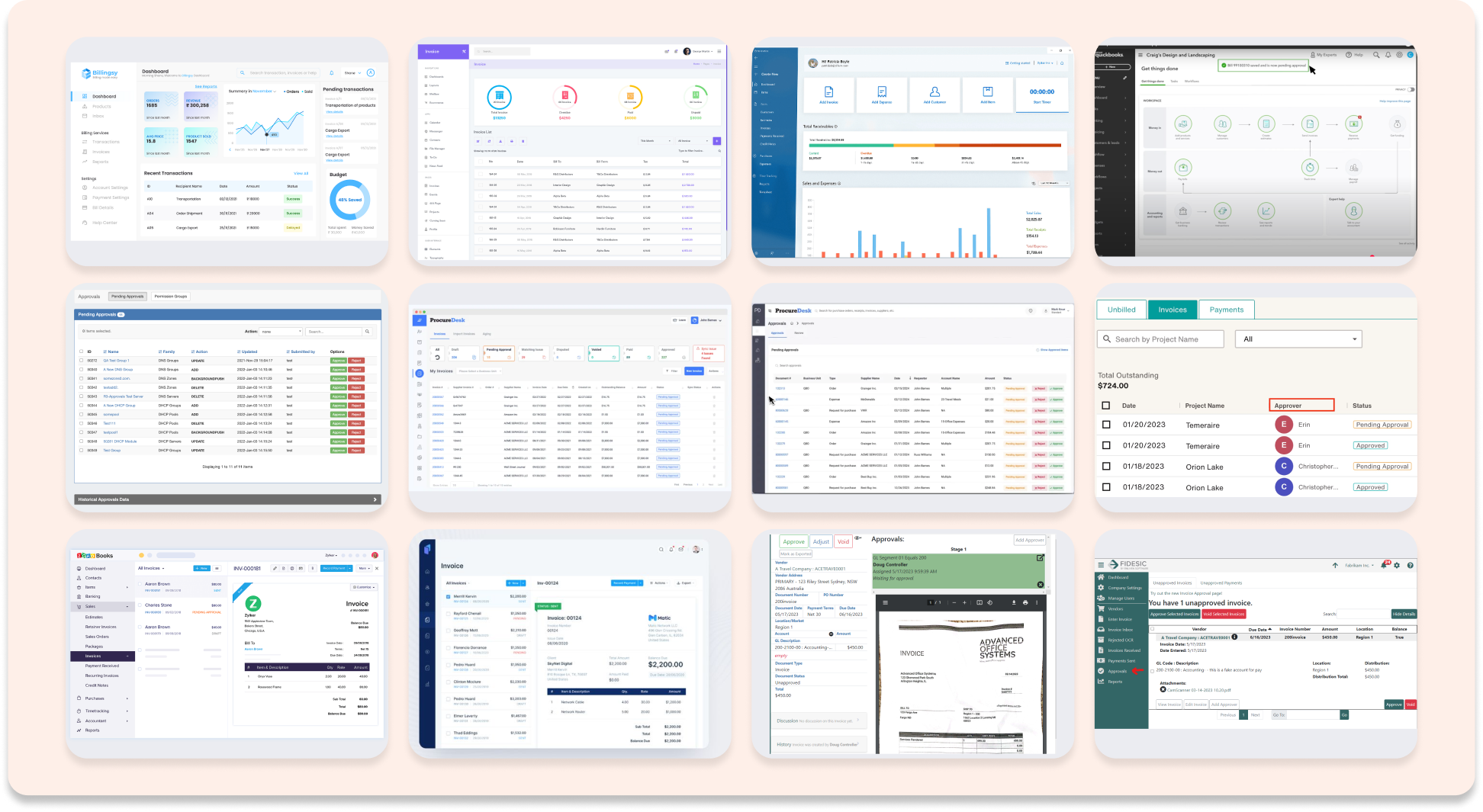
Inspiration
I reviewed and analysed approval flows from leading fintech platforms to gather inspiration and benchmark best practices. This helped me understand how others visualise status, manage tasks, and streamline approvals. I used these insights to inform my own design decisions, aiming to create a more intuitive, efficient, and user-friendly approval experience in line with industry standards.
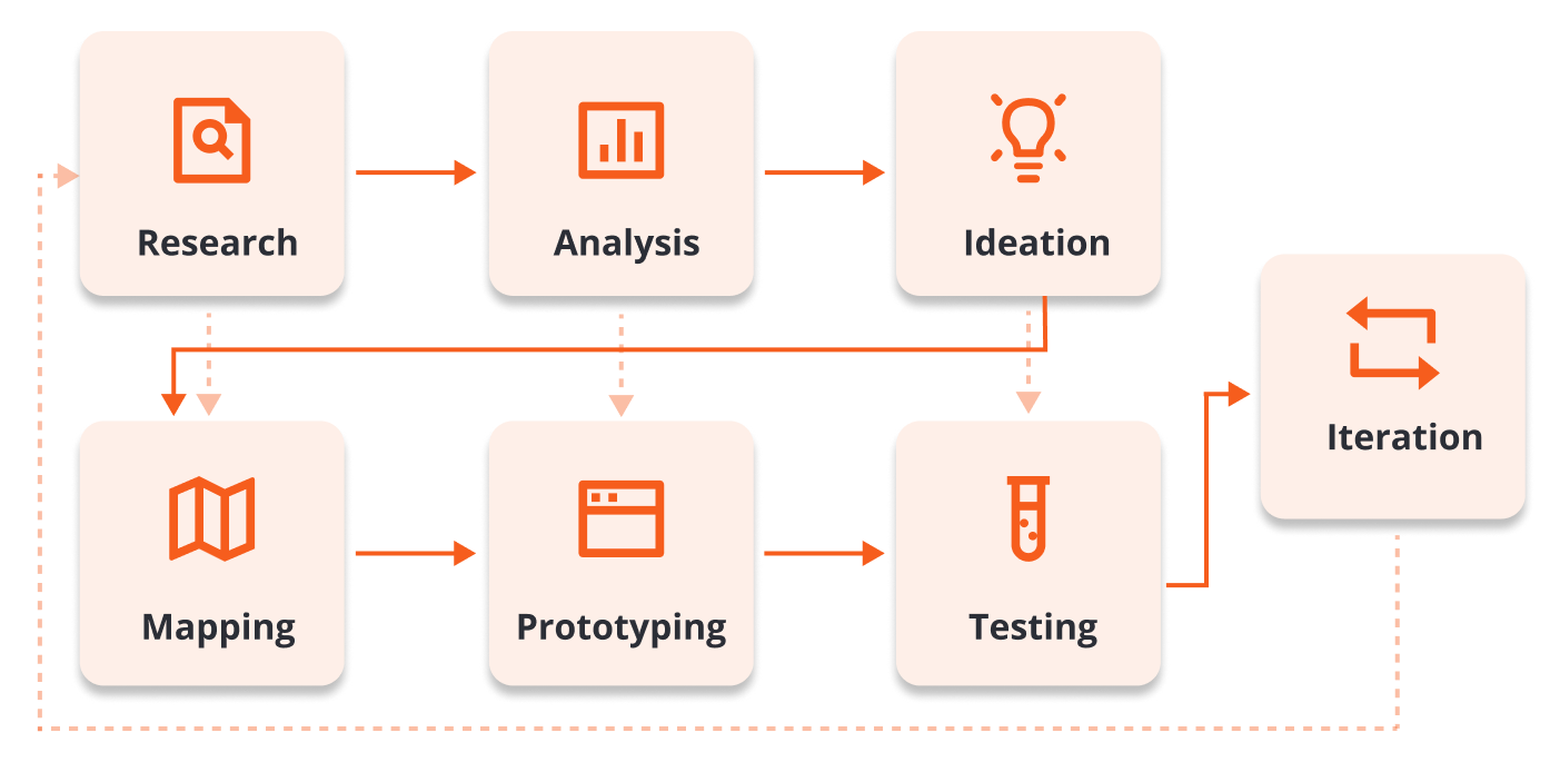
Refined Approval User Flows
To bring ideas to life, I began by mapping clear user flows to refine the experience across key approval stages. This helped define the structure and interaction logic before visual design.
The focus was on:
- Simplifying navigation: Reducing complexity in approval decision-making.
- Enhancing visibility: Structuring dashboards to support real-time tracking and clarity.
- Improving interactions: Streamlining invoice review, task actions, and handling exceptions.
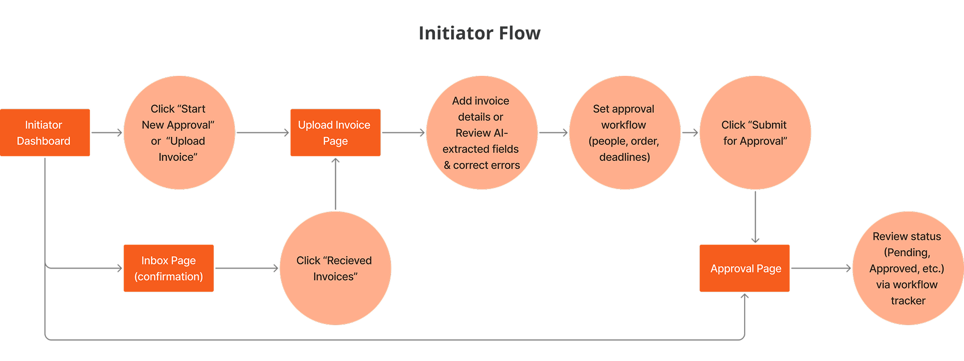
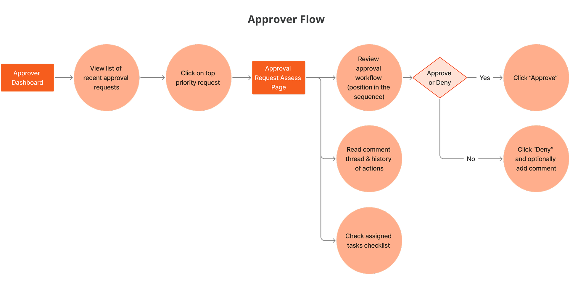
Through multiple iterations, I refined the user flows to ensure a seamless, intuitive approval journey. These structured flows laid the foundation for future UI enhancements, high-fidelity prototypes, and usability validation in the next phase.

Rapid prototyping enabled early validation of design decisions and brought conceptual ideas into a tangible, testable format. Leveraging agile delivery methods and prioritising user pain points, I refined the initiator and approver workflows to enhance visibility, usability, and task clarity across the BILL’s approvals management experience.
Bringing Designs to Life
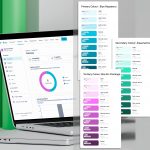
Building on initial task flows and Crazy 8 ideation sketches, I translated prioritised solutions into high-fidelity prototypes using the most current BILL design system. I replicated UI components based on screenshots and branding guidelines to ensure consistency with the existing product ecosystem.
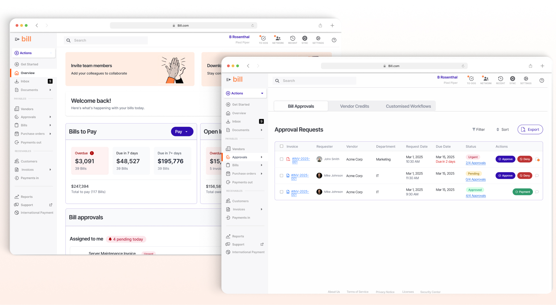
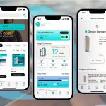
Designed Screens
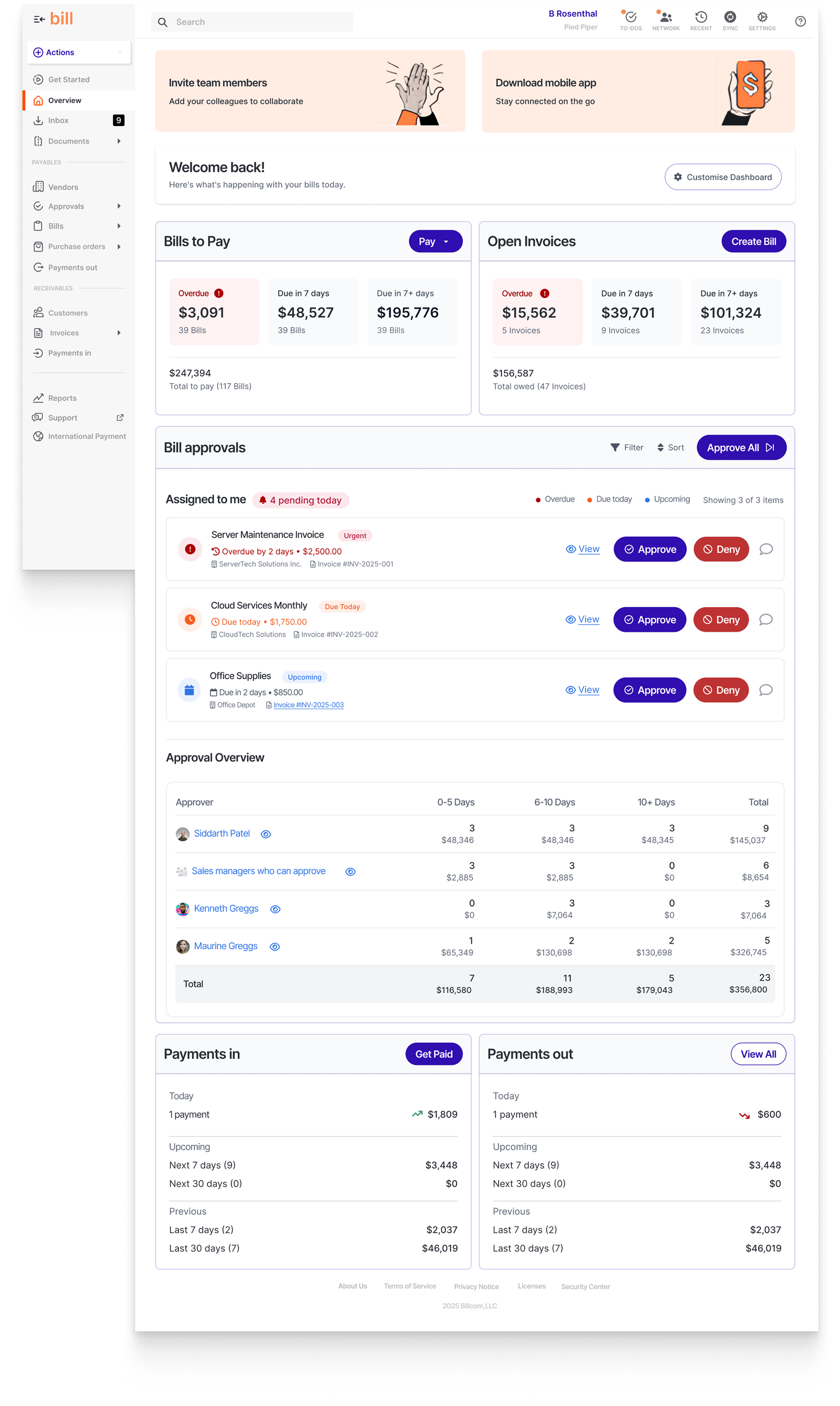
- Dashboard Page: A role-based command center with KPI tiles, pending approvals, urgent invoices, and timeline tracking for informed, real-time decision-making.
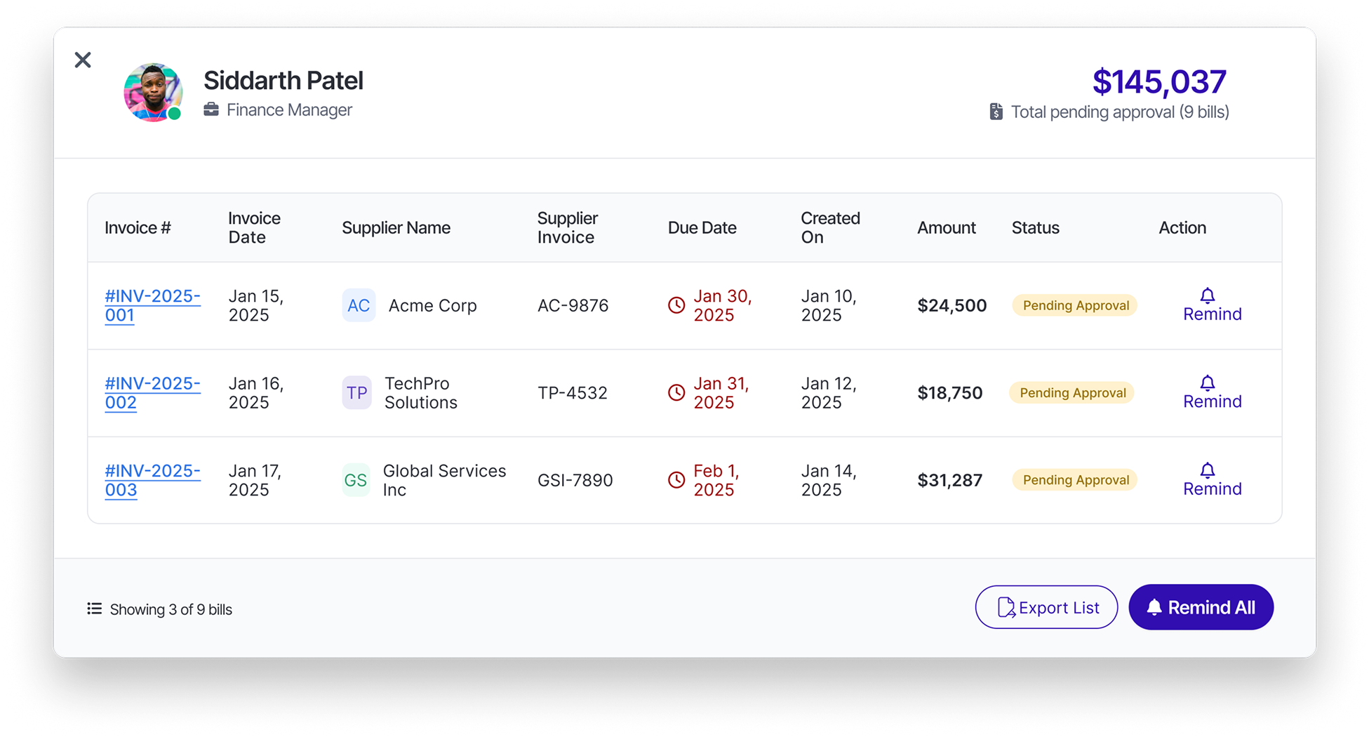
- Approver Breakdown Overlay: A contextual overlay surfacing the full approval chain, including individual statuses and reminder actions, empowering users to nudge blockers and track flow progress.
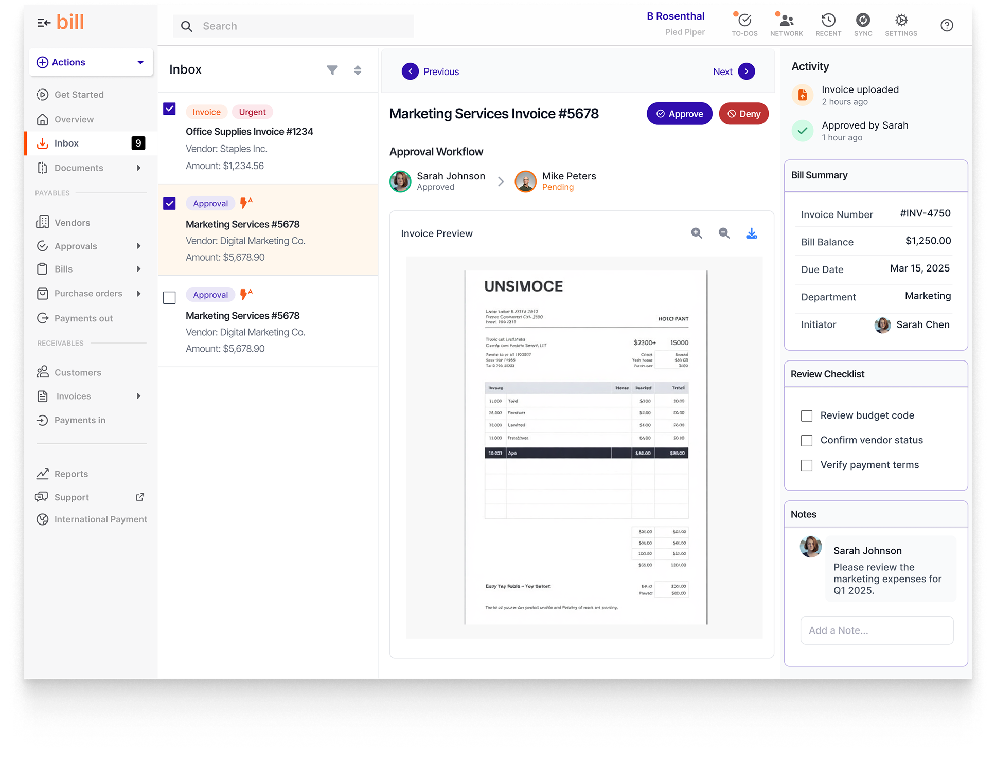
- Inbox Page: A dual-pane workspace unifying task management and invoice preview, enabling quick sorting, instant context, and seamless one-click approvals within a clean, focused layout.
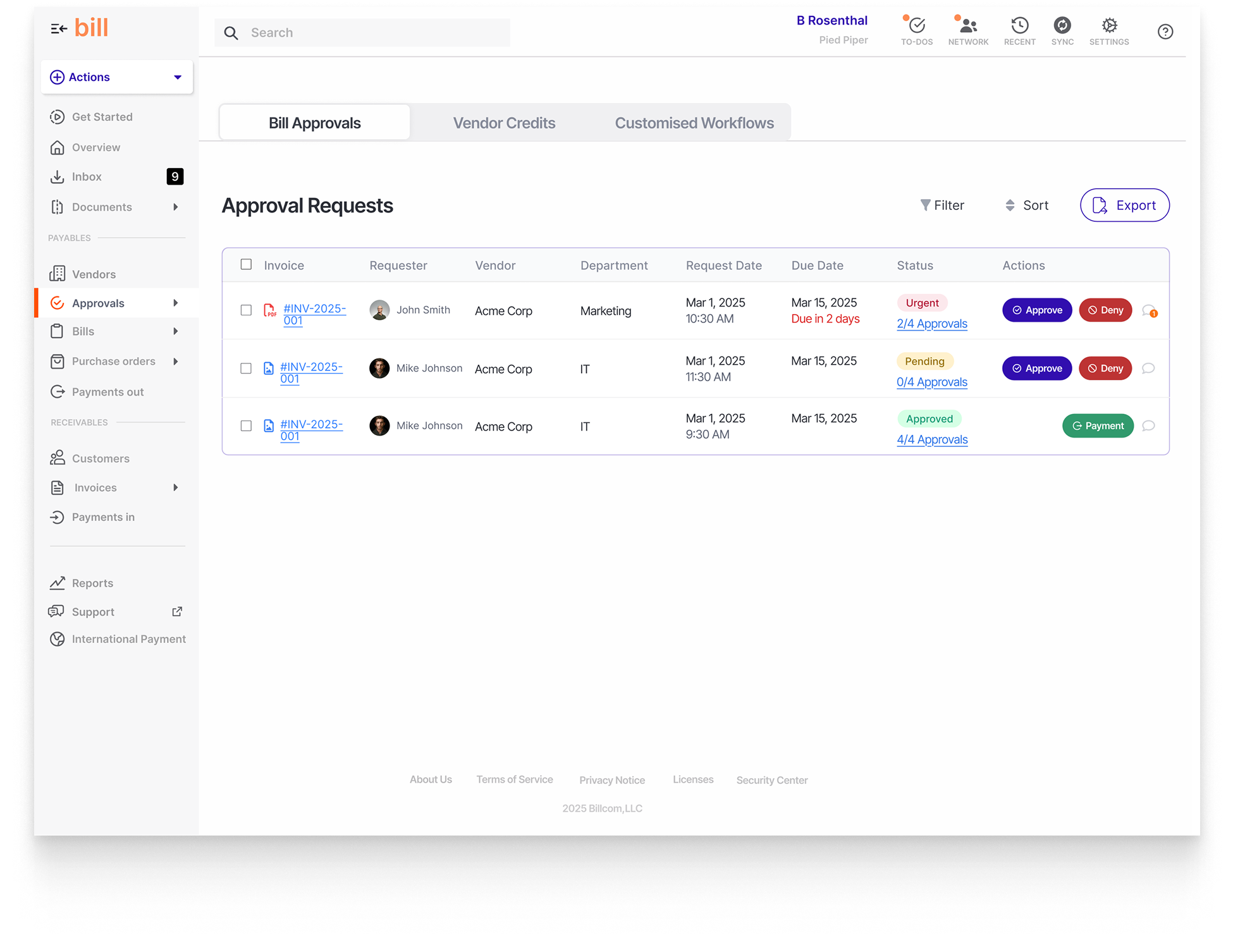
- Approvals Page: A structured, filterable approval hub that organises requests by status, priority, and user responsibility—designed for quick triage and batch decision-making.
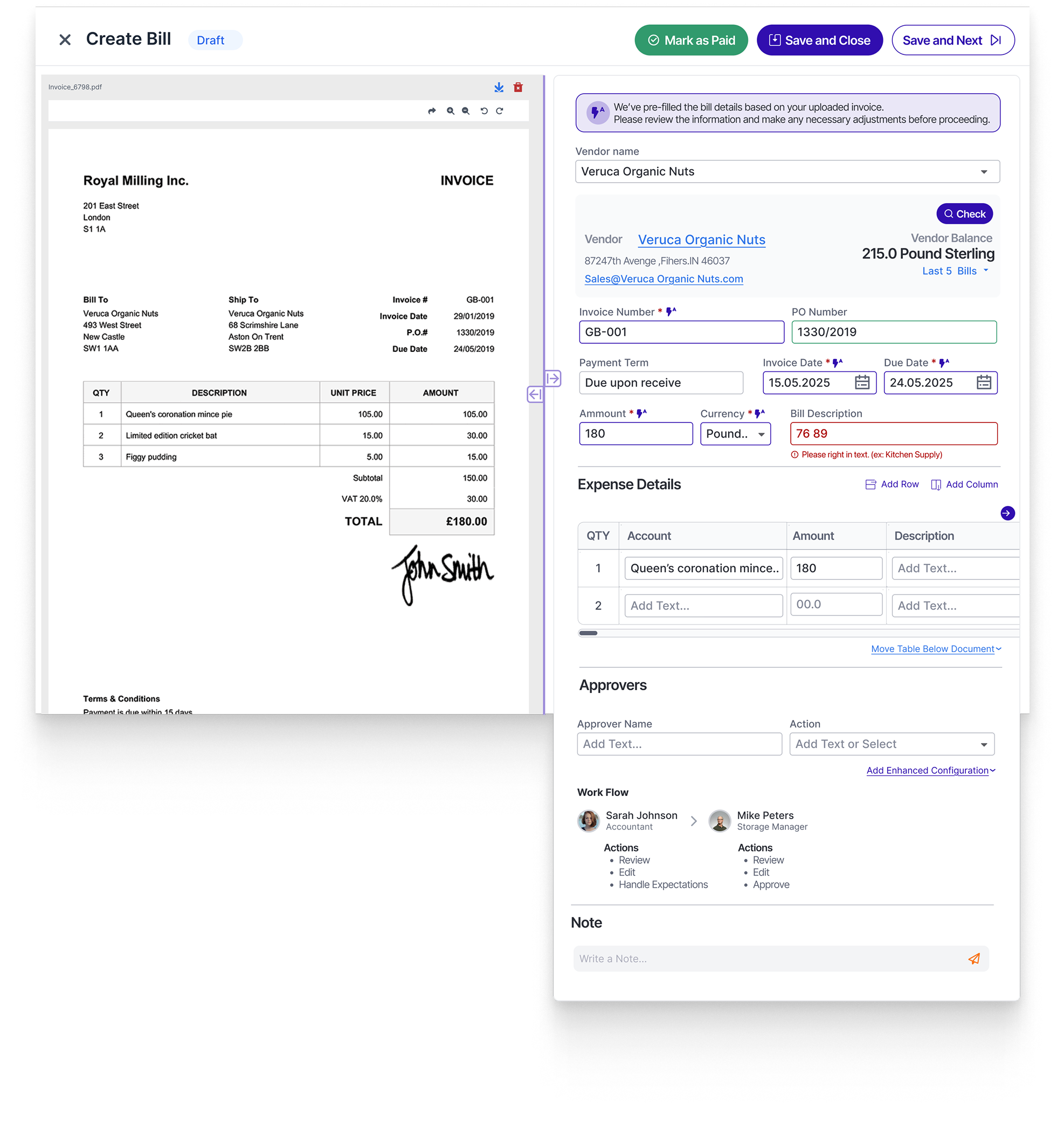
- Create Bill Layout: A guided, pre-populated form experience that reduces manual entry, surfaces validation in real-time, and lets initiators assign approvers contextually—designed for speed and accuracy.
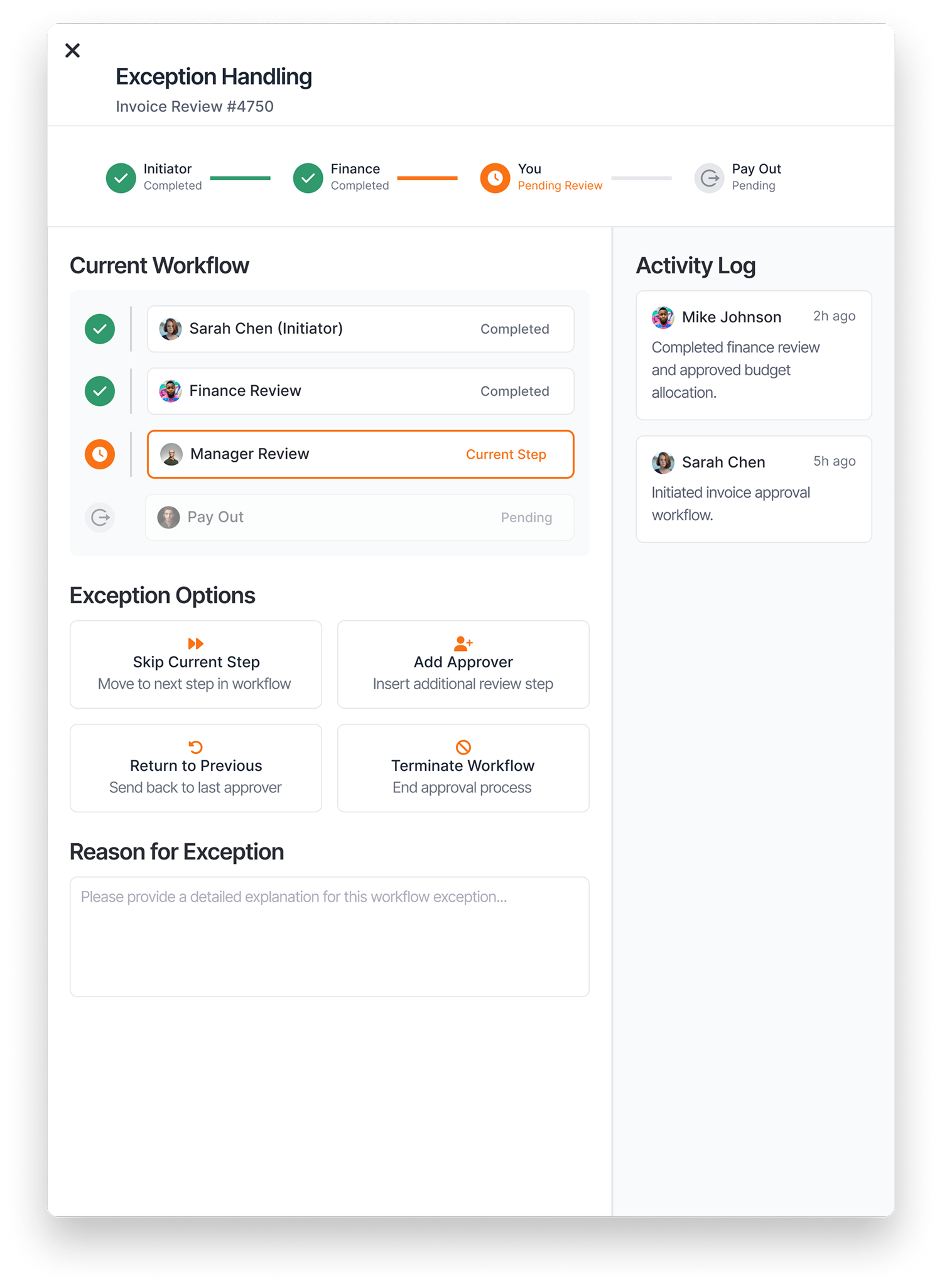
- Exception Handling Overlay: A decision-support layer offering nuanced control over workflow deviations like skipping steps, rerouting, or pausing approvals—ensuring compliance while enabling flexibility.
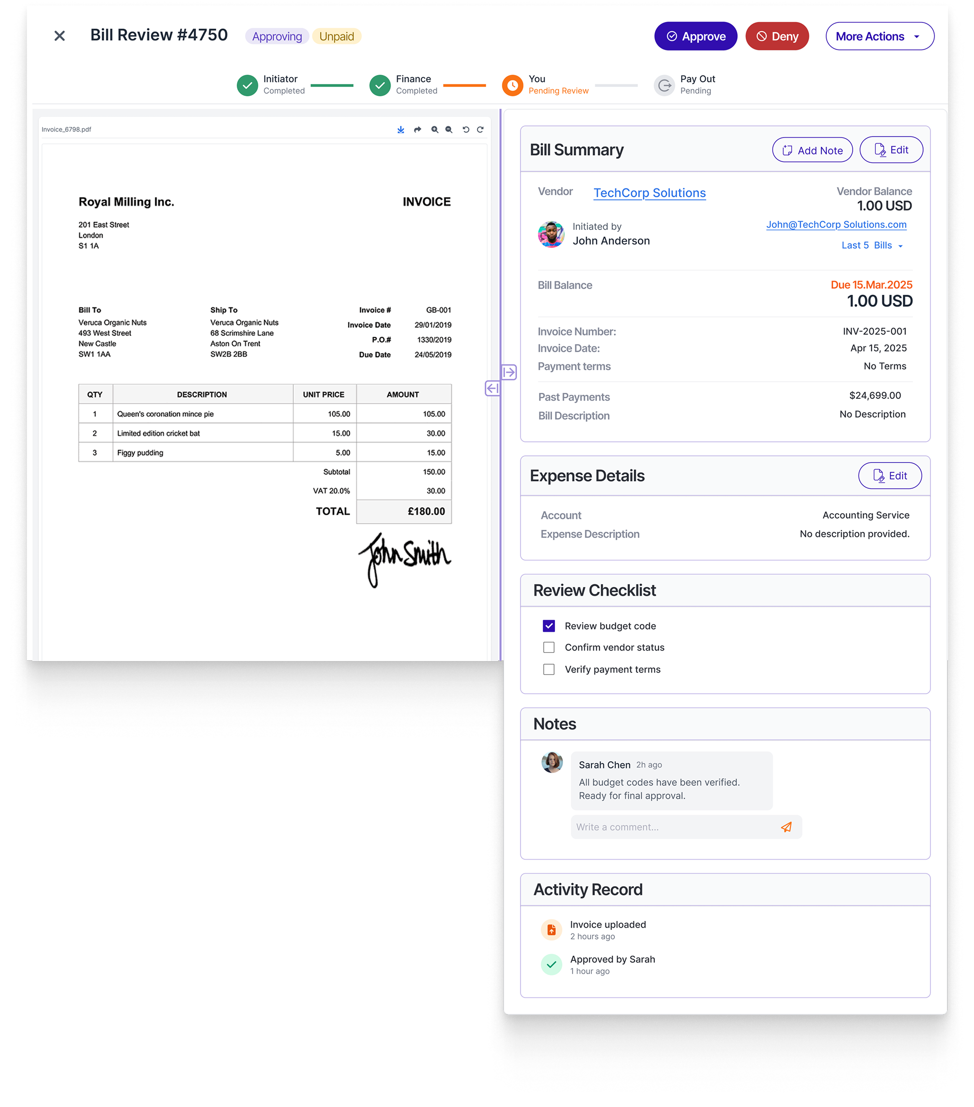
- Review Bill Layout (for Approving): A purpose-built interface combining approval actions, audit history, reviewer checklists, and note-taking—all in one screen—crafted for confident, traceable decision-making.
By grounding the design in real user pain points and leveraging system-consistent visuals, the result is an intuitive, scalable experience aligned with the needs and expectations of modern fintech users.

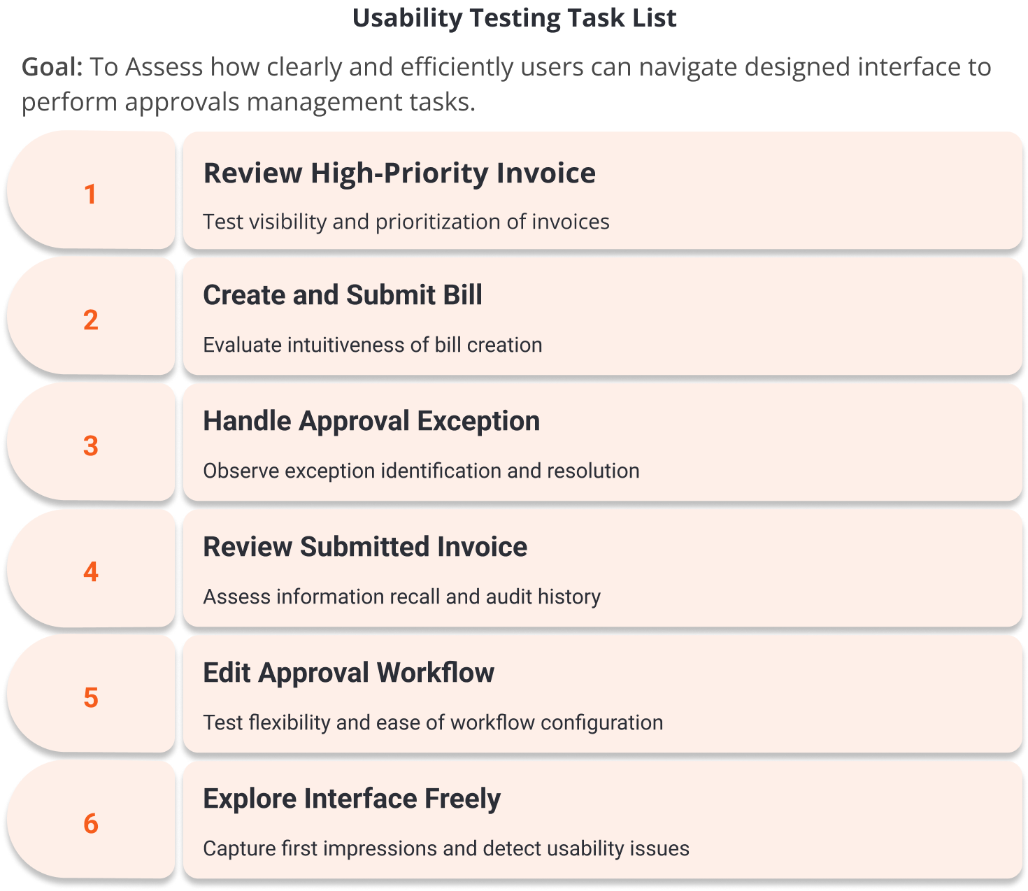
To validate the redesigned approval experience for BILL, I conducted structured, screen-based usability tests using Maze.
The goal was to measure task completion, identify interaction frictions, and collect qualitative feedback from users with fintech and invoice processing backgrounds.
Each task simulated key approval flows for both initiators and approvers, including edge cases like exception handling.
Test Setup
The interactive prototype was uploaded to Maze, simulating realistic scenarios across both initiator and approver roles. Participants were asked to complete key tasks such as reviewing and approving an invoice, routing it through a workflow, and handling exceptions—mirroring the core interactions in BILL.
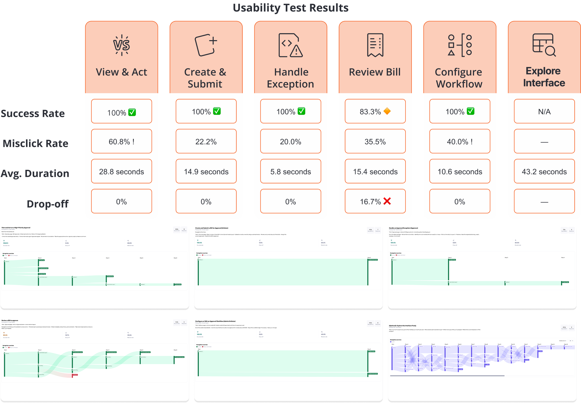
Usability Test Results
Across all six test scenarios, the prototype achieved a 100% task success rate in five flows, including:
- View and Act on a High-Priority Approval: 100% success, though misclick rate was high at 60.8%
- Create and Submit a Bill (Initiator): 100% success, with a 22.2% misclick rate
- Handle Approval Exception (Approver): 100% success, low 20% misclick
- Configure or Edit an Approval Workflow: 100% success, 40% misclick rate, indicating mild confusion
- Review a Bill to Approve: 83.3% success rate, with 16.7% drop-off and 35.5% misclick rate
Users were quick to complete tasks (avg. durations between 5–29s), suggesting high efficiency. However, the high misclick rates, especially in the Approval and Workflow Builder screens, indicate usability friction during navigation or decision-making moments.
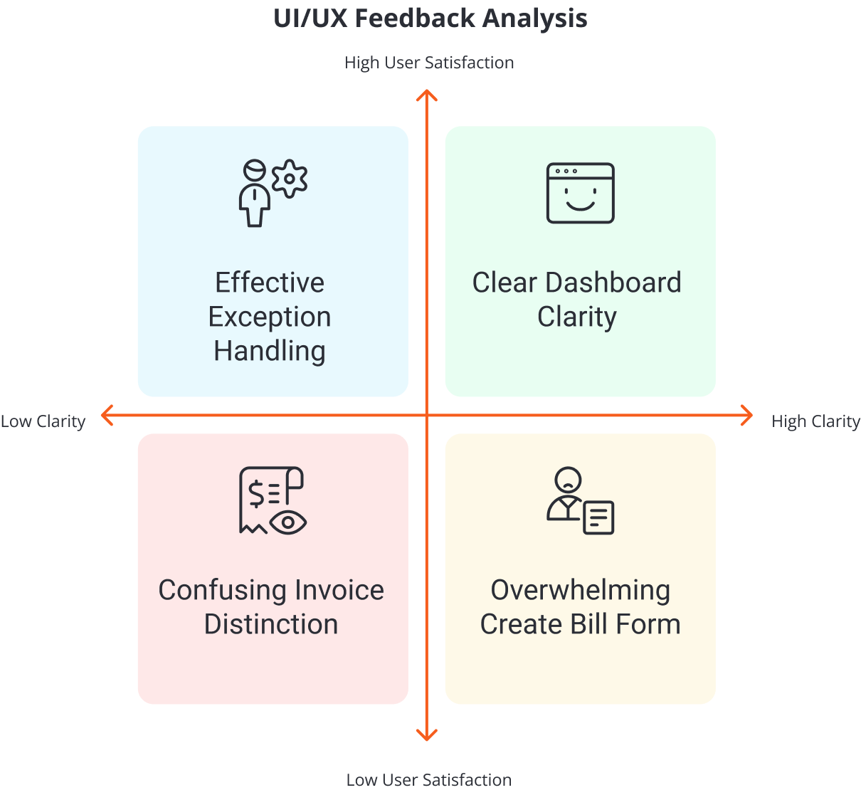
UI/UX Feedback Highlights
Users found the redesigned experience clear, personalised, and visually well-structured—but highlighted areas where added guidance and better filtering could enhance efficiency and confidence. Critical user feedback in each screen includes
Dashboard & Overview
- “Assigned to Me” and urgency color cues worked well
- Users wanted filters and clearer bulk action feedback
Inbox & Approval Screens
- Split layout and history view praised
- Hard to scan invoice types—filters suggested
Exception Handling & Workflow Configuration
- Flows felt structured despite complexity
- Users asked for tooltips and logic previews
Create Bill Form
- Trusted layout with document preview
- UI felt dense—needed collapsible sections and sticky footer
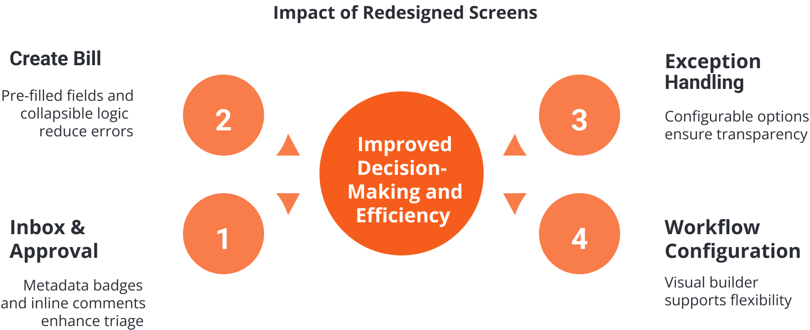
Design Comparison: Old vs. New
The redesigned experience introduced clarity, personalisation, and control across key workflows—resolving pain points from the original UI such as flat layouts, hidden status indicators, and lack of actionability. Below is the key improvements of new design in comparison with the old design across core screens and UX aspects:
Usability testing confirmed the redesign’s strengths in clarity, hierarchy, and ease of use, with high task success rates. However, misclicks in advanced flows revealed a need for better guidance. These insights will shape the next iteration—enhancing discoverability, bulk controls, and user confidence.

Following usability testing, several areas emerged as opportunities for improvement—especially the workflow configuration, where users felt unsure about routing logic. Feedback also pointed to the need for clearer batch action behaviour, better filtering options, and reduced cognitive load in dense screens like the Create Bill form. These insights will guide future iterations to enhance clarity, confidence, and efficiency across the experience.
Project Conclusion
This case study began with an ambitious goal: to rethink and improve BILL’s invoice approval experience by enhancing visibility, flexibility, and user efficiency. Through in-depth research, workflow mapping, high-fidelity prototyping, and iterative testing, I crafted a scalable solution that supports both initiators and approvers with greater clarity, confidence, and control.
From a learning perspective, this project was incredibly valuable in deepening my understanding of complex enterprise workflows, stakeholder needs, and the nuances of designing for trust and efficiency at scale. It sharpened my ability to turn user feedback into actionable insights and reinforced the importance of balancing usability with business logic in high-stakes financial systems.
Next Steps
With the foundation of the approval experience redesigned, the next phase will focus on expanding and enhancing related workflows across the BILL’s ecosystem—specifically in:
- Invoice Management – Simplifying intake, validation, and GL coding for faster processing.
- Payout Experiences – Improving visibility and control over scheduled payments, batching, and exceptions.
- Advanced Approval Scenarios – Supporting more complex conditional routing, delegation, and cross-team collaboration.
This evolution continues to prioritise real business needs, aiming to make financial operations faster, smarter, and more human-centered.
Other Works
- IQOS Companion App
 IQOS Companion App: A UX/UI Design Story Exploring How Data Can Drive… Read more: IQOS Companion App
 - Jira Case Study
 Exploring a Concept: Updating Jira’s Color Palette to Enrich the User Experience… Read more: Jira Case Study
 - SplitWise Case Study
 Splitwise Less stress when sharing expenses with anyone Optimising Splitwise:Better Usability & Higher… Read more: SplitWise Case Study