
IQOS Companion App:
A UX/UI Design Story Exploring How Data Can Drive Motivation and Behaviour Change
Project snapshot
- Role: UX/UI Designer , UX Researcher
- Duration: 1 week
- Tools: Figma, Miro, Maze, Gemini
Overview
A supportive digital partner for motivational behaviour Change
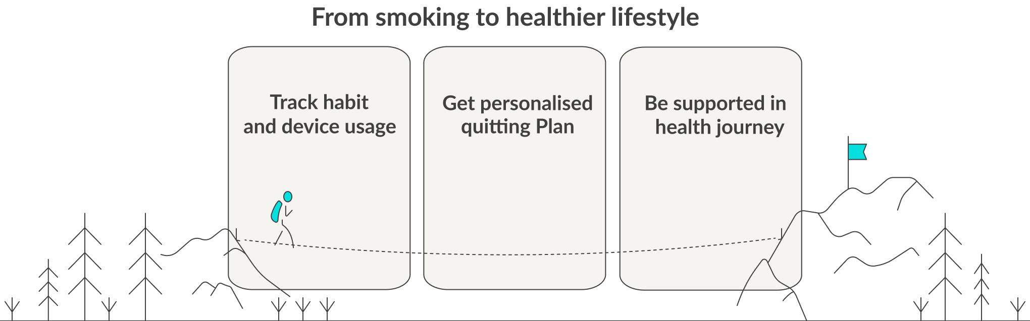
The IQOS Companion App is designed to transform raw usage data into meaningful motivation. By reframing reduction as progress, the app empowers adult smokers transitioning to IQOS with insights, encouragement, and emotional support, helping them stay on track toward a healthier lifestyle.
The Challenge
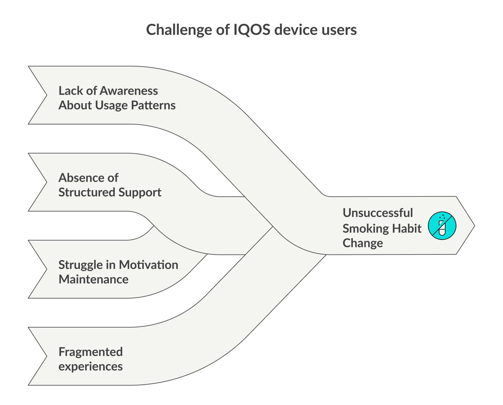
Adult smokers who switch to heated tobacco often struggle with:
- Lack of awareness about their usage patterns.
- No structured support for reducing or quitting cigarettes.
- Difficulty maintaining motivation without visible progress or community support.
- Fragmented experiences (device status, product purchases, behavioural goals all exist in separate places).
Without support, the transition journey often feels confusing and isolating.
The Solution
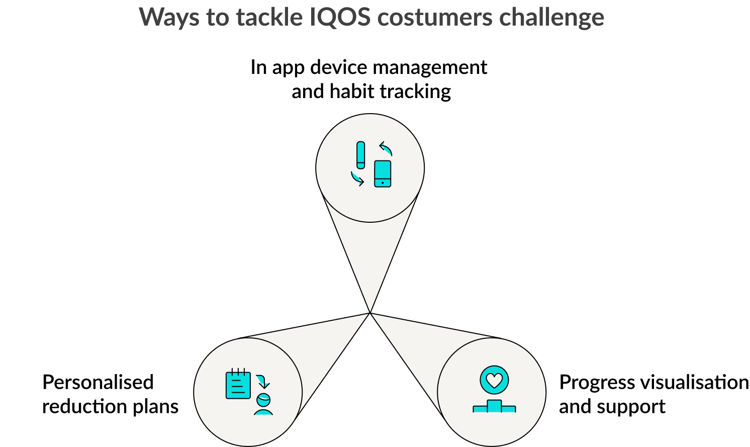
The IQOS Companion App serves as a central hub for IQOS users, supporting their transition from cigarette smoking toward a healthier journey of quitting. By connecting directly with IQOS devices, it:
- Make device management effortless.
- Turn usage data into motivation through clear, positive analytics.
- Offer personalised quitting plans that support realistic progress.
- Access community support to reduce isolation.
- Integrate in app shopping for convenience and easy access.
Design Goal
The goal is to create a digital companion that goes beyond technical functionality. The app empowers users to:
- Manage their devices seamlessly.
- Transform raw data into motivation.
- See their journey visualised.
- Stay connected with a supportive community.
- Access products and resources in one place.
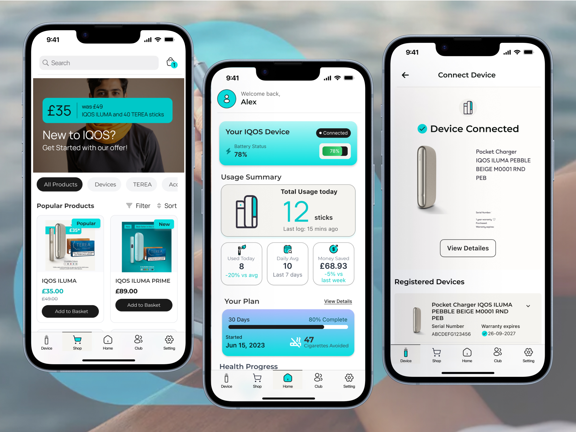
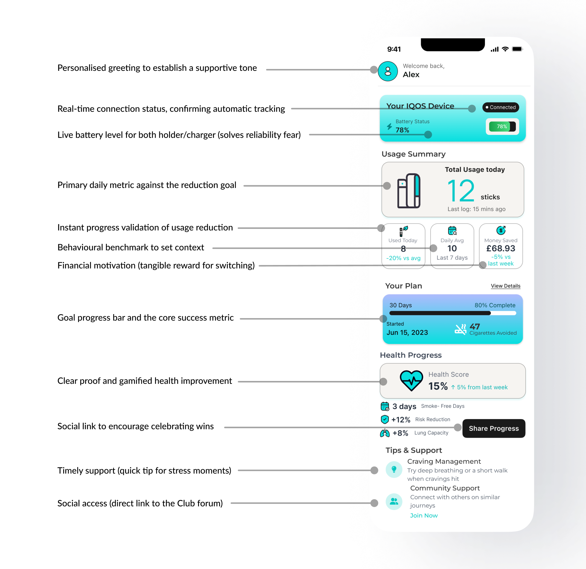
Daily Progress Hub
Manage device seamlessly. See usage and battery life, instantly turning data into motivation.
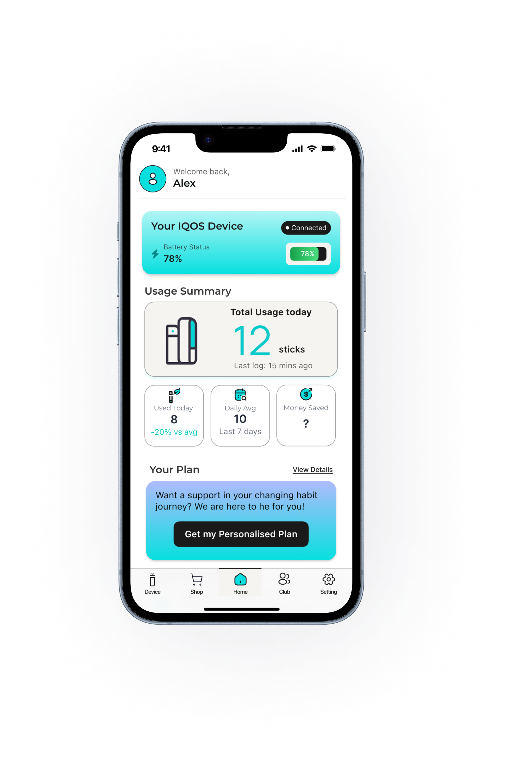
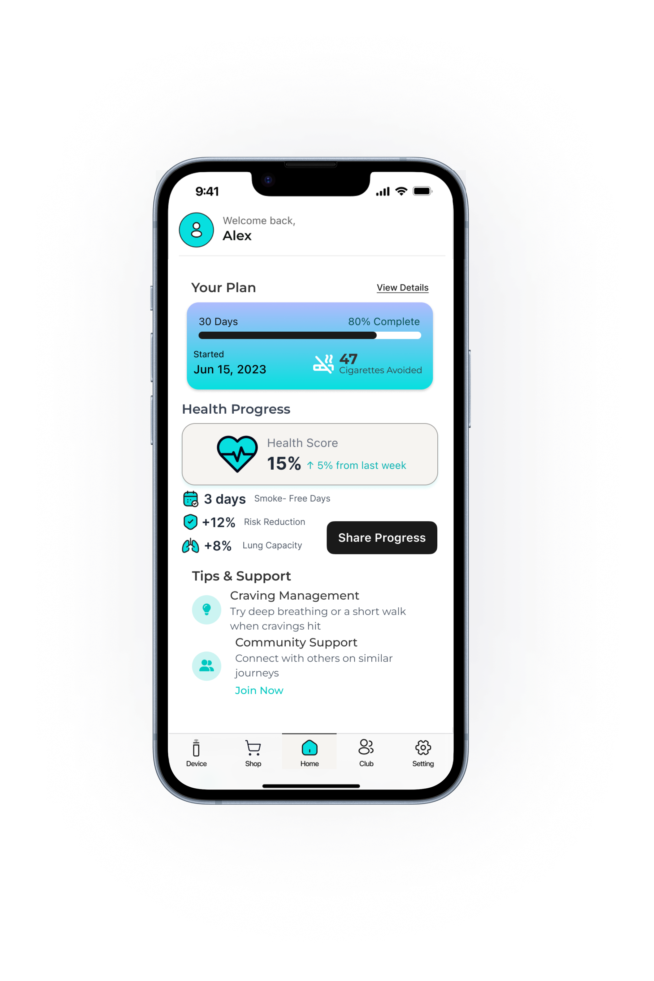
Visible Wins & Timely Support
Transform raw data into motivation by viewing money saved and health progress. Get tips and guidance to manage urges.
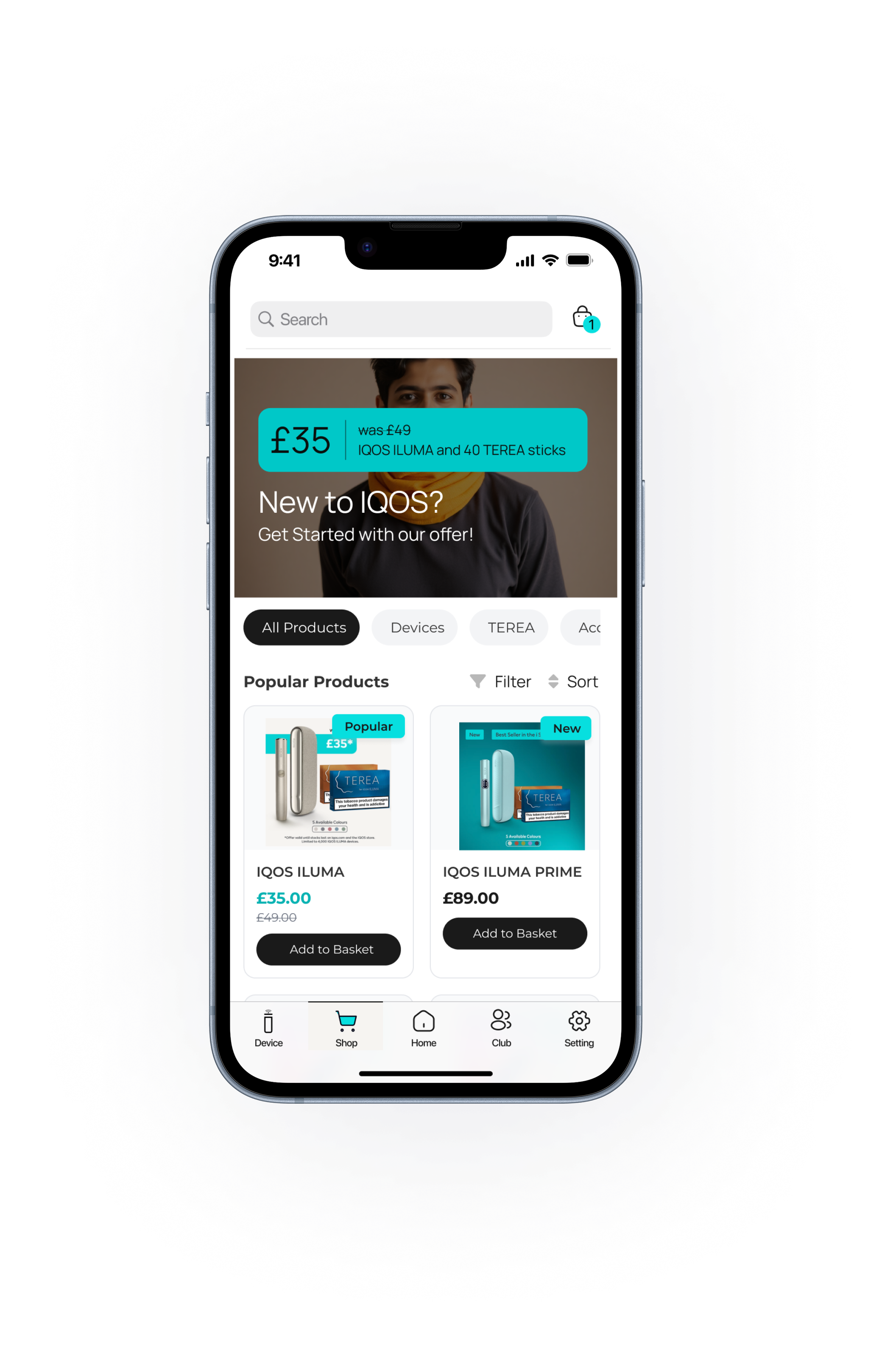
One-Stop Shop & Resources
Access products in one place. Shop for sticks and accessories instantly, keeping resources and purchasing convenient.
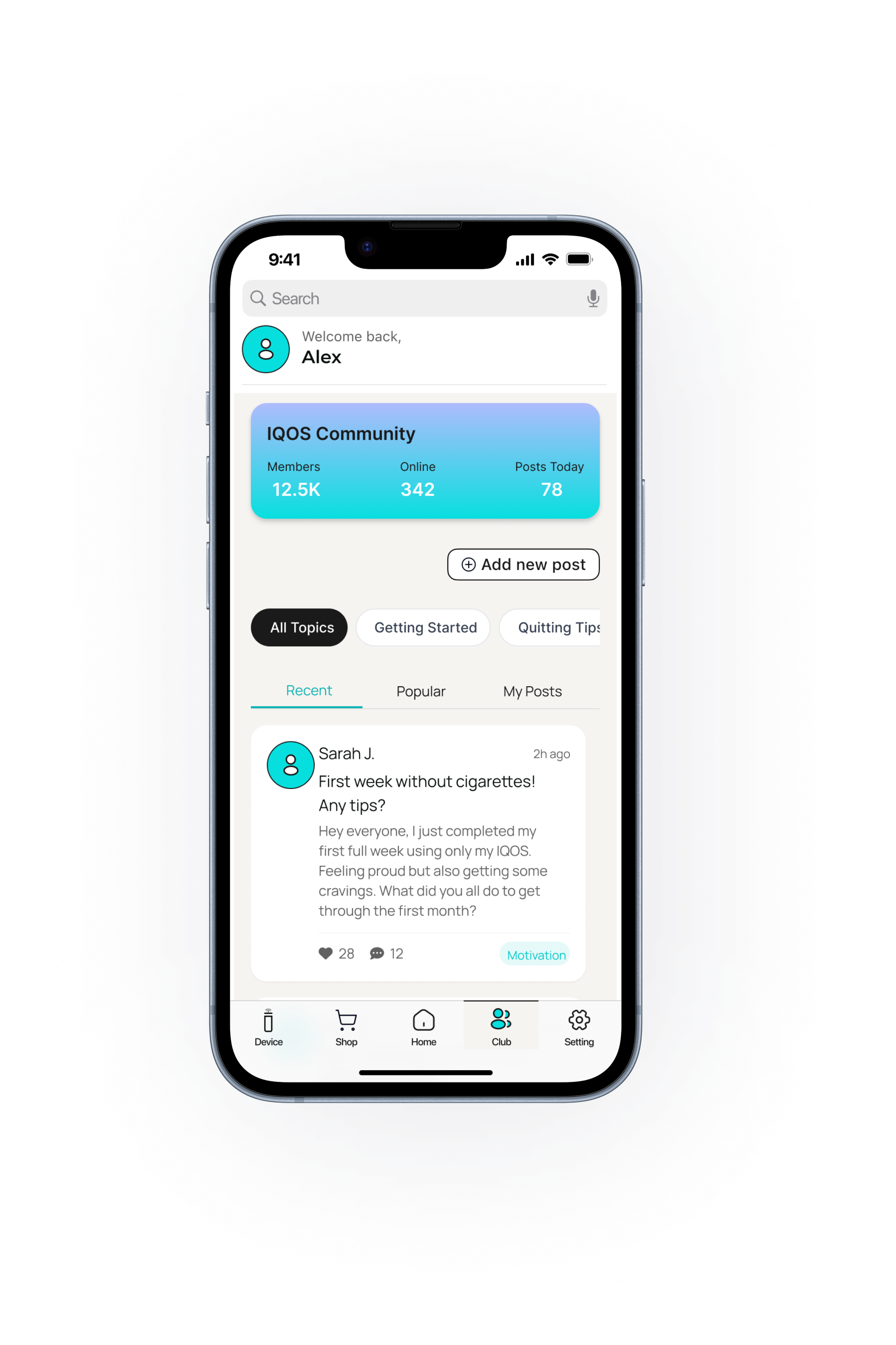
Connect & Celebrate
Stay connected with a supportive community. Share success, get encouragement, and see journey visualised collectively.
The IQOS Companion App is not a cessation tool in itself, but it becomes a bridge between the device and the behaviour change journey; a partner that helps adult smokers track, reflect, and move toward healthier habits.
Research
Discovery
To design an effective companion app, it was important to first understand the context of IQOS users and the behavioural challenges they face.
Unlike traditional smoking cessation apps, this solution needed to address the unique transition from cigarettes to a heated tobacco system, where the goals are often reduction, replacement, or gradual quitting.
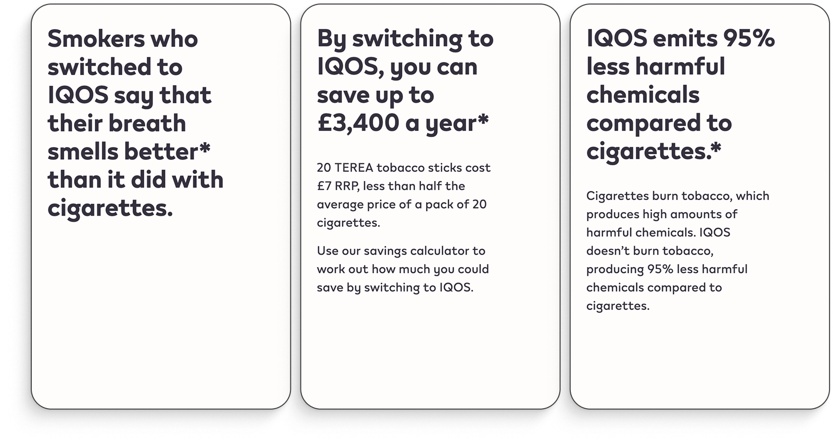
Source : https://www.iqos.com/gb/en/iqos-heated-tobacco-benefits.html
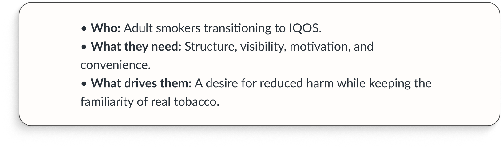
Target Audience
IQOS Users don’t just need data; they need meaningful motivation. Data had to be transformed into clear progress visuals, goals, and milestones that feel achievable.
Taking a Deep Dive
To capture the complexity of this journey, I explored three main areas:
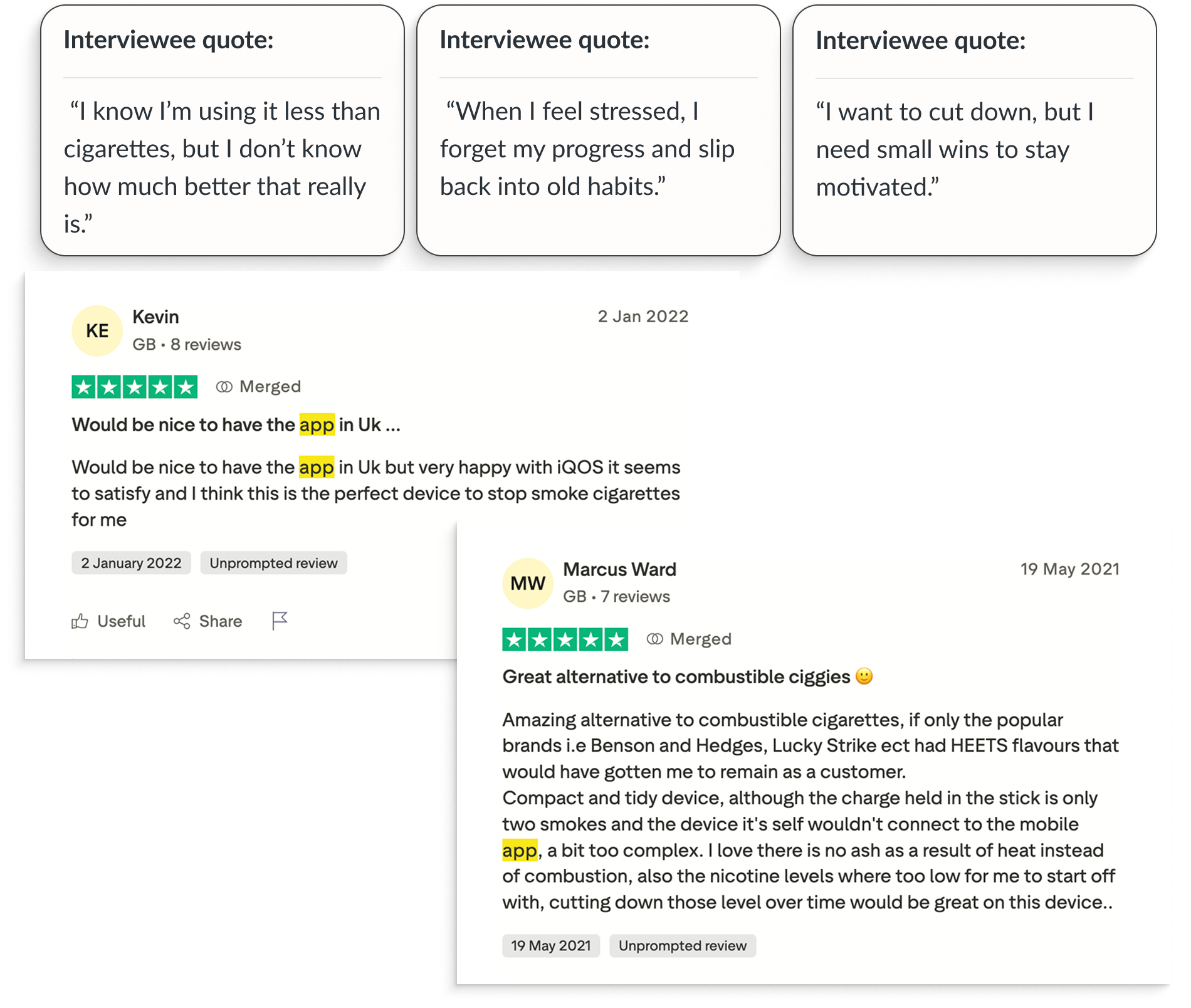
- User Perspectives
Interviews and quotes from adult IQOS users revealed common struggles:
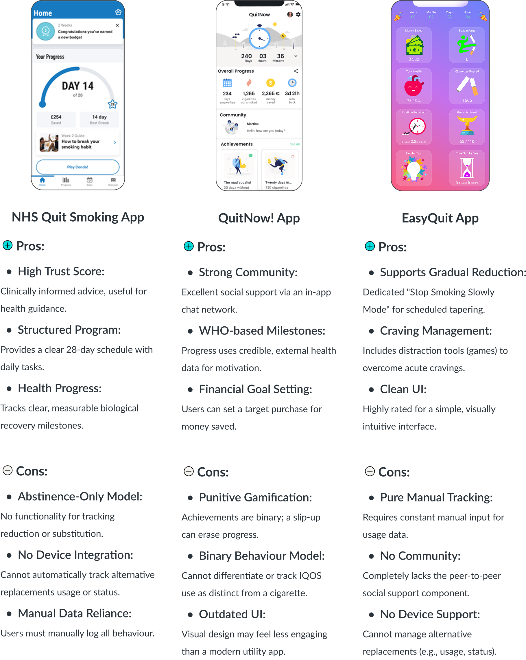
- Competitive Landscape
A review of existing smoking cessation apps (such as NHS Quitting app, QuitNow, and others) showed that most focus on complete abstinence, milestones, or cost savings. While effective for some, these models don’t fully align with IQOS users, who are often reducing rather than quitting outright.
This insight highlighted the need for a solution tailored to incremental progress and motivation, rather than “all-or-nothing” success.
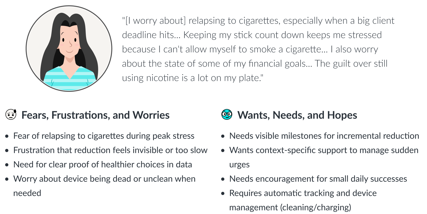
- User Persona: Sara, 34, Marketing Professional
Sara switched to IQOS six months ago to manage high work stress. She fears relapsing to cigarettes and is frustrated that her reduction efforts feel invisible. She needs automated tracking and non-judgmental motivation to confirm she’s making real, tangible progress toward a healthier habit.
The Insight
From this research, a deeper insight emerged:
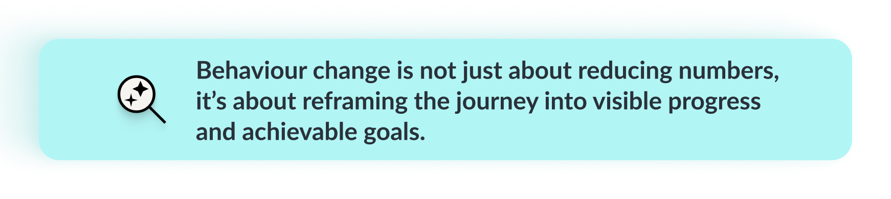
IQOS users don’t simply need a tracker; they need a digital companion that empathises with their struggles, celebrates small wins, and keeps motivation alive when habits and emotions collide.

Product
Opportunities
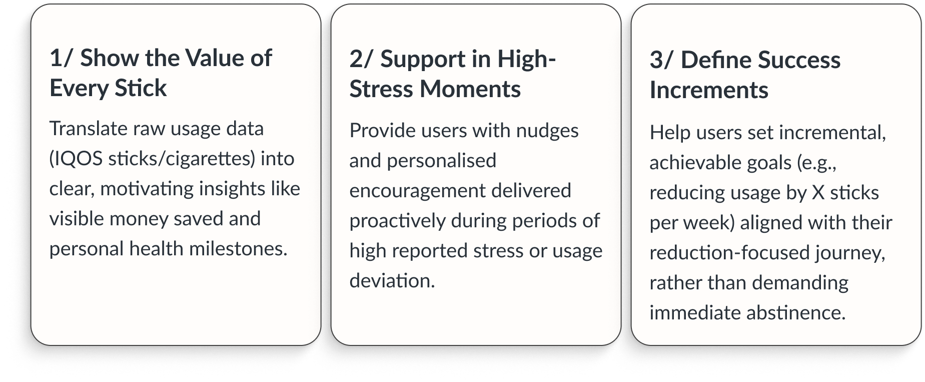
Based on insights, the companion app should shift from being a passive tracker to an active motivator. The opportunity lay in designing a platform that:
Possible Features
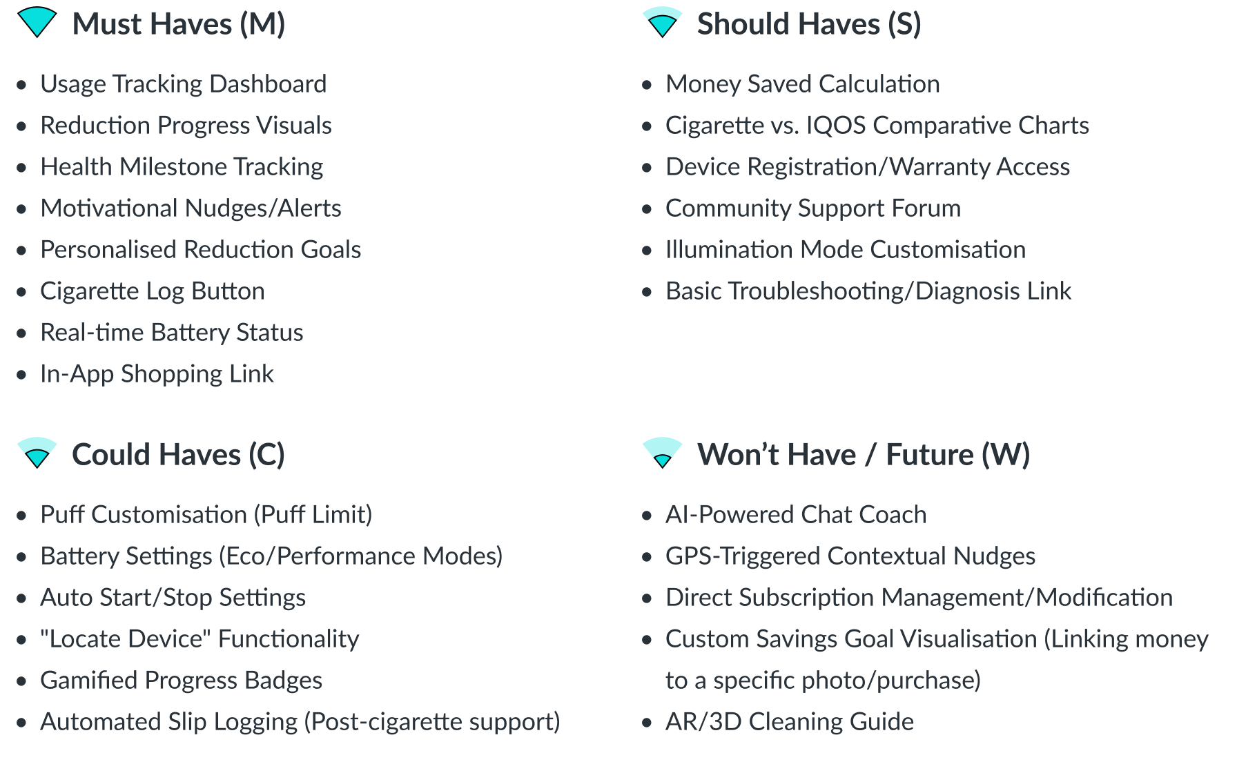
Based on the 3 core experiences – Device Management, Behavioural Insight, and Motivational Support – I compiled a list of features that will help bring it alive. I sorted them into a tier list to determine their importance for the MVP.
It’s important to note that a previous, similar IQOS app existed (often regional) but was often unsuccessful in its target locations because it was not functional in some major markets (like the UK) and lacked a cohesive, motivational design, serving only as a technical tool.
My goal is to revive the best technical features while embedding them in a truly supportive, user-centric journey.
Information Architecture
The app was structured around four key pillars:
- Track – Monitor consumption and progress.
- Motivate – Celebrate milestones and encourage consistency.
- Guide – Provide actionable tips and personalised insights.
- Support – Offer emotional reinforcement during challenges.
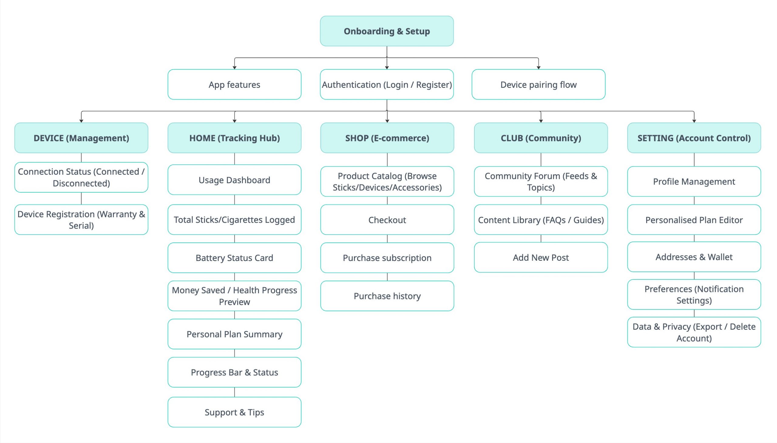
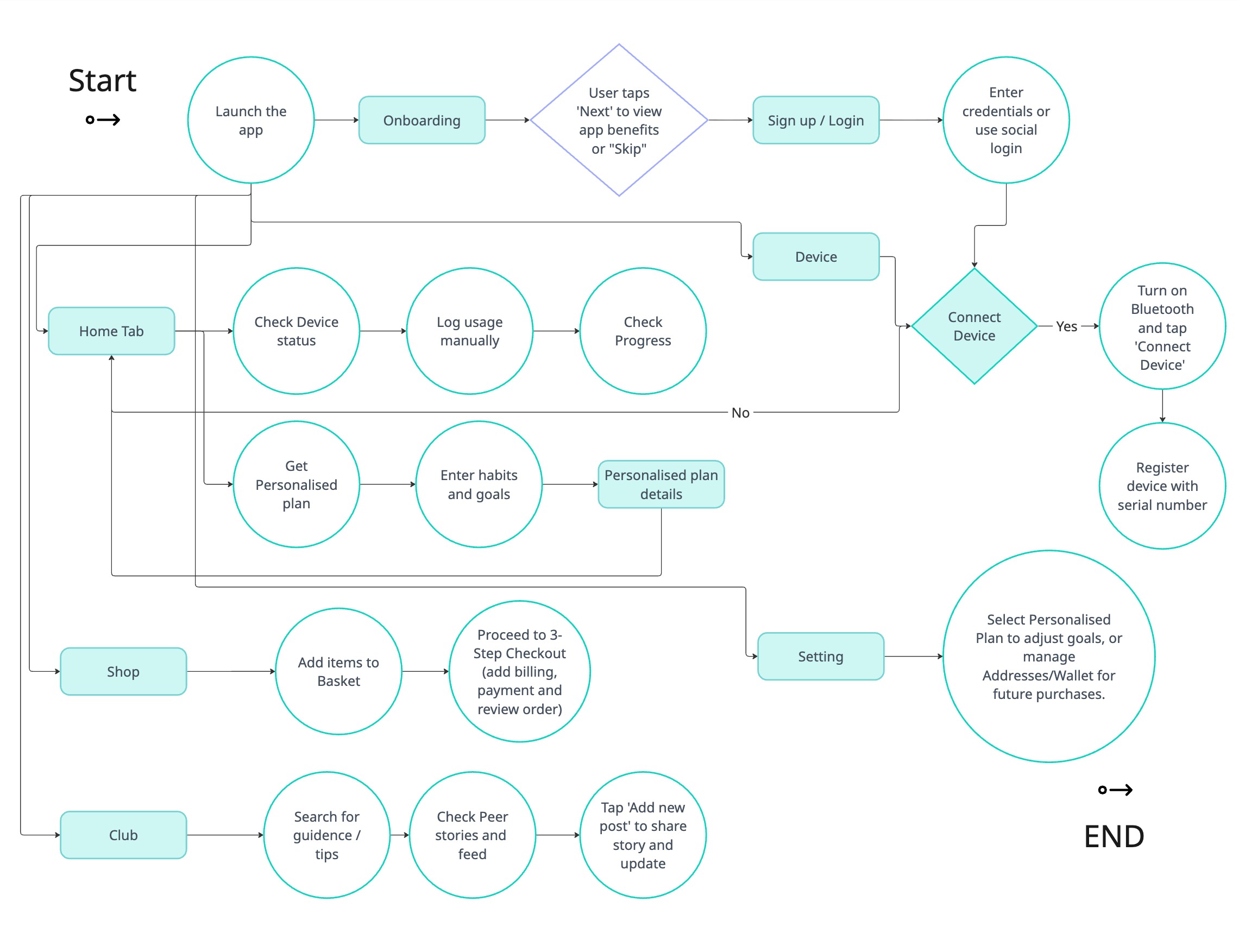
Mapping Interactions
To ensure smooth navigation from device syncing to progress tracking and goal-setting, I created user flows with focus on minimising friction while keeping motivational touchpoints visible.
Design
Bringing the Idea to Life
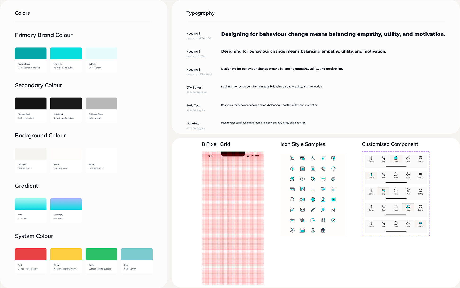
The first crucial step was establishing a visual foundation that honours the brand’s identity while ensuring a native, supportive iOS experience. To translate the unique branding while ensuring native usability on iOS, I implemented a strategic visual system:
- Colour Palette: I used the signature Turquoise colour of IQOS branding book for all primary actions and status indicators. The dark Charcoal Grey of the palette provides high contrast for typography.
- Typography: The design pairs the strong, branded voice of Montserrat (Bold) for all headlines and titles, with the clean, legible native SF Pro for all body text and data points.
This combination ensures the app is highly usable and clearly aligned with the premium IQOS brand.
Key UI Design Breakdowns
- Design System
Foundation uses Turquoise accents and a blended Montserrat/SF Pro typography hierarchy. This creates a premium, high-contrast, and readable UI.
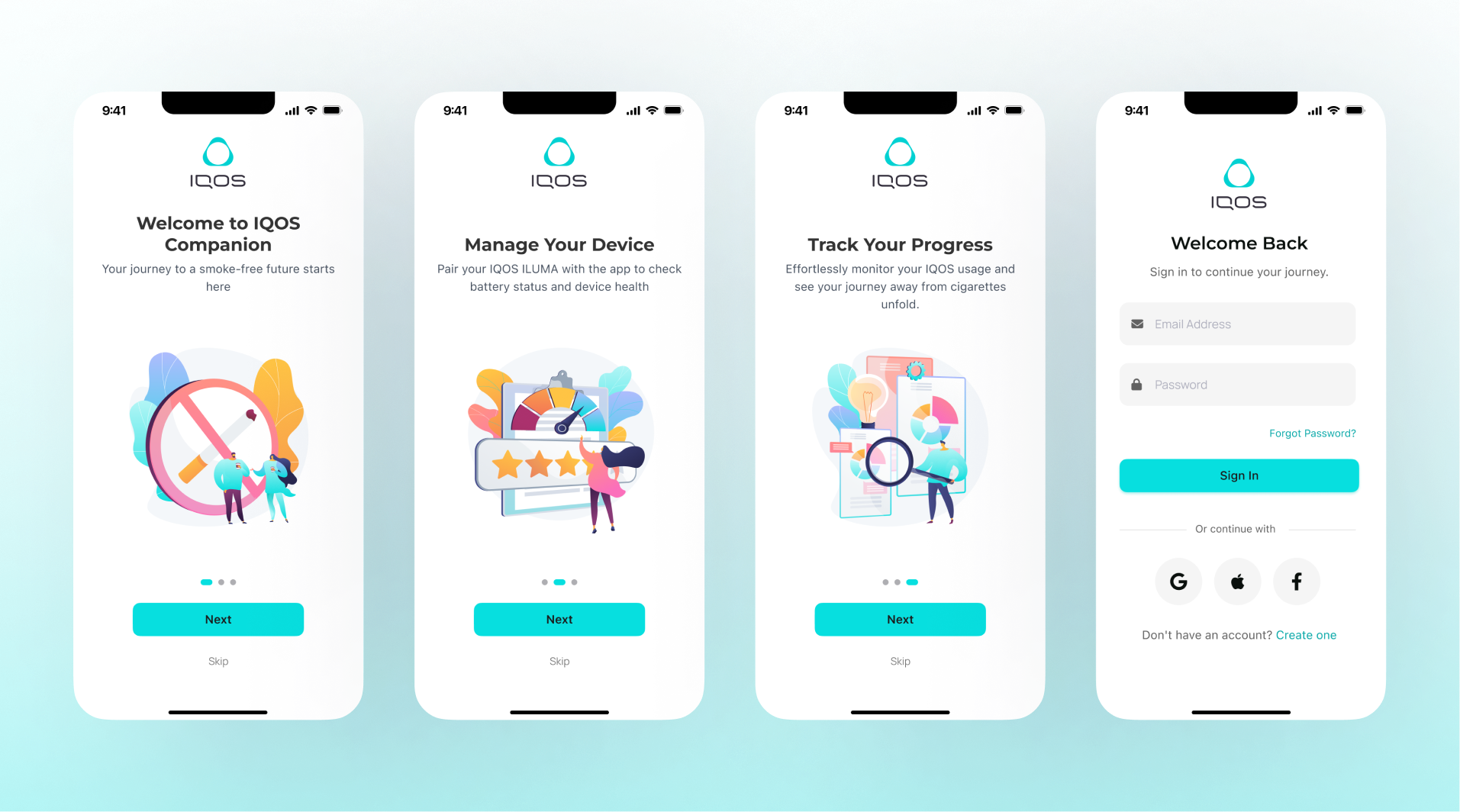
- App Onboarding and Sign Up
Three concise screens communicate core app value. Authentication offers quick social login options for a low-friction start.
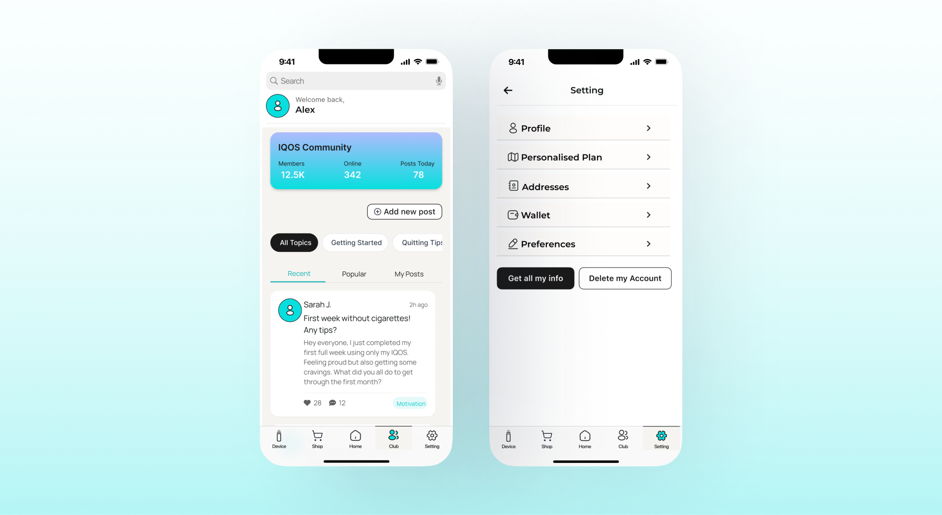
- Dashboard (Home tab)
The daily hub shows live Battery Status and Total Usage Today. Prominently displays Money Saved and Plan Progress to instantly confirm effort.
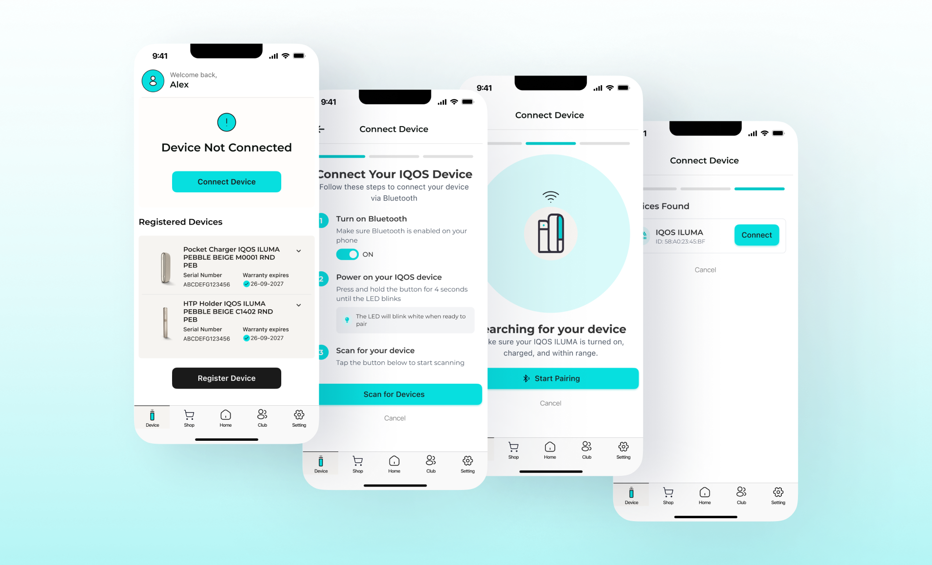
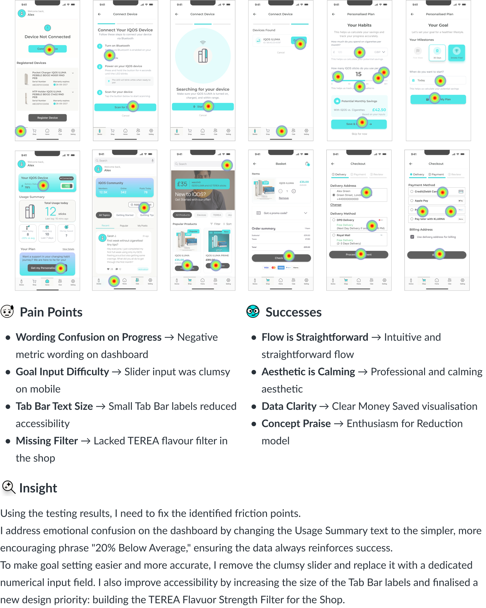
- Device Connection
Guides the user with clear, numbered steps for pairing. A successful connection instantly activates tracking and registers the warranty details.
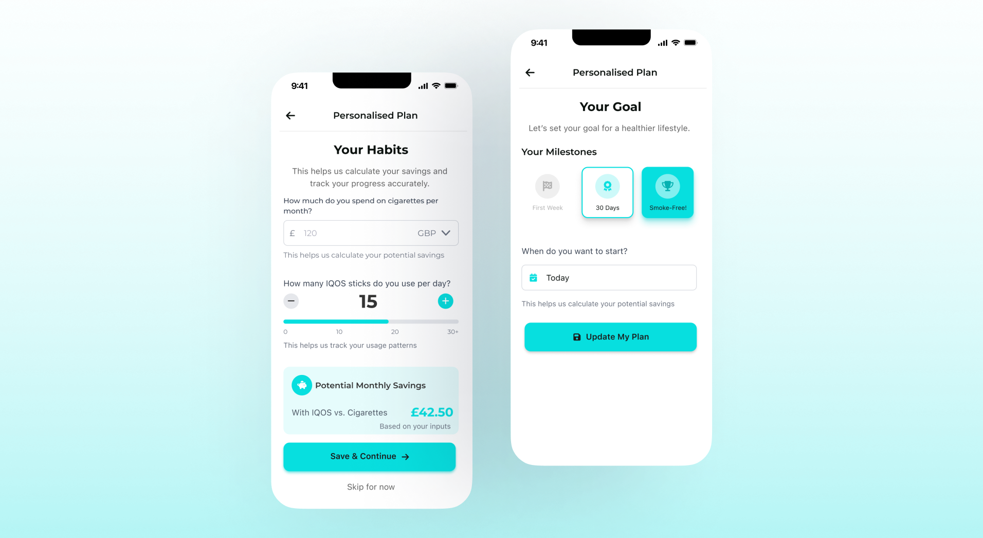
- Personalised Plan
Gathers Habit Inputs (cost/usage) to calculate savings. Allows users to select reduction milestones (e.g., 30 days) over forced abstinence goals.
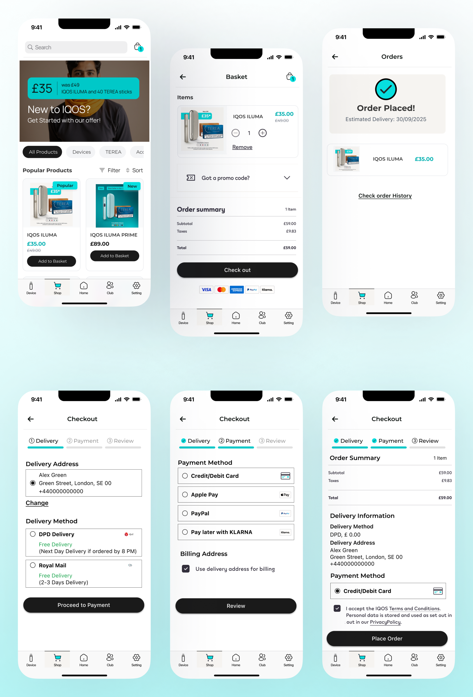
- In-App Shopping and Checkout Process
Seamless e-commerce flow. Browsing is easy, and checkout is multi-step with flexible payment options.
- Community Club and Settings
Club provides social support via a community feed and tips. Settings is the control panel for managing the Personalised Plan and data privacy.
Testing & Iteration
Completion & Satisfaction = B+
Inserting the UI elements into my high-fidelity prototypes led to a few critical iterations after internal feedback. Once I finalised the core screens, I conducted an unmoderated usability test through Maze, focusing on quantitative metrics and qualitative feedback from four current adult IQOS users who fit the Sara persona.
My goals were to test the clarity of the Goal Setting Flow, observe the Ease of the Purchase Flow, and gather feedback on the emotional clarity of the Motivational Data presented on the Dashboard.
As a result, all participants completed the critical tasks, with an average completion time indicating a generally intuitive, yet slightly confusing, path for data entry.
Feedback Highlight
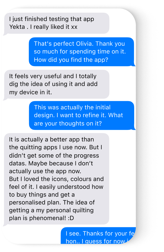
I invited 5 participant, one of them was a regular IQOS Device user, who offered this immediate and direct feedback upon completing the flow. It affirms the effort to design a professional tool for the high-stress user:
“I just finished, and honestly, the prototype is well made. I’ve tried multiple quitting apps, but they just feel shoddy and restrictive. This one feels professional, like a real product. The way you instantly see the battery life, money saved, and the device connection status is very useful. If this drops, I would genuinely use it every single day. It finally feels like an app that’s helping me switch, not just judging me for still using nicotine.”
Reflection
The usability testing provided the critical validation needed to move this concept forward. The high enthusiasm from participants, particularly the regular IQOS user, affirmed that the core thesis is a powerful market differentiator:
The combination of automatic data tracking and a premium aesthetic directly solves the user’s fears of invisible progress and shoddy, judgmental interfaces.
The app is confirmed to be “helping users switch, not judging them.”
Key Learnings
- Strategic Brand Translation: Successfully marry the premium IQOS visual identity with iOS native standards is crucial to build trust and professionalism.
- Empathy in Data Design: Confirmed that data must be presented to reinforce incremental success and minimize the emotional friction associated with tracking sensitive habits.
- Prioritising Utility: The highest-value features were not motivational, but real-time utility (e.g., Battery Status), which drives daily user engagement.
- Eliminating Micro-Friction: Learned that high-impact fixes like replacing the clumsy slider with a numerical input are critical for optimising the conversion flow.
- Designing for Control: The user demands simple, direct control over their goals and their device, validating the necessity of automatic tracking and proactive device status visibility.
Future Success Measurements
These metrics are essential for validating the potential impact of the app on the market, if launched, and the user’s habits:
- Habit Reduction → ≥80% of total consumption comes from IQOS sticks after 90 days.
- Device Engagement → Daily Active Users (DAU) remain above 25%, confirming users check data frequently.
- Customer Loyalty → ≥30% of users complete a second purchase through the in-app Shop within 60 days.
- Feature Adoption → ≥65% of activated users set and actively track a Personalised Plan.
My Plan to Express the Idea
As the sole designer, the next steps focus on finalising the necessary materials to present this idea as a viable, polished product opportunity:
- Final UI Polish & Documentation: I will implement all identified B+ fixes (e.g., the numerical input and Tab Bar size) and finalise the detailed design system documentation.
- Architecture Feasibility: I will translate the API and Bluetooth Integration requirements (real-time data syncing, e-commerce flow) into a technical brief to confirm the architecture is feasible.
- Content Sourcing: I will finalise the structure for the Community and Content Library, outlining key articles and peer support features.
- Feature Prioritisation: I will isolate the required elements for the Minimum Viable Product (MVP) versus the features targeted for later enhancement, such as the Flavour Strength Filter and FlexPuff controls.
Other Works
- IQOS Companion App
 IQOS Companion App: A UX/UI Design Story Exploring How Data Can Drive… Read more: IQOS Companion App
 - BILL
 Simplifying Approval Processes:A UX Case Study on Enhancing Visibility and Usability of… Read more: BILL
 - SplitWise Case Study
 Splitwise Less stress when sharing expenses with anyone Optimising Splitwise:Better Usability & Higher… Read more: SplitWise Case Study