

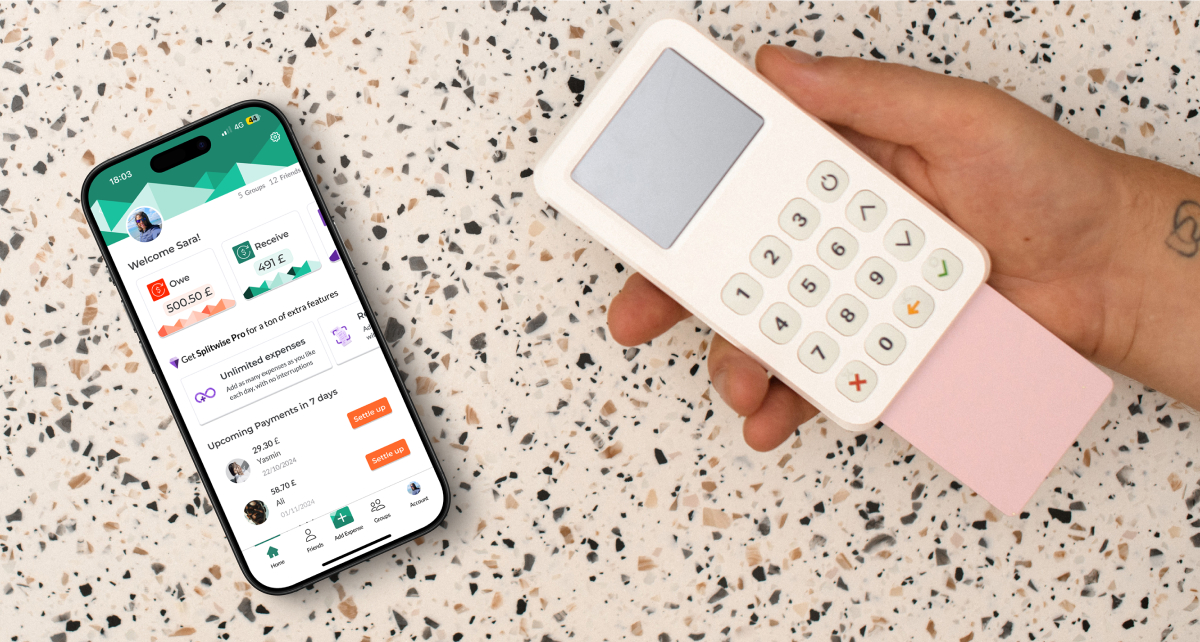
Splitwise
Less stress when sharing expenses with anyone
Optimising Splitwise:
Better Usability & Higher Conversions
Splitwise is a popular expense-sharing app that helps friends, families, and colleagues effortlessly manage and split expenses.
This is a short tale of how we went the extra mile to address usability challenges and redesign the app.
MY ROLE
Responsible for conducting initial research, proposing the project, conceptualising ideas, designing solutions, and delivering key modules and feature enhancements.
TEAM & TOOLS
- Team: 2 UX/UI designers
- Mentor: Marzie Nadali
- Duration: 4 weeks
- Tools: Figjam, Figma, Zoom, Illustrator, Canva
"%3E%3Cpath d="M882.078 211.604V52.3164L602.573 211.604H882.078Z" fill="%23CDF0EA" stroke="%23CDF0EA" stroke-width="1.20217"/%3E%3Cpath d="M882.078 211.604V52.3164L1161.58 211.604H882.078Z" fill="%231BC29F" stroke="%231BC29F" stroke-width="1.20217"/%3E%3Cpath d="M-124.229 187.903V88.4727L83.6708 187.903H-124.229Z" fill="%2352595F" stroke="%2352595F" stroke-width="1.20217"/%3E%3Cpath d="M154.432 218.383V59.0957L433.936 218.383H154.432Z" fill="%23FF2900" stroke="%23FF2900" stroke-width="1.20217"/%3E%3Cpath d="M154.432 218.383V59.0957L-125.073 218.383H154.432Z" fill="%23FF815C" stroke="%23FF815C" stroke-width="1.20217"/%3E%3Cpath d="M47.5145 187.903V79.4336L-140.047 187.903H47.5145Z" fill="%23D0B3EB" stroke="%23D0B3EB" stroke-width="1.20217"/%3E%3Cpath d="M47.5145 187.903V79.4336L235.076 187.903H47.5145Z" fill="%23A473DB" stroke="%23A473DB" stroke-width="1.20217"/%3E%3Cpath d="M292.276 209.344V50.0566L12.7717 209.344H292.276Z" fill="%231BC29F" stroke="%231BC29F" stroke-width="1.20217"/%3E%3Cpath d="M292.276 209.344V50.0566L571.781 209.344H292.276Z" fill="%230C3C32" stroke="%230C3C32" stroke-width="1.20217"/%3E%3Cpath d="M543.111 256.799V97.5117L822.616 256.799H543.111Z" fill="%231BC29F" stroke="%231BC29F" stroke-width="1.20217"/%3E%3Cpath d="M1150.99 189.006V29.7188L1430.5 189.006H1150.99Z" fill="%231BC29F" stroke="%231BC29F" stroke-width="1.20217"/%3E%3Cpath d="M543.111 256.799V97.5117L263.607 256.799H543.111Z" fill="%230C3C32" stroke="%230C3C32" stroke-width="1.20217"/%3E%3Cpath d="M1150.99 189.006V29.7188L871.488 189.006H1150.99Z" fill="%230C3C32" stroke="%230C3C32" stroke-width="1.20217"/%3E%3Cpath d="M732.933 218.383V59.0957L453.428 218.383H732.933Z" fill="%23373B3F" stroke="%23373B3F" stroke-width="1.20217"/%3E%3Cpath d="M732.933 218.383V59.0957L1012.44 218.383H732.933Z" fill="%2352595F" stroke="%2352595F" stroke-width="1.20217"/%3E%3Cpath d="M995.001 187.905V83.9551L812.599 187.905H995.001Z" fill="%23FF2900" stroke="%23FF2900" stroke-width="0.784526"/%3E%3Cpath d="M995.001 187.905V83.9551L1177.4 187.905H995.001Z" fill="%23FF815C" stroke="%23FF815C" stroke-width="0.784526"/%3E%3Cpath d="M1412.42 191.266V31.9785L1132.91 191.266H1412.42Z" fill="%23373B3F" stroke="%23373B3F" stroke-width="1.20217"/%3E%3Cpath d="M453.334 190.164V111.072L314.55 190.164H453.334Z" fill="%23D0B3EB" stroke="%23D0B3EB" stroke-width="0.596922"/%3E%3Cpath d="M453.334 190.164V111.072L592.119 190.164H453.334Z" fill="%23A473DB" stroke="%23A473DB" stroke-width="0.596922"/%3E%3C/g%3E%3Cdefs%3E%3CclipPath id="clip0_442_13634"%3E%3Crect width="1200" height="151" fill="white" transform="matrix(-1 0 0 1 1200 0.341797)"/%3E%3C/clipPath%3E%3C/defs%3E%3C/svg%3E%0A)
Objective
This redesign aimed to address issues in user interactions and conversion challenges, increasing user engagement, boosting premium conversions, and enhancing the app’s usability.
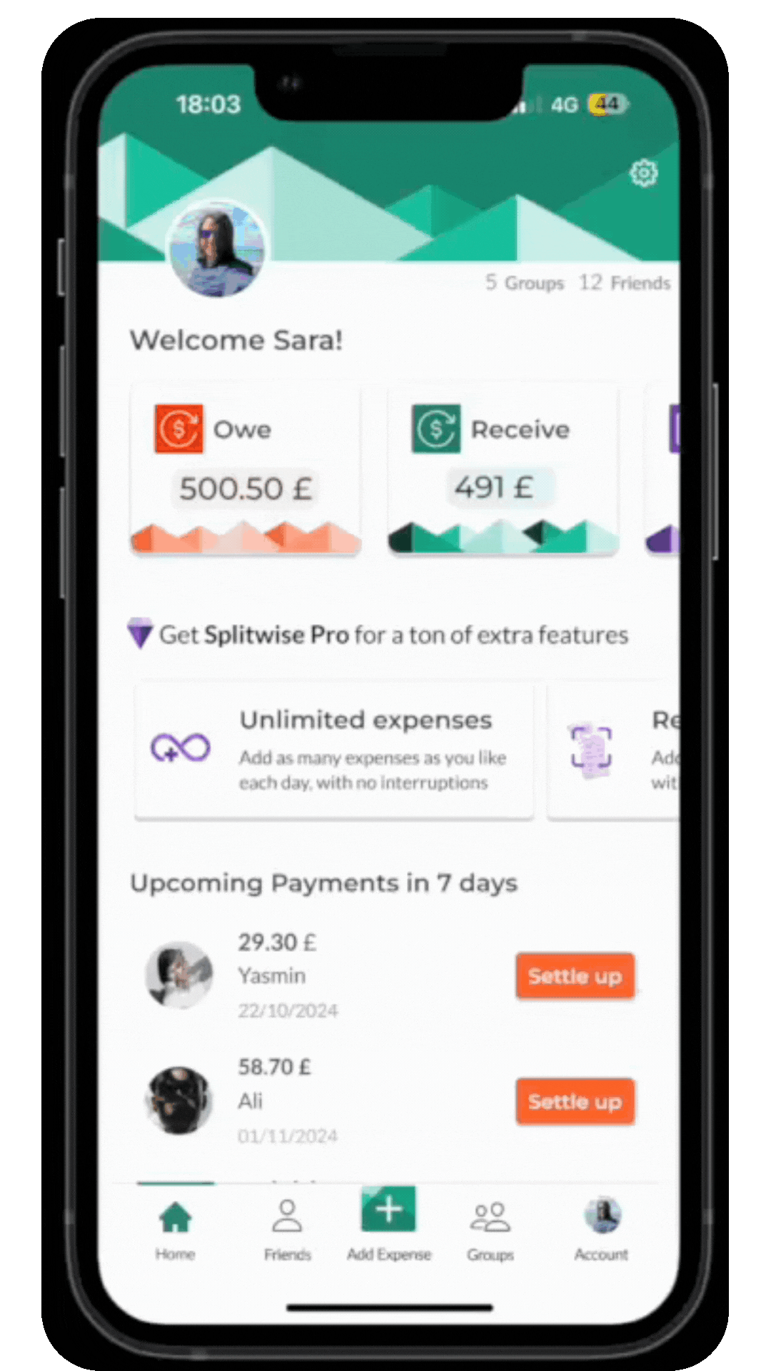
What we designed?
Streamlined Expense Addition Process
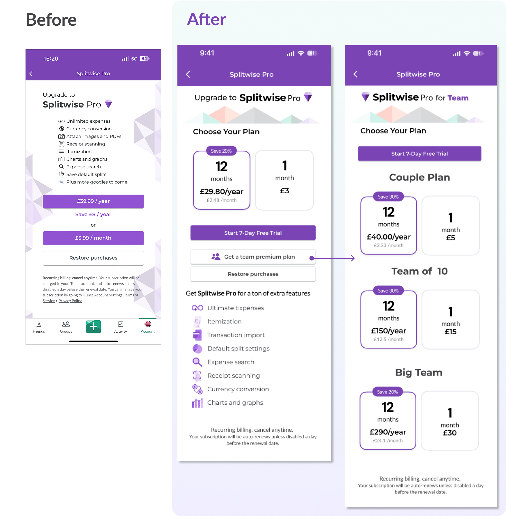
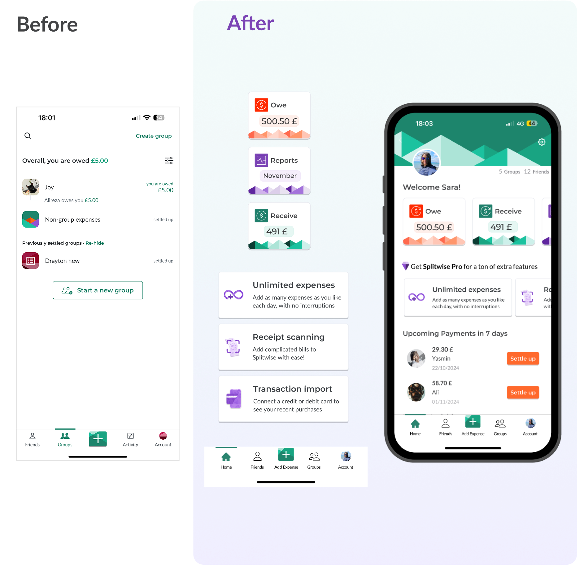
We redesigned the conversion wall to show premium value without restricting free users.
- Unlimited entries for premium users
- Key free features retained
- Contextual upgrade nudges.
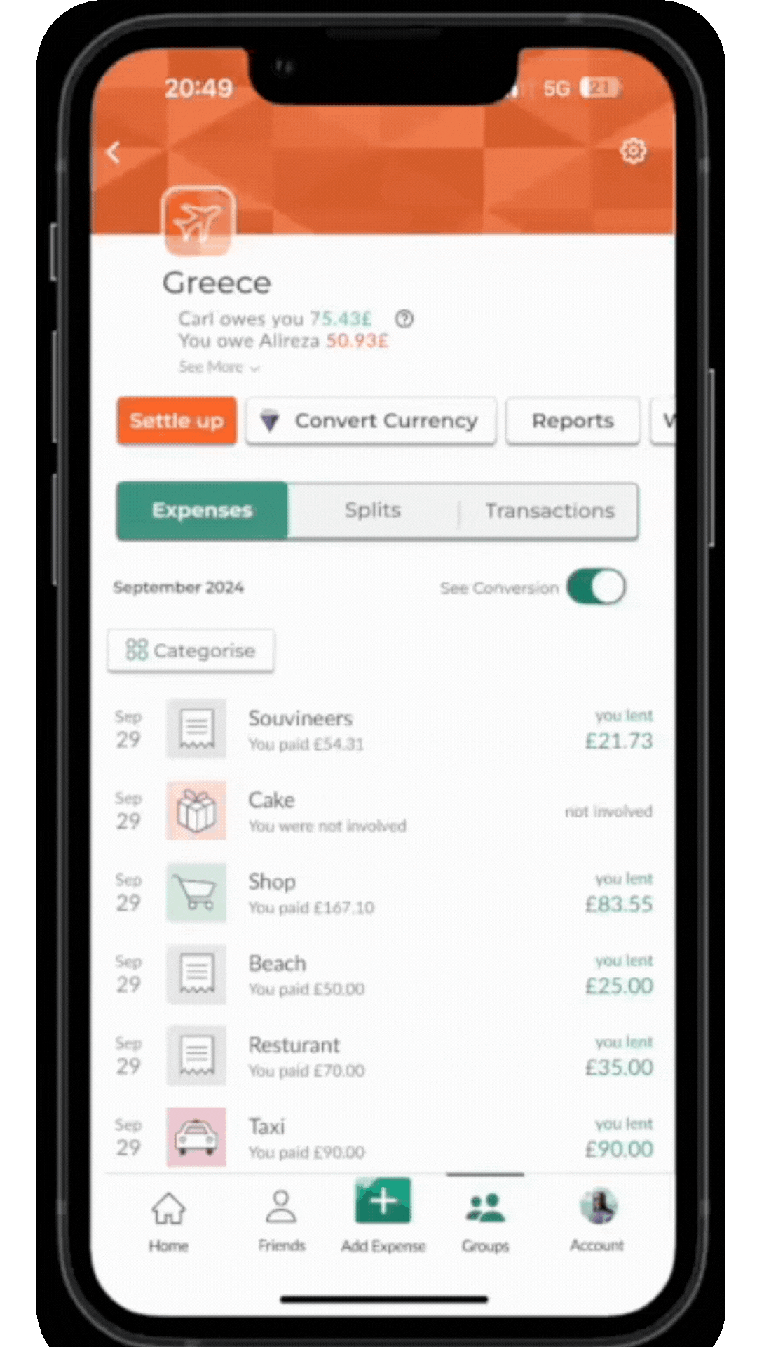
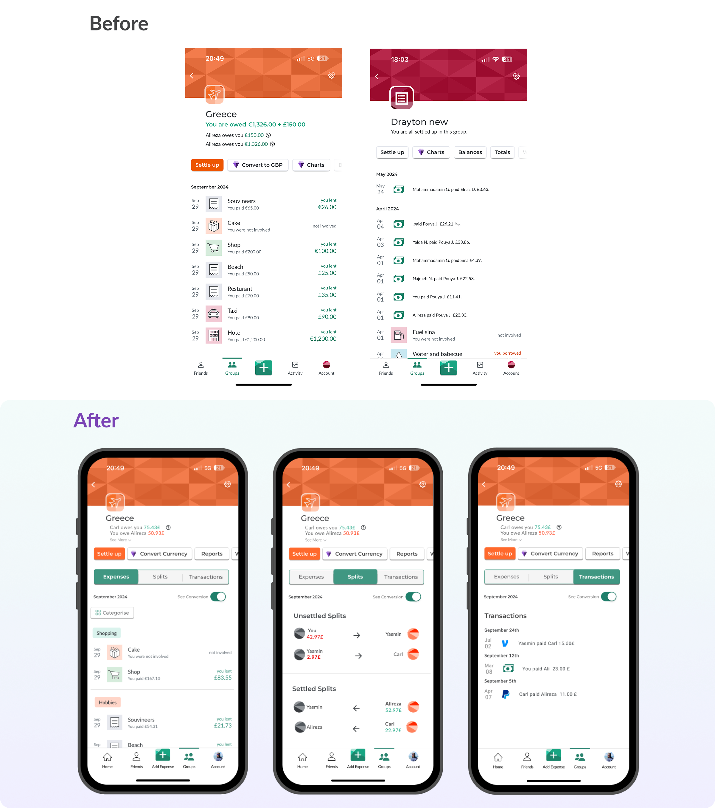
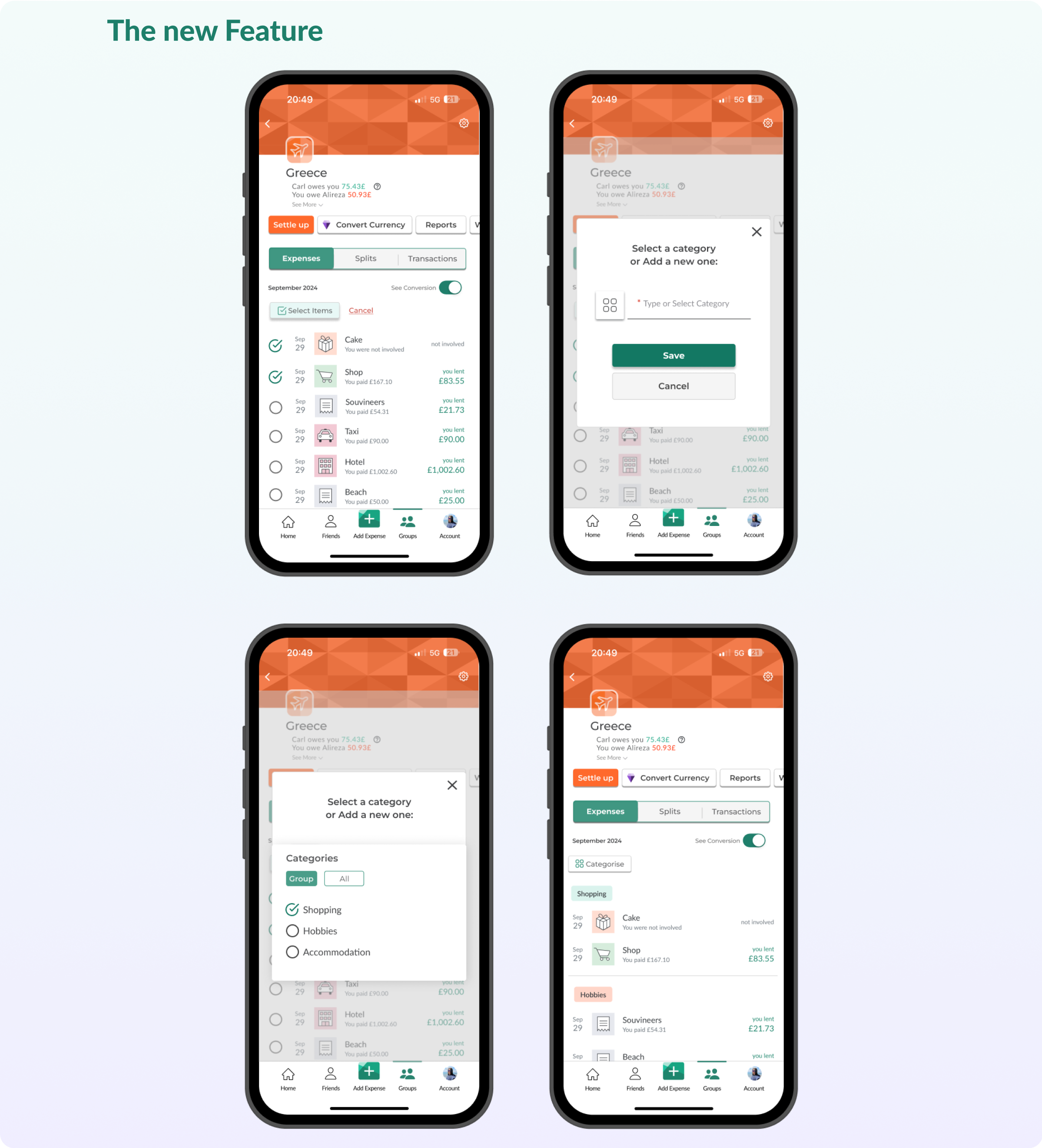
Enhanced Financial Management
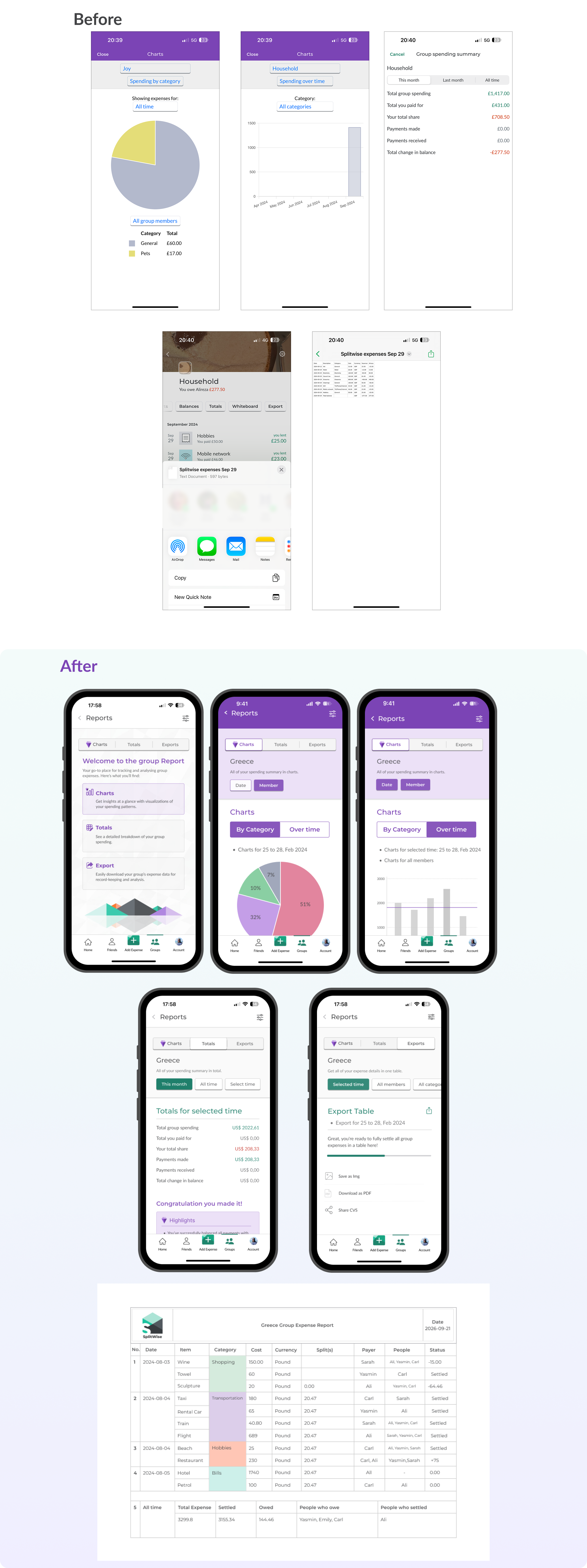
We introduced categorisation and reporting tools for easier tracking.
- Customisable categories
- Exportable reports
- Spending insights
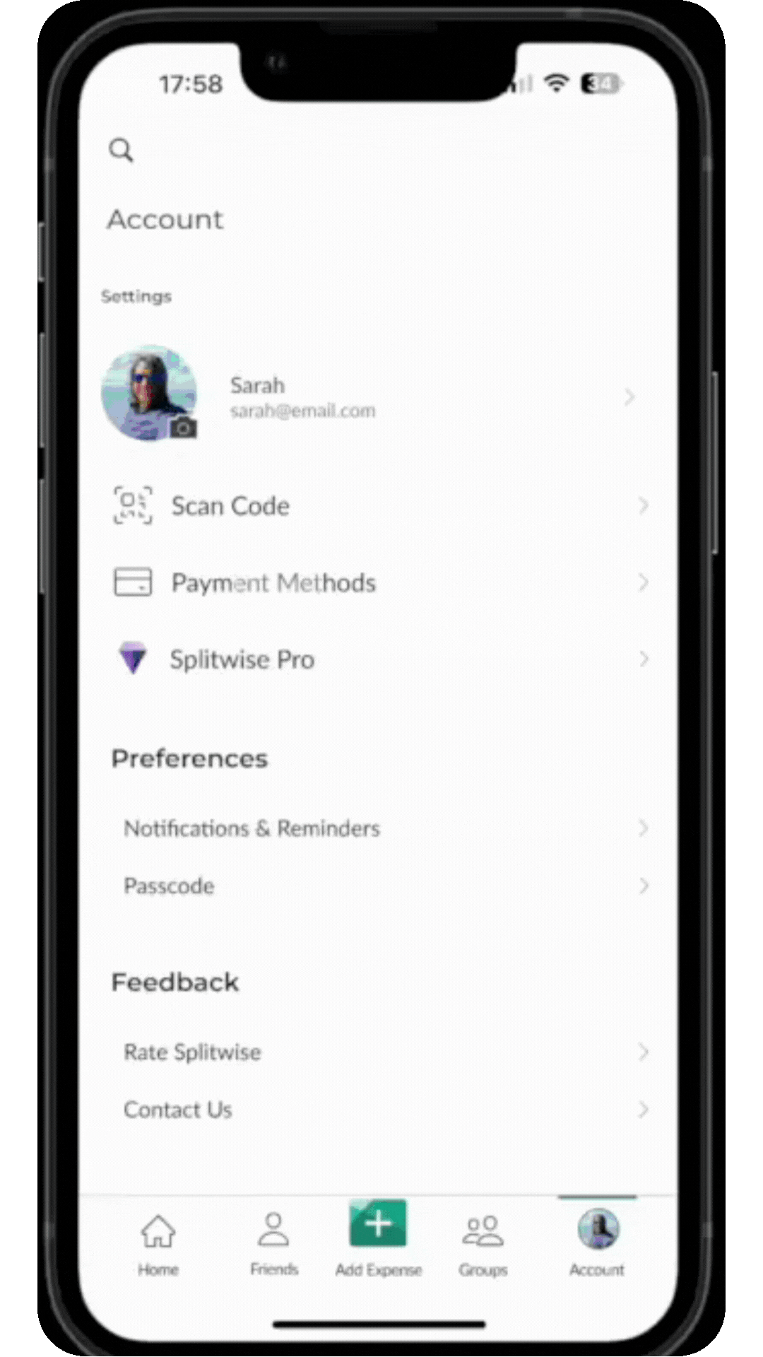
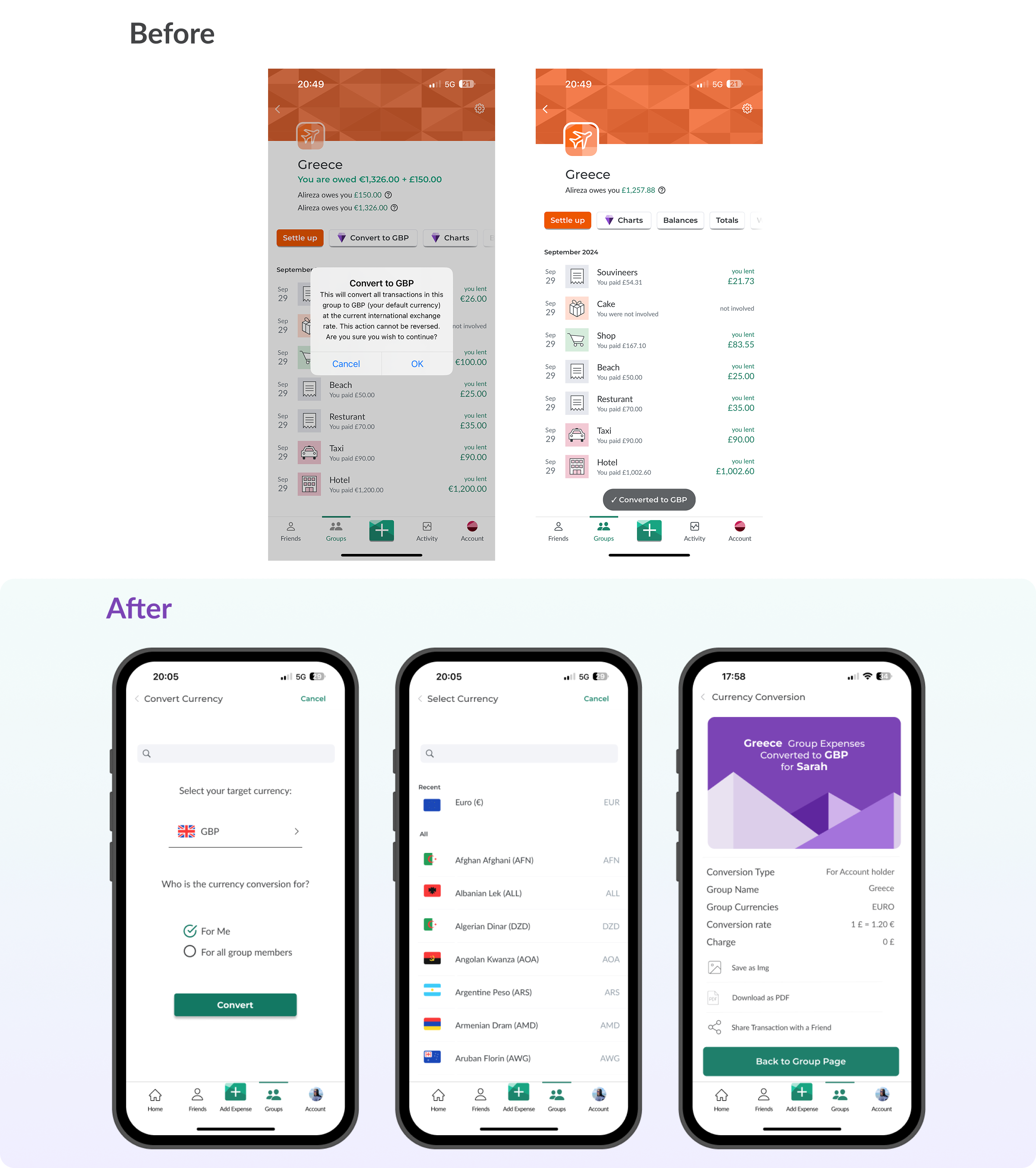
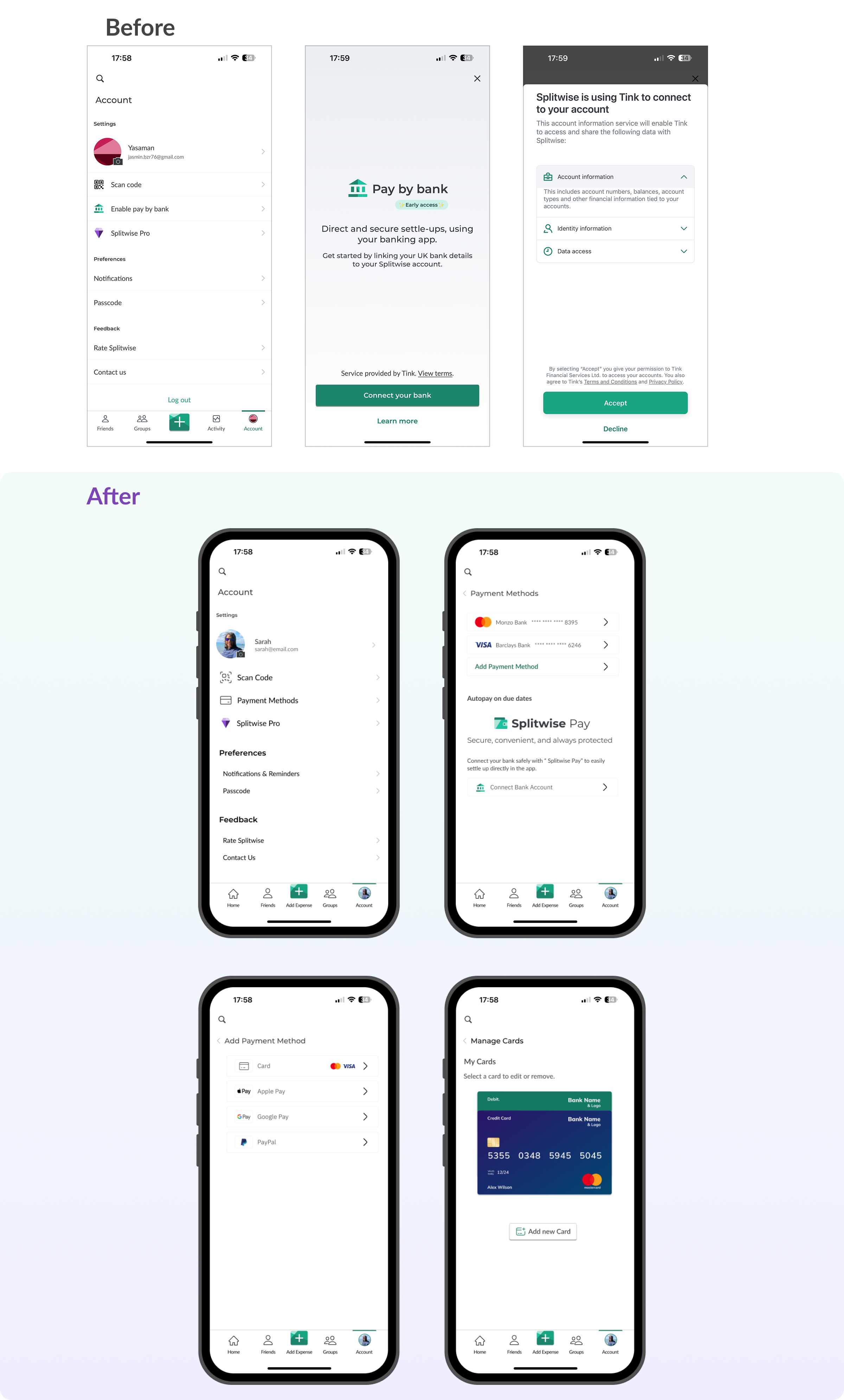
Payment Integration
We simplified payments with multiple methods and currency conversion
- Card Payment, PayPal, Apple/Google Pay
- In-app currency conversion
- Direct settlement options
Explore and interact with the prototype
The Problem
As Splitwise expanded, users increasingly relied on it for seamless expense management across diverse contexts. However, challenges in understanding premium benefits, inflexible expense addition, and a confusing settlement process left users frustrated and disengaged.
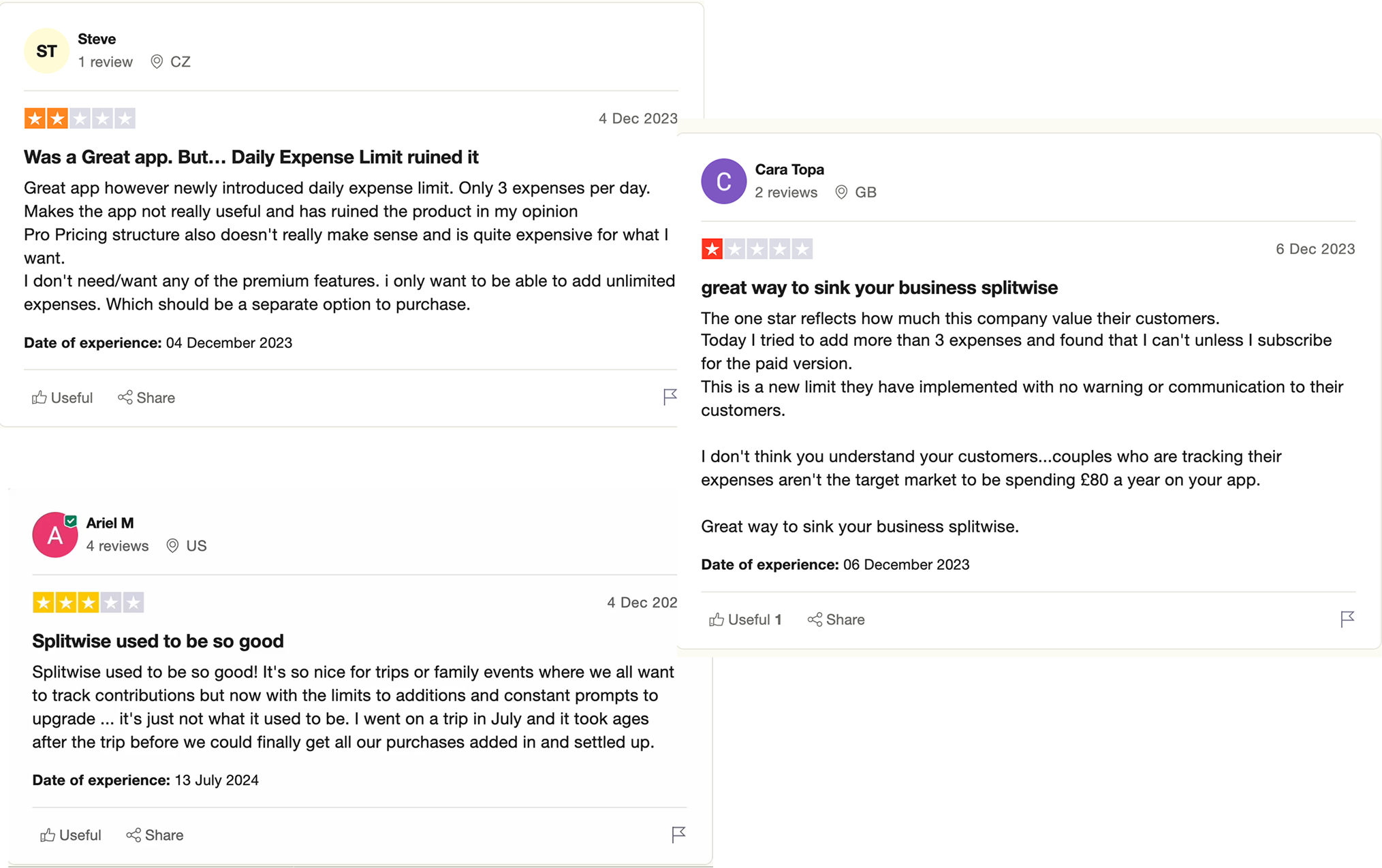
“Settling balances is confusing when the app doesn’t clearly show who owes what and how to pay.”
Why are we focusing on this problem?
Drawing insights from user feedback, Trustpilot reviews, and support tickets, we focused on understanding user frustrations with the app, asking focused questions:
Why don’t users see value in premium features?
What makes financial tracking confusing?
How does balance settling cause struggles in the app?
How do unclear financial summaries cause trust issues?
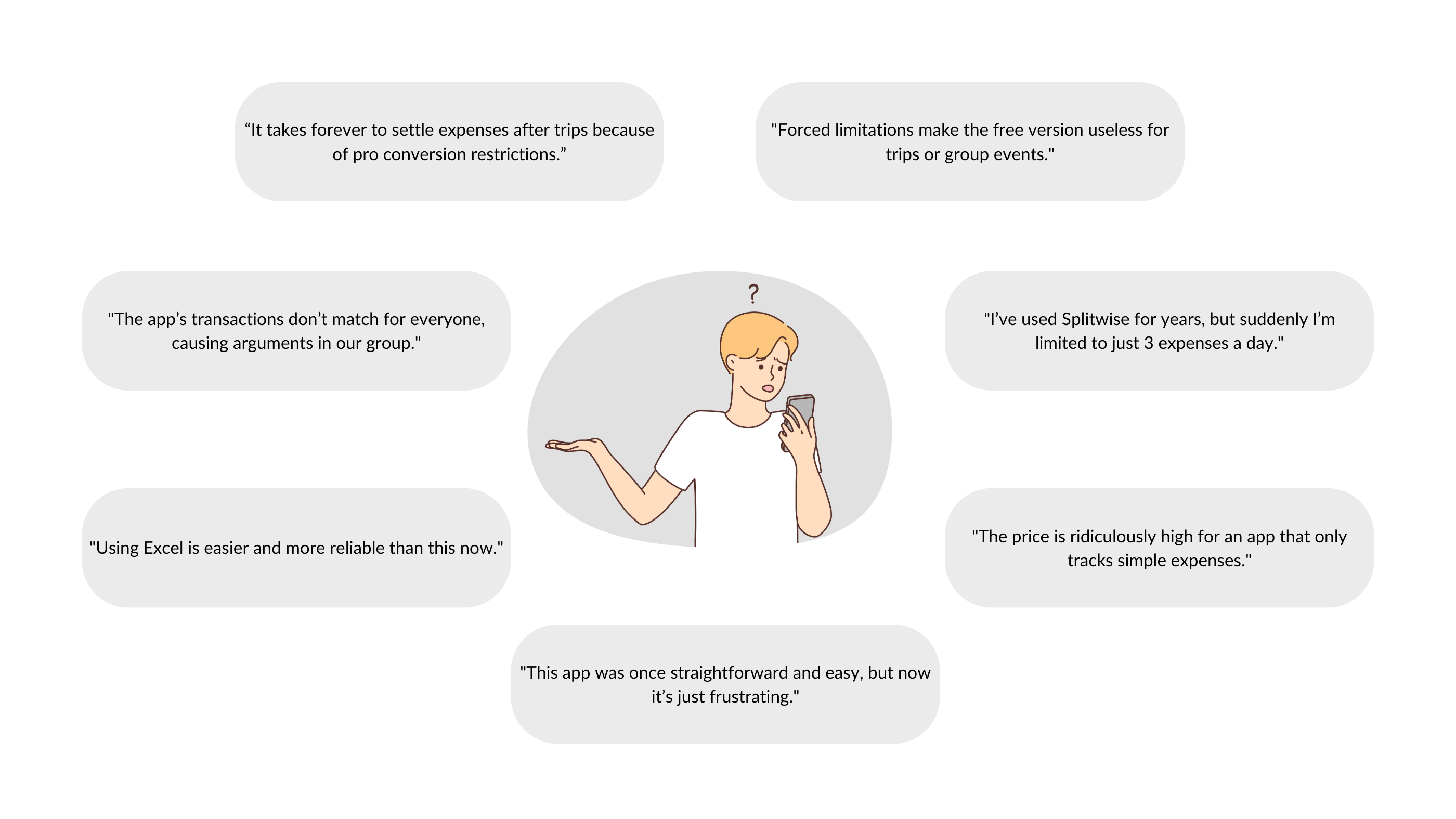
As a result, We noticed these key patterns displayed by Splitwise users when handling group expenses in app:
Annoyed by limits and overlays pushing premium without clear value
Getting confused while settling balances with others
Facing difficulty adding expenses quickly and flexibly
Feeling frustrated by unclear financial summaries
Let’s dive into how we made things better
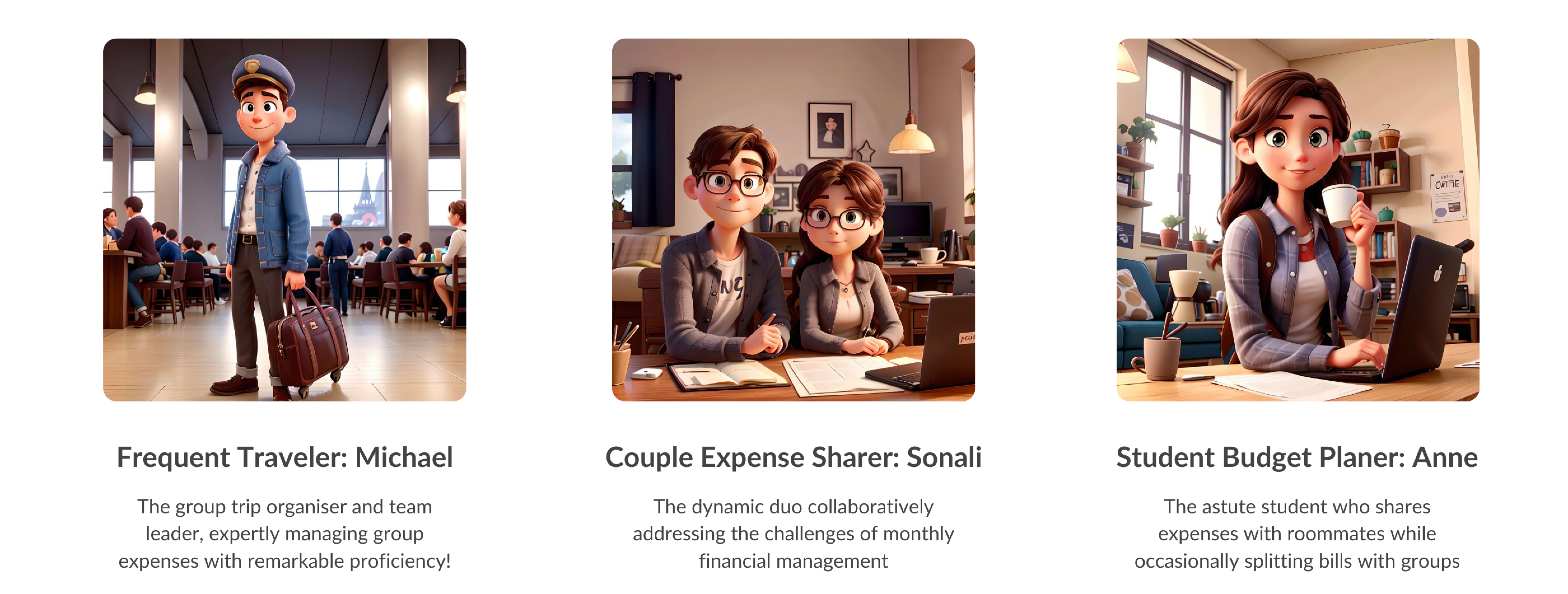
Walking in Users’ Shoes
To guide our design, we created three personas based on user interviews and real scenarios. These personas helped us understand their needs and design solutions that truly work for them.
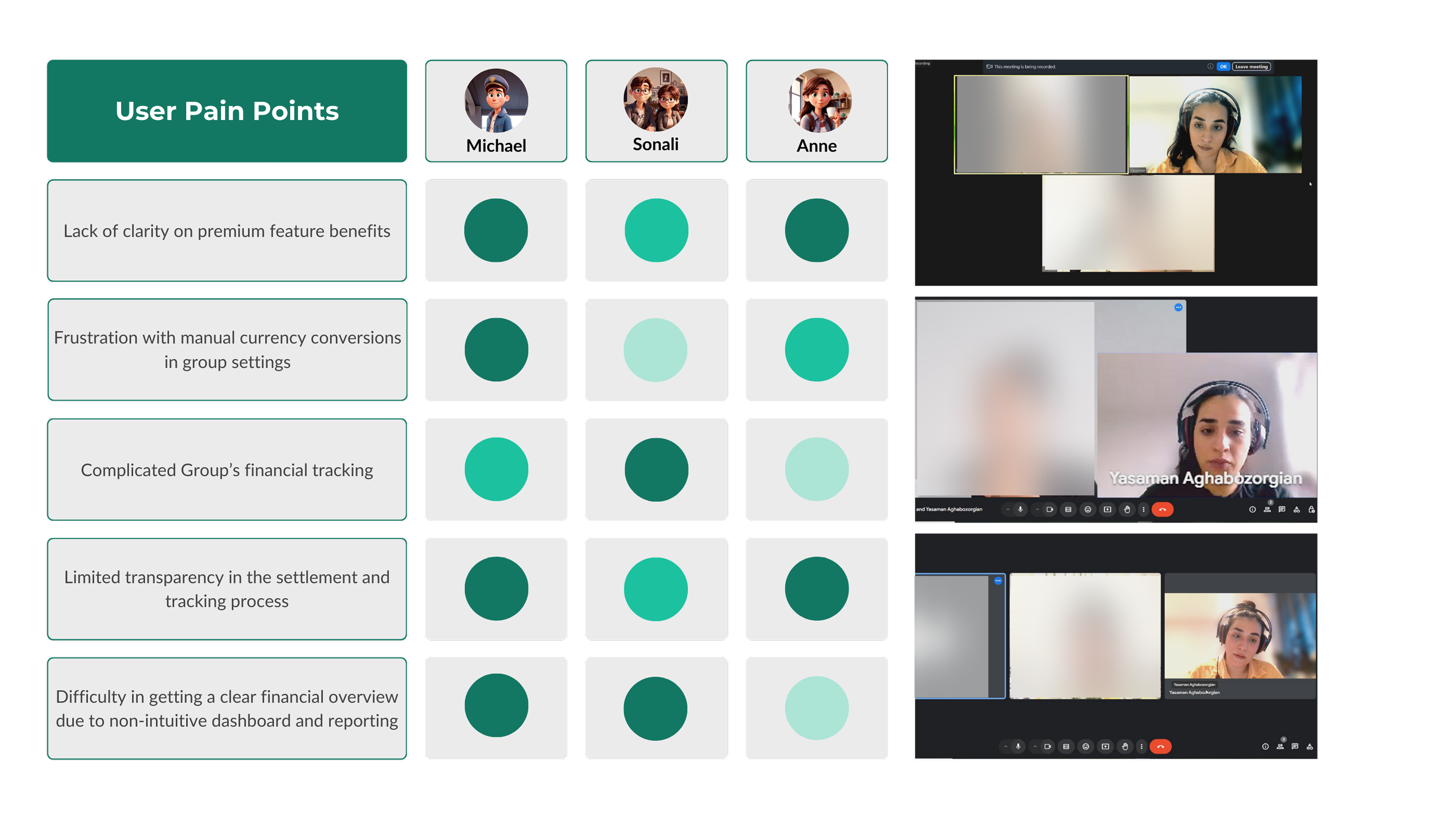
Conversations That Shaped Our Design
Aiming to empathise and truly connect with users, we engaged in meaningful conversations and listened carefully to their stories. Through these interviews, we uncovered the challenges they faced, from unclear premium benefits to the frustration of manual currency conversions in group settings.
Leading the Path Forward
To address our users’ frustrations, we started by examining the existing design and user flows.
What exists?
By comparing these with the pain points uncovered during interviews, we identified opportunities for improvement and crafted focused “How Might We” questions to guide our solutions.
Let’s Ideate!
But First, What Are Competitors Doing?
We analysed similar apps to identify strengths and weaknesses. Key takeaways included better premium feature prompts and grouped expense tracking with detailed reporting, inspiring ideas to improve Splitwise.
Where Creativity Sparks
Our ideation process was fueled by the insights we gathered from user research and competitive analysis. To address the key pain points, we brainstormed solutions that tackled premium feature clarity, streamlined expense tracking, and simplified settling mechanisms.
To prioritise our efforts, we used the MoSCoW method to categorise our ideas and focused on these key (should-have) features:
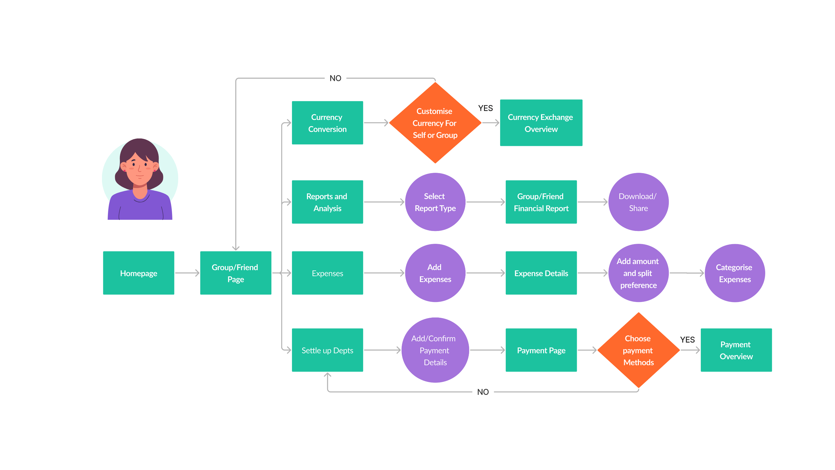
Bringing Ideas to Life: Sketching and User Flows
To start, I translated our prioritised ideas into rough sketches, exploring different layouts and interactions to visualise potential solutions. These sketches helped me identify what worked and what needed refining, providing a foundation for our design process.
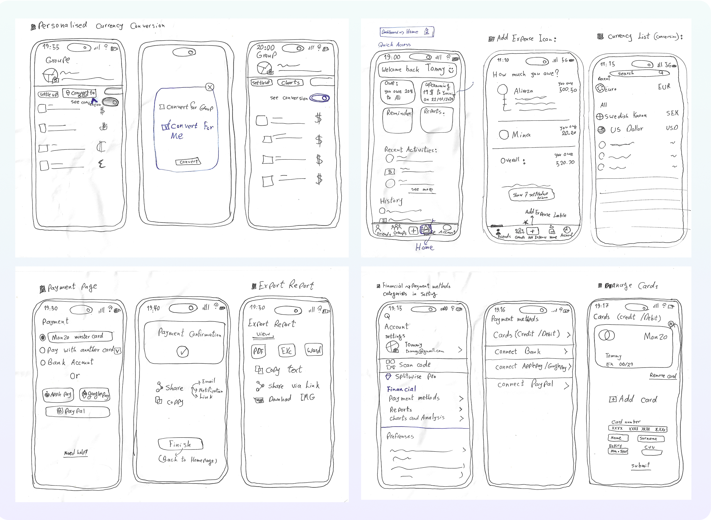
After analysing the sketches, I refined the user flow, ensuring it aligned with user needs and addressed the pain points identified during research. The new flow focused on clarity, efficiency, and seamless navigation, making every interaction intuitive and user-friendly.
Final Designs:
A Smarter, Simpler Splitwise Experience
So we redesigned the features to introduce the solutions we found based on research, enhancing clarity, usability, and efficiency.
‘Before’ and ‘after’ comparisons showcased major improvements, with each decision driven by user insights to create an engaging experience.
Conversion Wall: A Clear Path to Premium Benefits
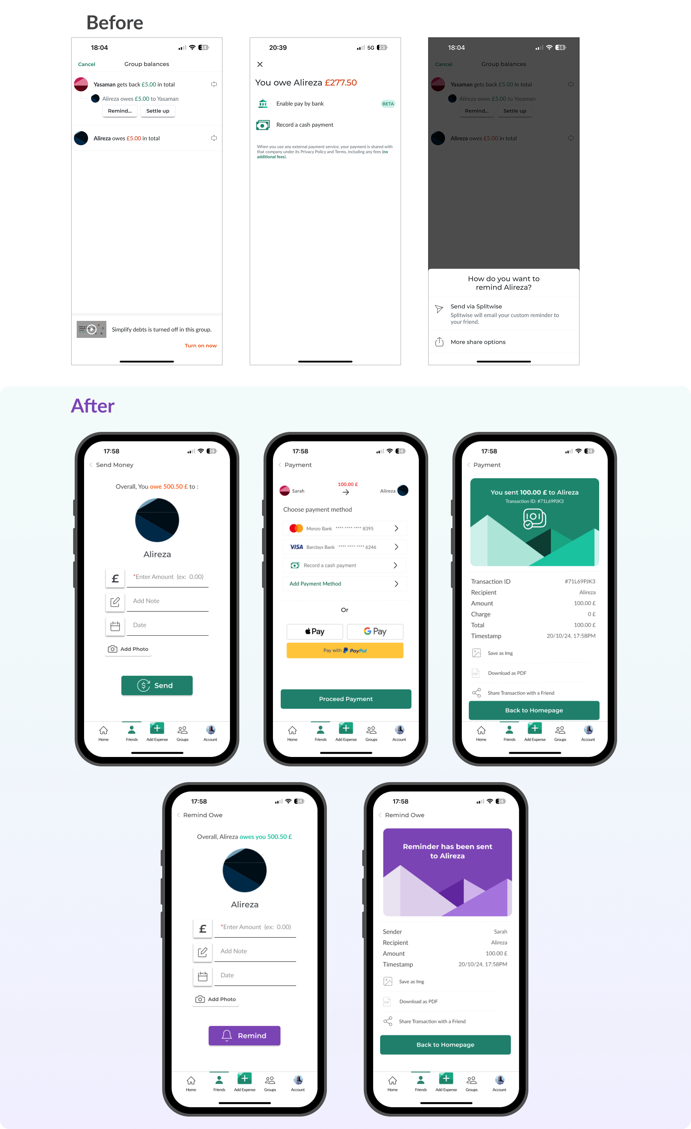
Expense adding is now Quick, Clear, and Efficient
Also , activity details are organised here!
And there is more
Flows and Features That Matter
- Dashboard: Refined app navigation with quick access and an improved expense entry process.
- Currency Conversion: Real-time conversion for individuals and groups.
- Expense Categorisation: Simplified organisation and tracking of expenses.
- Payment Integration: Seamless payment options for hassle-free settlements.
- Send and Remind Payments: Simplified reminders to settle balances.
- Export Reports: Exportable tables for detailed financial tracking.
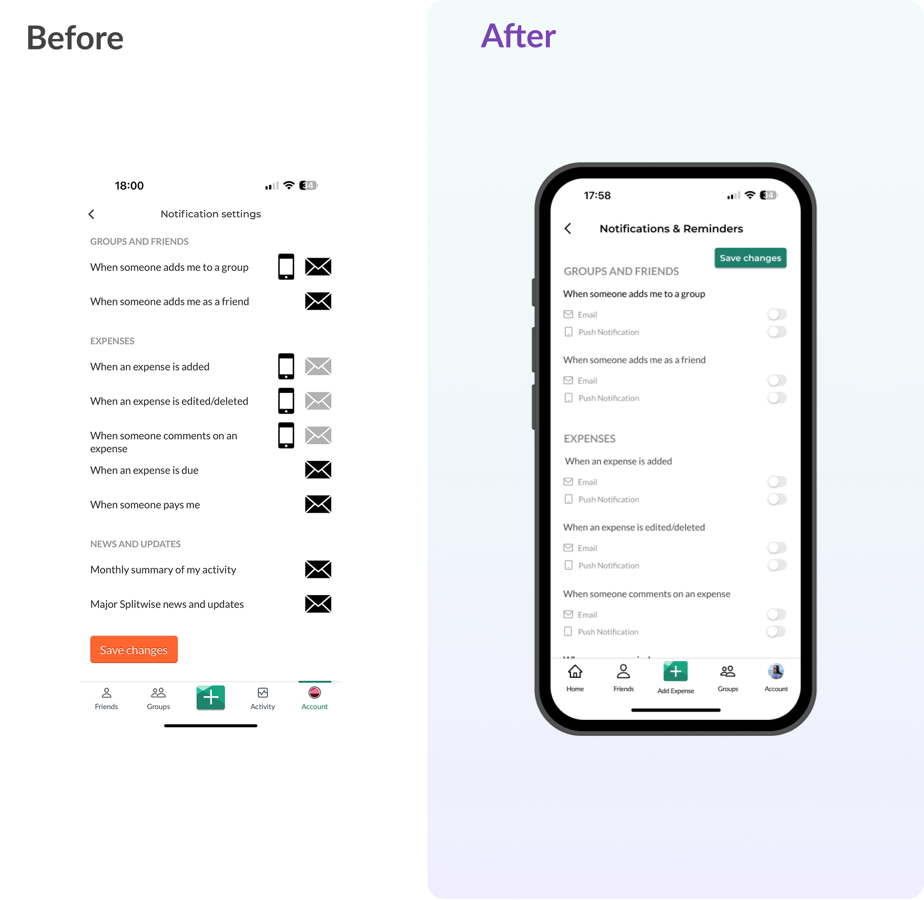
- Notification setting: Enhanced usability with intuitive design, visual clarity, and accessibility.
Users Said The Impact of Our Changes
We tested our new designs with real users from our interviews to see how they felt. Here’s what they said:
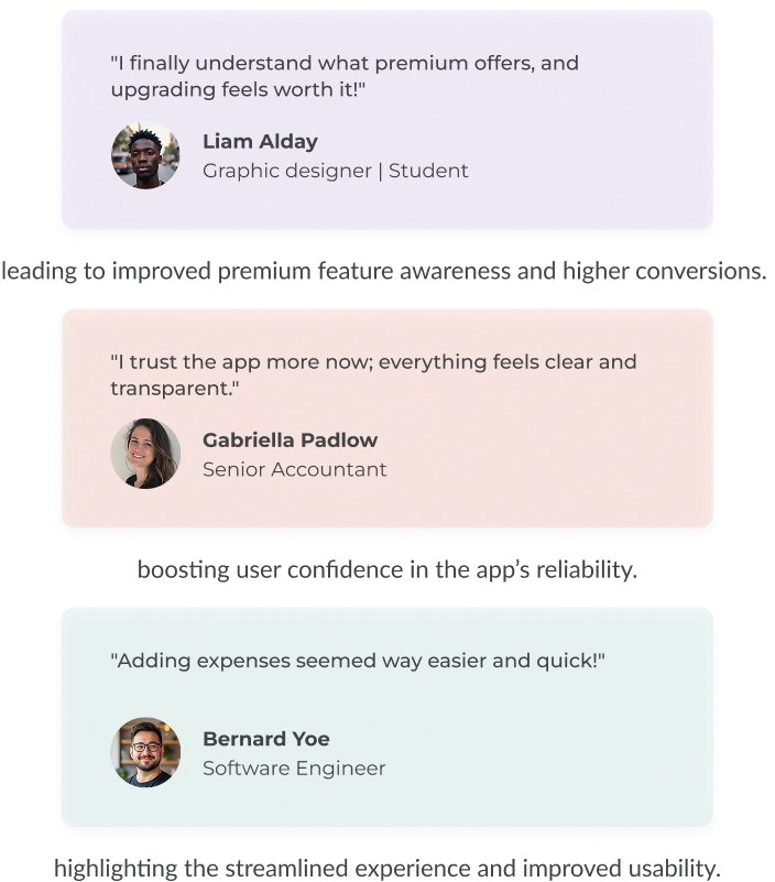
These insights show that users felt more informed, satisfied, and confident in managing their expenses with the new design.
In the end , we learned a lot!
This project provided valuable insights that will guide our future work:
- Communicating Value Drives Conversions: Users respond better when they clearly see the benefits, making it crucial to highlight premium features effectively.
- Simplified Flows Enhance Engagement: Streamlining processes leads to better user experience, making tasks easier and more intuitive.
- Transparency Builds Trust: Users appreciate clear and honest settling processes, which boost confidence and encourage long-term use.

Next, we are Expanding the Vision
This project provided valuable insights that will guide our future work:
- Conducting deeper user research to identify further areas for improvement.
- Exploring new design enhancements that align with user expectations.
- Developing features that make expense management even more intuitive.

Our commitment to innovation and user satisfaction drives us to continuously find and refine new possibilities, making it the go-to solution for more user-friendly and effortless expense management.
Other Works
- BILL
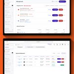 Simplifying Approval Processes:A UX Case Study on Enhancing Visibility and Usability of… Read more: BILL
 - Jira Case Study
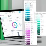 Exploring a Concept: Updating Jira’s Color Palette to Enrich the User Experience… Read more: Jira Case Study
 - MidShift Project
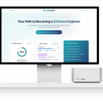 MidShift: Shaping a Career Development Platform with a Human-Centric AI Roadmap Introduction… Read more: MidShift Project